Kitchfix Identity
Kitchfix was already a well-established and well-respected brand in the Chicago clean food movement when BatesMeron was invited to help them evolve and expand their brand. We couldn’t have been more excited. It’s not every day that you get the opportunity to work with people who share so many values we cherish, like transparency, honesty and authenticity—on products and services that are as delicious as they are healthy.
Founded by chef Josh Katt in 2012, Kitchfix is a prepared meal delivery service and so much more. It’s a super-convenient solution for people who want to improve how they eat with craveable dishes free of any artificial, processed or refined ingredients. Each of Kitchfix’s daily menus overflows with locally sourced, organic and paleo deliciousness.
The service has proven to be a hit—so much so that Kitchfix now includes a storefront, a popular catering service and, more recently, a line of paleo and gluten-free granola for the consumer packaged goods market.


When BatesMeron came to the table, Kitchfix had already successfully landed its paleo granola in all of the Whole Foods, Mariano’s and Treasure Island stores in the Chicagoland area. Next, they wanted to expand their reach nationwide. For that big step—they realized that their brand and message had to be on point.
Immediately, we knew our chief goal would be to give the brand a personality as flavorful as the granola itself. (Seriously, you need to try this stuff.)


Kitchfix Voice and Visual Identity
During our initial meetings, Chef Katt gave us an inside look at his creative culinary process. We discovered it starts with something that isn’t necessarily healthy, but he’s craving it…and bad. The next step is to deconstruct and re-create that dish with clean, nutritious and meaningful ingredients. Proving that for Katt, healthy can be even more flavorful and exciting! We locked onto this idea of “craveability,” and launched their new messaging around that very concept.

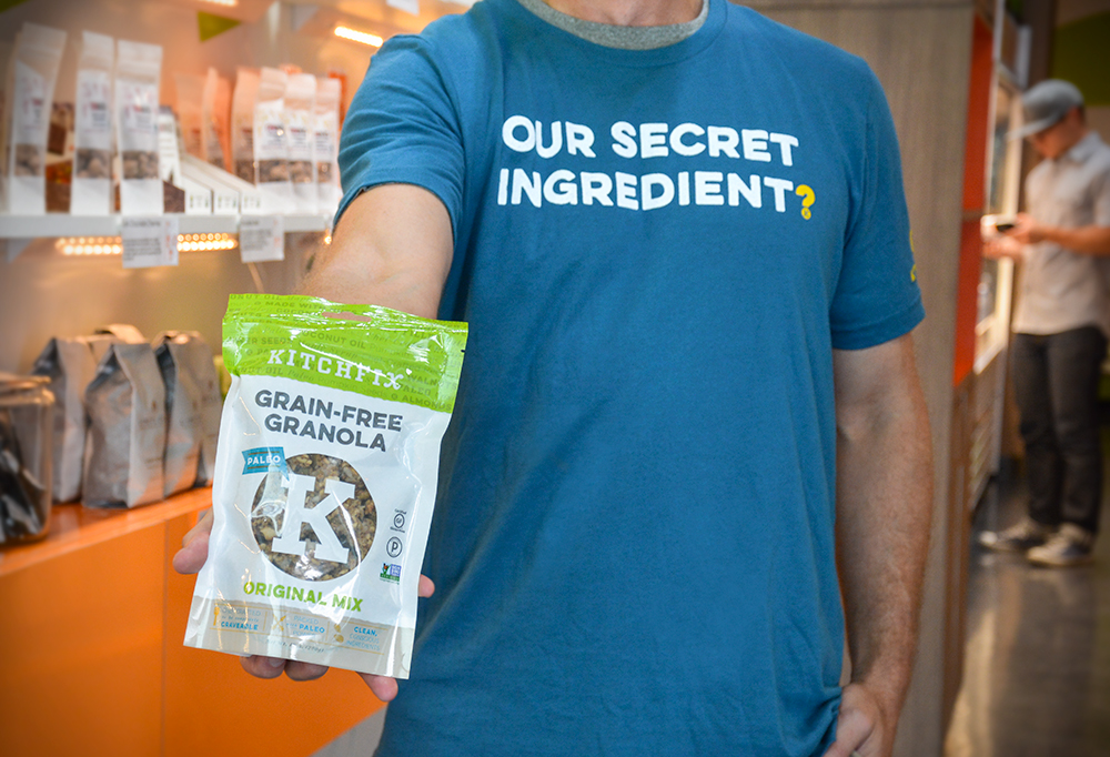
We developed branding guidelines that emphasized key product benefits with a language that’s all Kitchfix’s own. It began with the tagline “Full of Flavor, Not Filler.” And thanks to a super productive tagline brainstorm, extended to other great words and phrases like “pure deliciousness,” “paleo pick-me-up,” “our secret ingredient: no secret ingredients” and, of course,”craveable” that add endless color for us to use across packaging, marketing and their website.
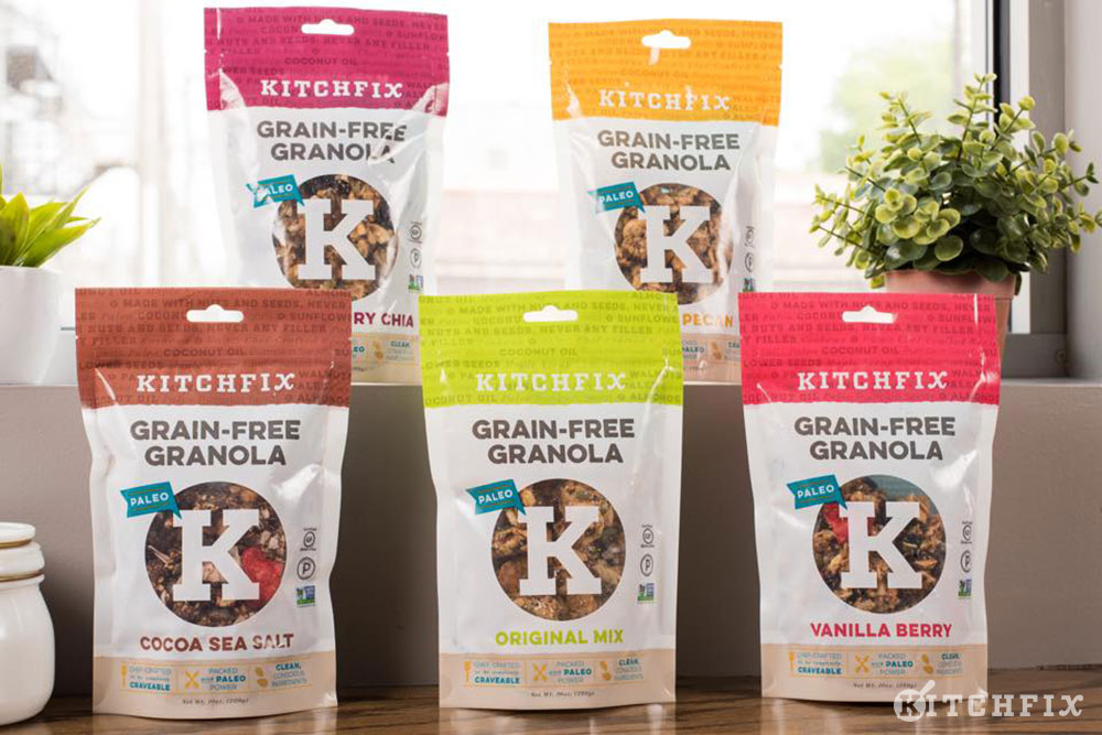
With the brand personality in place, we developed mood boards to kickstart ideas for the brand’s visual standards. Kitchfix loved these mood boards and selected an earthy, yet vibrant tone, so we built out a complete color palette with an array of primary and secondary colors, like Celery, Turmeric, Almond and Kale, that give the brand maximum flexibility to have a visual personality as enticing as the new brand voice.


Granola Packaging
Kitchfix is poised for nationwide expansion. Knowing this, it was important that the product make an impact from the grocery store shelf. An evolution of the existing packaging, our designs take full advantage of the new voice and color palette to draw the consumers eye with pops of color and a personality that’s hard to ignore.

By creating mood boards and developing such a rich palette of graphical tools to deploy, it was no problem to develop visually exciting packaging. These designs perform double-duty, being both appealing and informative. And Kitchfix loves going against the grain—pun intended!—to show that healthy can be colorful, fun and CRAVEABLE.


Website Evolution
Designing the updated overlay for the new Kitchfix Granola microsite gave us a great opportunity to take their new messaging one step further. We developed a series of web sliders featuring call-outs from the our language library. Elsewhere in the site design, we pulled in elements from the packaging itself, like our K pattern and icons that call attention to key benefits of the product.

Like all the materials we created for Kitchfix’s brand evolution, the modern, responsive web design is not just great to look at, it’s functional—a bold expression of the Kitchfix brand. And, it’s built for expansion as Chef Katt and the crew prepare to launch into new CPG categories, including grain-free waffles, which you can look for in a freezer aisle near you very soon.
At the end of this project, we can’t help but glow. Our clients are happy and we got to do what we love—help our clients’ brands speak in a language that’s purely unique and truly their own.
![]()


