American Community Bank ’16 Report
Annually, American Community Financial, Inc., gathers its board and investors to assess its performance for the prior year. This is a time to review critical financial information, but it is also a time to reinforce American Community’s brand identity and its promise to its customers and community. Their annual report is a financial statement that needs to make a statement.
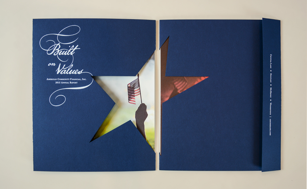

To ensure the impact of this year’s report, we placed American Community’s role as a heartland community bank front and center. A rich, Classic Laid paper stock in Patriot Blue from Neenah Paper is used for the cover, which envelopes the entire report and opens across two panels to display a large die-cut star that echoes the logo mark for American Community’s family of brands.
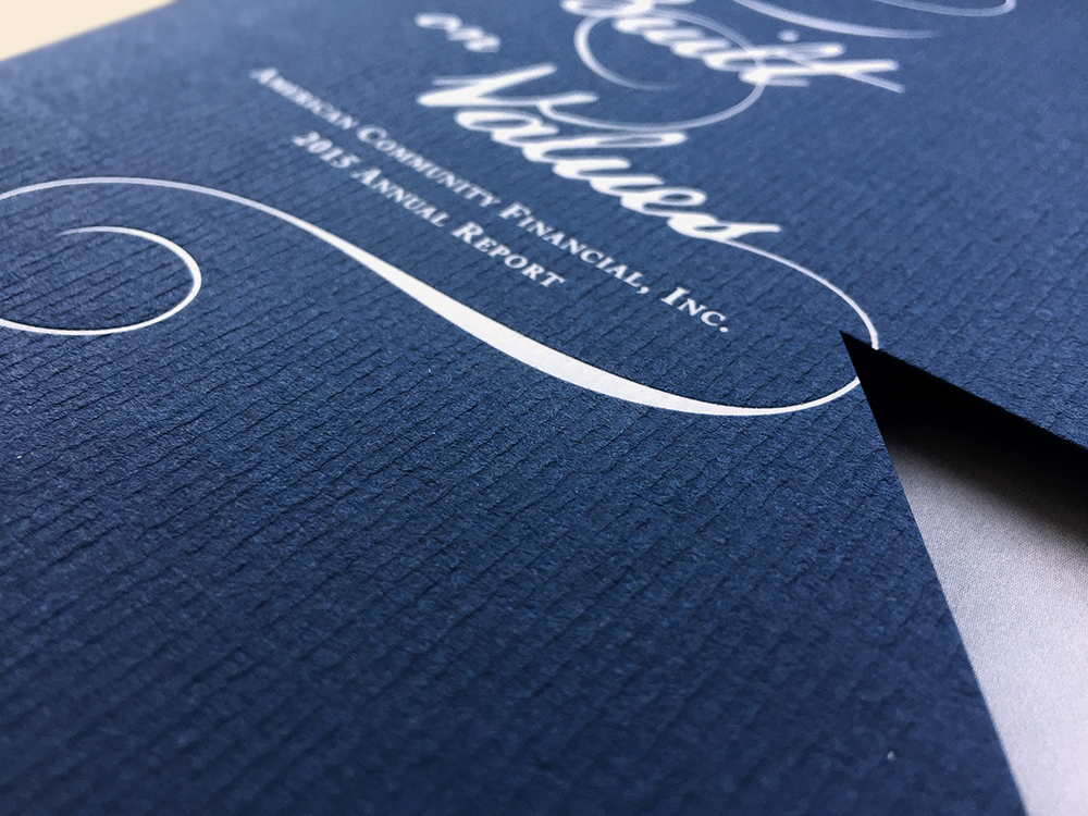

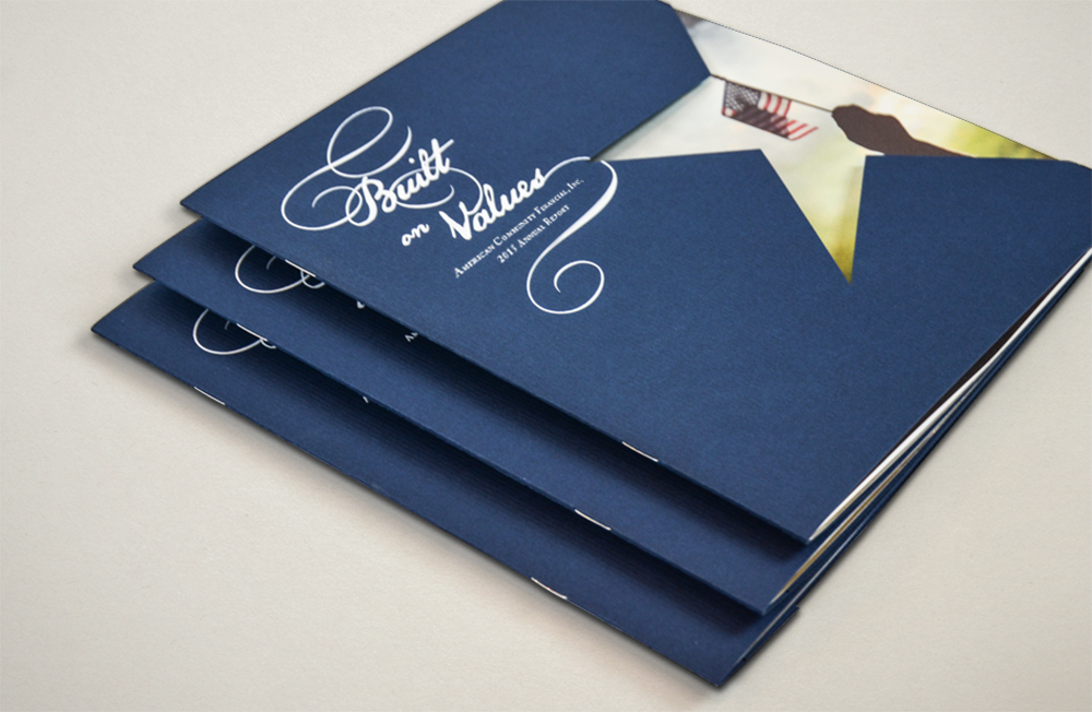
Our messaging solidifies the brand’s role as a financial pillar in the community. From the introductory letter to shareholders to the core values of the brand placed throughout—we play with the duality of the word, ‘values.’ For a community-focused Midwestern bank, both financial success, security and customer service are of equal importance. The report not only reflects this, but also the stability American Community has provided during the collective recovery of recent economic hardships.
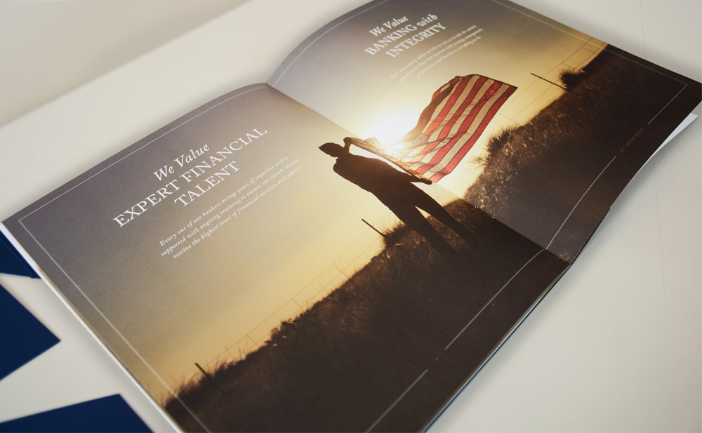
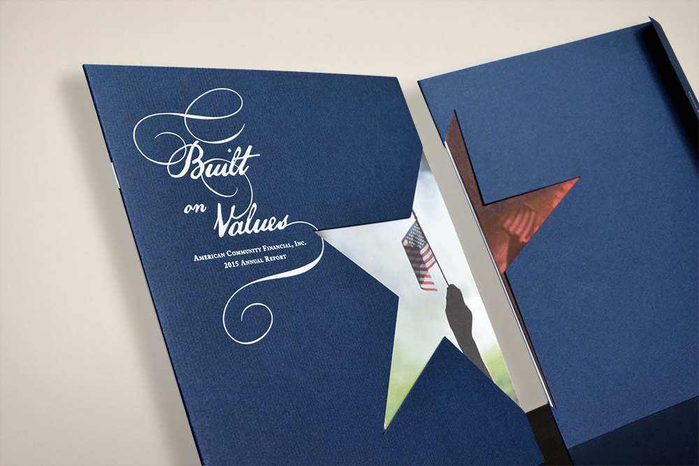
As part of American Community Financial’s ongoing branding evolution, it was important that the 2015 Annual Report stand apart from those of year’s past. With it’s regal look and feel, heartwarming imagery and confident tone, it made the exact statement our client was looking for.


