
Meridian Charter Schools — Rebrand
Meridian Charter Schools—formerly known as Civitas Education Partners—came to BatesMeron in need of a complete rebrand. A CICS (Chicago International Charter Schools) charter school network in Chicago, IL, the organization sought a fresh identity that would better represent its community, from a new name to a totally revamped look and feel. We jumped at the chance to roll up our sleeves and get to work on this massive creative challenge!
Meridian Charter Schools—formerly known as Civitas Education Partners—came to BatesMeron in need of a complete rebrand. A CICS (Chicago International Charter Schools) charter school network in Chicago, IL, the organization sought a fresh identity that would better represent its community, from a new name to a totally revamped look and feel. We jumped at the chance to roll up our sleeves and get to work on this massive creative challenge!
First Day of School
As with every new project, we had to first gain a proper understanding of our partner’s organization and industry. What sets them apart? What do they want their brand to convey? We brought our independent research and carefully crafted questions to the table for an in-depth Discovery Session to learn every want and need of our new client.
SERVICES: logo and name creation / messaging / website design / branding / swag / ongoing marketing support
Out With the Old, In with the New
Civitas Education Partners had long felt their name did not properly represent their identity. Students and families were often confused by the moniker, and leadership did not feel it reflected the heart of their organization. We experimented with different directions and inspirations, searching for the perfect way to encapsulate the charter network’s essence. After great exploration, our work finally led us to Meridian Charter Schools.

Naming Rationale: Meridian Charter Schools is wholeheartedly dedicated to helping each and every student reach their highest potential. Meridian—the highest point at which an object can be seen before it disappears over the horizon—represents our promise to support the community.
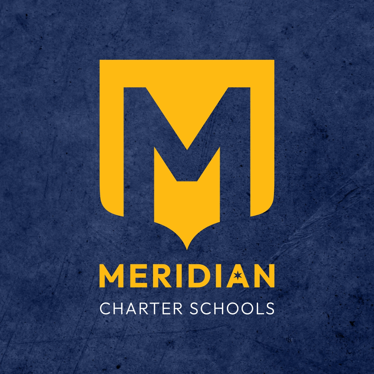
No brand is complete without a stand-out logo—so that’s exactly what we set out to create. We played with a variety of designs, incorporating nods to the Chicago star, post-secondary success, family legacy, uncharted horizons and the strength of the support offered by Meridian.


A college inspired banner, the chosen logo embodied Meridian’s commitment to success beyond graduation. Presenting a strong visual mark with clean, modern typography, the logo also offered a sense of legacy—bringing a well-established feel to the charter network.
Finding Meridian’s Voice
While our design team embarked on their journey to create the perfect logo, our copy team had a mission of their own: Writing the renewed Messaging and Positioning for Meridian Charter Schools. At the heart of the work we do at BatesMeron, M&Ps define the true core of a brand, covering everything from tone of voice to value proposition. We took special care to ensure each and every word worked to embody the ideals of Meridian Charter Schools.

It’s All in the Details
To complete Meridian’s budding identity, we had to incorporate typography, colors, photography and textures to form a truly unique aesthetic. We aimed to inspire feelings of collegiate-level professionalism and family legacy while also exuding a warm and welcoming community.
Using refined fonts and comforting tones that still paid homage to nostalgic school colors, the result was a modern twist on a familiar classic. Rich hues of blue and gold, accentuated by custom patterns and the perfect fonts, produced in an identity that was ready to graduate.


Mascot Makeover
The importance of school pride cannot be overlooked when creating a brand that impacts students—we knew we needed to design mascots that would inspire confidence and community at each school…and most importantly for teenagers, look cool.
The CICS Northtown Puma, the CICS Ralph Ellison Lion and the CICS Wrightwood Wildcat were previously established mascots, but they did not have original or consistent designs. We crafted a collection of signature mascots for the schools, providing them with ownable and cohesive designs that students and staff could be proud of.

New Year, New Look
With a full branding suite in place, we finally got to bring our design work to the physical world. The new school year was approaching, meaning students needed new backpacks and uniforms, and teachers needed new business cards and stationery—we created Meridian branded materials for all the charter network’s needs.


Bringing the Branding Back to School
Meridian knew they needed refreshed swag for their first back-to-school event as a rebranded organization. In addition to creating props and backdrops for a Meridian photobooth, we designed notebooks and t-shirts for attendees. School pride was on full display as the Meridian community embraced the new look and feel.
It’s Not Official ‘til
It’s on the Internet
It was finally time to build a domain for the freshly revamped Meridian Charter Schools. Our team of writers, designers and developers worked together to completely restructure and recreate the organization’s website.
We streamlined the existing content, eliminating repetitive information and reorganizing the flow. We then applied our updated branding, messaging and tone of voice, working with the Meridian team to ensure the website met all CICS requirements.
Teamwork Makes
the Dream Work
With all facets of the rebrand complete, we transitioned our focus to ongoing support. We established a retainer with Meridian Charter Schools that will allow us to continue assisting them with all branding and marketing needs. From designing school materials to managing social media and email content, we look forward to our continued relationship with this phenomenal organization!

Out With the Old, In with the New
Civitas Education Partners had long felt their name did not properly represent their identity. Students and families were often confused by the moniker, and leadership did not feel it reflected the heart of their organization. We experimented with different directions and inspirations, searching for the perfect way to encapsulate the charter network’s essence. After great exploration, our work finally led us to Meridian Charter Schools.
Naming Rationale: Meridian Charter Schools is wholeheartedly dedicated to helping each and every student reach their highest potential. Meridian—the highest point at which an object can be seen before it disappears over the horizon—represents our promise to support the community.
No brand is complete without a stand-out logo—so that’s exactly what we set out to create. We played with a variety of designs, incorporating nods to the Chicago star, post-secondary success, family legacy, uncharted horizons and the strength of the support offered by Meridian.
A college inspired banner, the chosen logo embodied Meridian’s commitment to success beyond graduation. Presenting a strong visual mark with clean, modern typography, the logo also offered a sense of legacy—bringing a well-established feel to the charter network.
Finding Meridian’s Voice
While our design team embarked on their journey to create the perfect logo, our copy team had a mission of their own: Writing the renewed Messaging and Positioning for Meridian Charter Schools. At the heart of the work we do at BatesMeron, M&Ps define the true core of a brand, covering everything from tone of voice to value proposition. We took special care to ensure each and every word worked to embody the ideals of Meridian Charter Schools.

It’s All in the Details
To complete Meridian’s budding identity, we had to incorporate typography, colors, photography and textures to form a truly unique aesthetic. We aimed to inspire feelings of collegiate-level professionalism and family legacy while also exuding a warm and welcoming community.
Using refined fonts and comforting tones that still paid homage to nostalgic school colors, the result was a modern twist on a familiar classic. Rich hues of blue and gold, accentuated by custom patterns and the perfect fonts, produced in an identity that was ready to graduate.


Mascot Makeover
The importance of school pride cannot be overlooked when creating a brand that impacts students—we knew we needed to design mascots that would inspire confidence and community at each school…and most importantly for teenagers, look cool.
The CICS Northtown Puma, the CICS Ralph Ellison Lion and the CICS Wrightwood Wildcat were previously established mascots, but they did not have original or consistent designs. We crafted a collection of signature mascots for the schools, providing them with ownable and cohesive designs that students and staff could be proud of.

New Year, New Look
With a full branding suite in place, we finally got to bring our design work to the physical world. The new school year was approaching, meaning students needed new backpacks and uniforms, and teachers needed new business cards and stationery—we created Meridian branded materials for all the charter network’s needs.
Bringing the Branding Back to School
Meridian knew they needed refreshed swag for their first back-to-school event as a rebranded organization. In addition to creating props and backdrops for a Meridian photobooth, we designed notebooks and t-shirts for attendees. School pride was on full display as the Meridian community embraced the new look and feel.
It’s Not Official ‘til
It’s on the Internet
It was finally time to build a domain for the freshly revamped Meridian Charter Schools. Our team of writers, designers and developers worked together to completely restructure and recreate the organization’s website.
We streamlined the existing content, eliminating repetitive information and reorganizing the flow. We then applied our updated branding, messaging and tone of voice, working with the Meridian team to ensure the website met all CICS requirements.

Teamwork Makes the Dream Work
With all facets of the rebrand complete, we transitioned our focus to ongoing support. We established a retainer with Meridian Charter Schools that will allow us to continue assisting them with all branding and marketing needs. From designing school materials to managing social media and email content, we look forward to our continued relationship with this phenomenal organization!


“When we began our rebranding journey, we were looking for a design firm that could help us not only reinvent our brand but more importantly, tell our story. BatesMeron worked with us closely, with all of our schools and our school support office, to listen and collaboratively craft our design vision. Throughout the course of our partnership they have been critical thought partners, taken feedback on adjustments and supported individual school identities as well. This partnership has modernized our marketing and is allowing us to reach more families, community members and donors than ever before. With their support, we continue to tell our story through beautifully designed websites, newsletters and social media posts.”
“Becka and her talented, gifted team have forever possessed very succinct siloed roles and responsibilities, which cumulatively produce brilliant results. The Rough Cut project embodied the owner’s passion bred with his craft, creating a deeply personal depiction of the artist’s real life, a genuine “diamond from the rough.” BatesMeron is a happy, ingenious, and brightly creative firm with the ability to prepare for the race and run that race like the Olympians they are. They are led by mighty minds, yet with a humble delivery, coupled with a myriad of interconnected layers of brilliance… resulting in a worthy enterprise to deliver results.”


