Distinctive Schools — Branding, strategy & marketing
Insights and Illumination
To understand Distinctive Schools’ wants and needs, we hosted an in-depth discovery session to determine where Distinctive Schools was currently positioned in the charter school market. We worked with their team to define imagery and design preferences and gain a fundamental understanding of the brand’s values.
We introduced a fun activity where a variety of newspaper headlines were printed out, and the Distinctive Schools team was asked to “buy” their favorite headlines with Monopoly money. Since a brand voice needed to be defined, the game helped us determine how Distinctive Schools wanted to be perceived by their target audience.
SERVICES: brand messaging / visual identity / brand collateral / marketing

Multiple Audiences,
Zero Problems
The most significant challenge our team pinpointed was Distinctive Schools’ lack of a cohesive communication strategy for its three primary audiences. Our solution involved creating a fresh, inclusive brand voice that would empower all audiences—regardless of the topic at hand.



Building the Best Resource
To ensure consistent and high-quality creative direction, we developed a comprehensive brand book filled with outstanding content that marketers could readily use for crafting compelling communications. Our team worked to position Distinctive Schools as a professional learning community committed to collaboration, belonging and educational excellence. We aimed for a clear, concise, understandable and replicable creative work.
Brand elements that were already being utilized by Distinctive Schools served as the inspiration for design and copy explorations. We recognized the strongest elements of the existing brand and infused them into a new creative identity in fresh and unexpected ways—starting with the color palette.
Brand elements that were already being utilized by Distinctive Schools served as the inspiration for design and copy explorations. We recognized the strongest elements of the existing brand and infused them into a new creative identity in fresh and unexpected ways—starting with the color palette.


Gradient Greatness
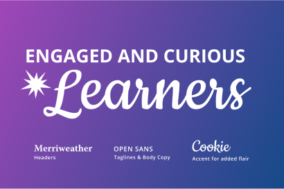
The BatesMeron design team hit the ground running by exploring gradients inspired by colors used in the Distinctive Schools logo. We explored every color combination until we found a gradient that brought the creative identity to life and could serve as an easily identifiable visual signature.
This distinct graphic element reinforced the brand essence in subtle, fun ways and incorporated a sense of motion that highlighted teachers, students and staff.


Fun with Patterns
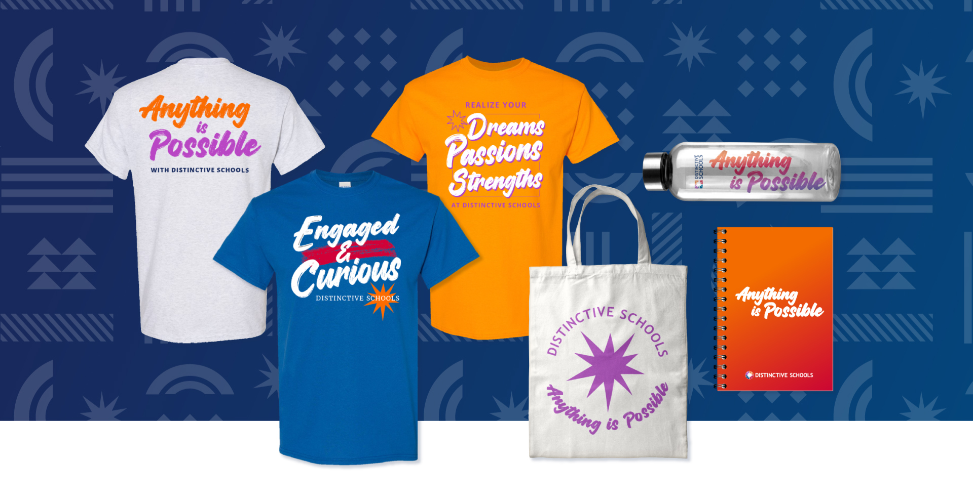
To help draw audience focus and further elevate the brand in unexpected ways, shapes that gave a sense of depth and movement were incorporated into designs. These dynamic shapes would be mixed and matched to create patterns that would be utilized as accents on photography, text-heavy presentation slides and more.


Getting the Word Out on the CTA
We were asked to bring a theme to life for Distinctive Schools’ annual CTA initiative that would embody their newly revitalized brand and attract attention from families and educators in a uniquely refreshing manner. This challenge was particularly daunting against the backdrop of a city saturated in marketing.
Getting the Word
Out on the CTA
We were asked to bring a theme to life for Distinctive Schools’ annual CTA initiative that would embody their newly revitalized brand and attract attention from families and educators in a uniquely refreshing manner. This challenge was particularly daunting against the backdrop of a city saturated in marketing.
Anything is Possible
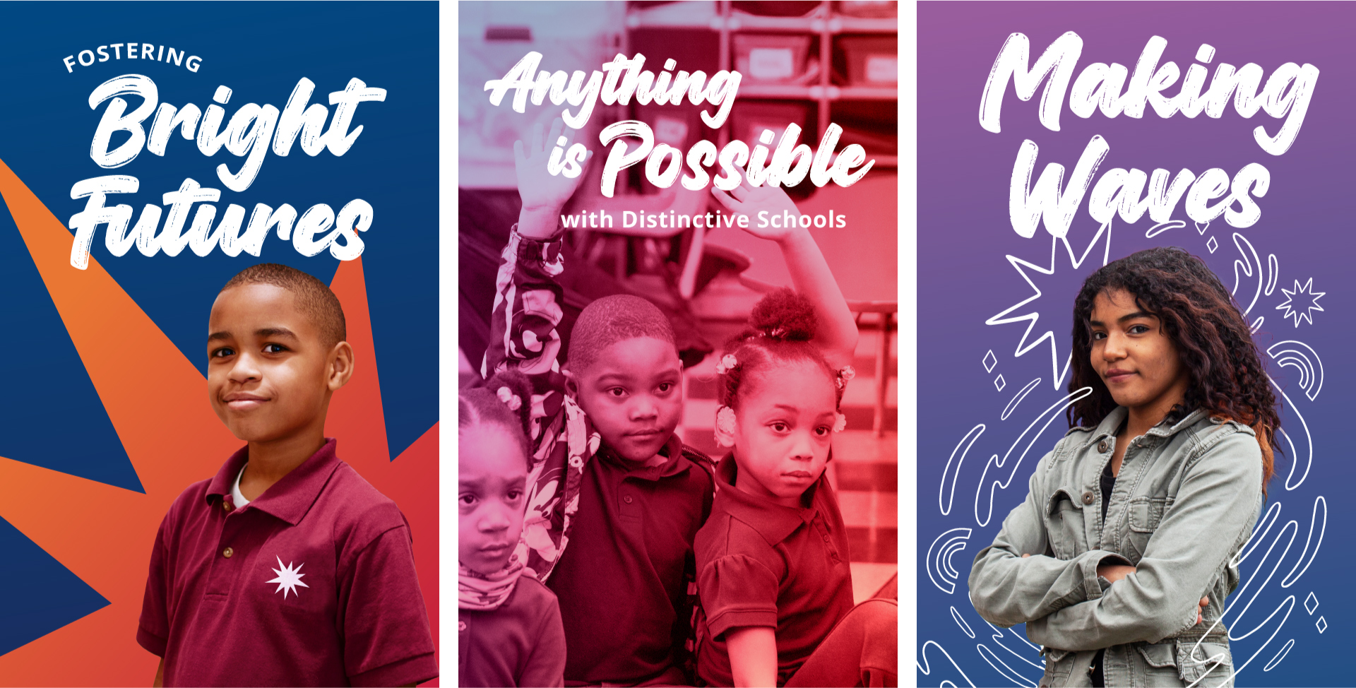
After going through concept exploration, we were asked to concentrate efforts around an approach we presented that emphasized the Distinctive Schools’ best attributes through an aspirational rally call. Anything Is Possible.
Our approach was inspired by Distinctive Schools’ belief that all students can achieve greatness regardless of their zip code. To put it simply, Anything Is Possible with Distinctive Schools.
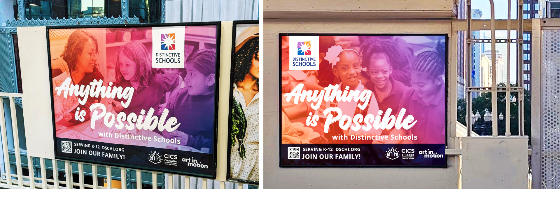
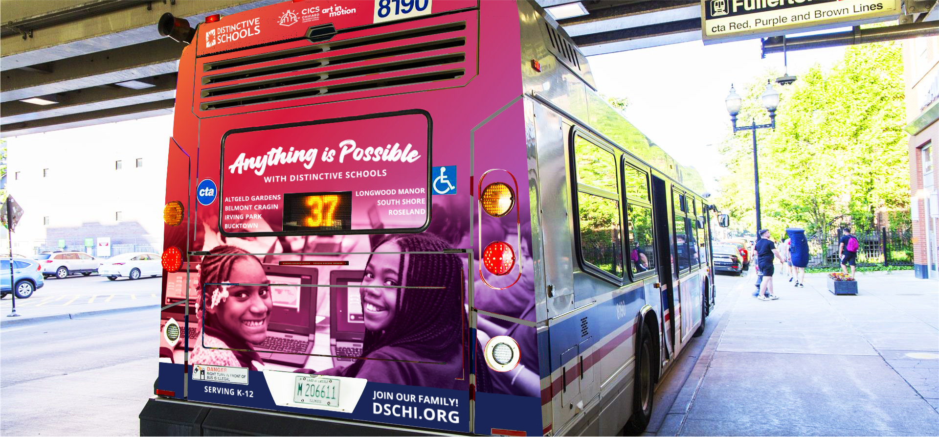
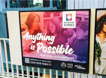
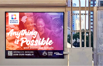
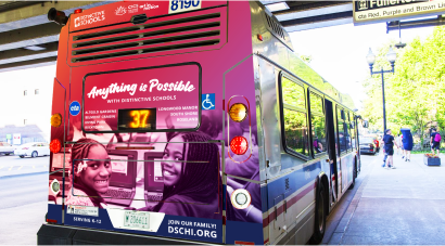
It was Thrilling to See the Campaign Come to Life Across the City of Chicago.
Our use of vibrant gradients, compelling headlines and impactful photography seamlessly encapsulated the city’s spirit, igniting a sense of joy and effectively conveying the exceptional quality of Distinctive Schools.
It was Thrilling to See the Campaign Come to Life Across the City of Chicago.
Our use of vibrant gradients, compelling headlines and impactful photography seamlessly encapsulated the city’s spirit, igniting a sense of joy and effectively conveying the exceptional quality of Distinctive Schools.


“BatesMeron led us through various design meetings, including multiple sessions in collaboration with our chief leadership team. They developed a positioning document to thoroughly explore the way we speak about our brand internally and externally. They created an updated brand guidelines document, a new version of our logo, and advised on how to use our brand elements effectively. Finally, they created collateral for a CTA campaign that included full backs on buses, print and digital media for CTA platforms, and bus tails.”

“BatesMeron led us through various design meetings, including multiple sessions in collaboration with our chief leadership team. They developed a positioning document to thoroughly explore the way we speak about our brand internally and externally. They created an updated brand guidelines document, a new version of our logo, and advised on how to use our brand elements effectively. Finally, they created collateral for a CTA campaign that included full backs on buses, print and digital media for CTA platforms, and bus tails.”


