Typefaces. Fonts. Character style. I have to say, as a writer, I have a profound love for not only what words say but also how they look. You can’t blame me though. With so many different fonts and type characteristics to choose from, I just want the meaning of my words to have some extra support from their appearance.
For example, some fonts just have a way of screaming, “Hey girl, hey!” while others have a way of saying, “Excuse me sir, would you care for a cup of tea?” [Insert British accent.]
If you don’t believe me, just take a look around at all the different type that’s around you. I’m sure you see some Times New Roman on your newspaper, maybe some Comic Sans on your kid’s homework assignment and some type of Script font on your mom’s email signature. (“But Nina, Lucinda Calligraphy just gives off such a classic, handwritten feeling.”)
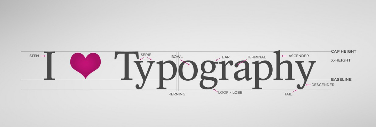
Although I’m not a designer, I can appreciate that typefaces help establish the attitude of a design. There are many, many, many details and characteristics that go into a font and therefore into the art of typography, which I won’t pretend to fully understand. But what I want you to get out of reading this post is that there are literally thousands of fonts. Between category, classification, style, weight and width—the art of type is truly endless and the type you choose to use definitely has a way of personifying you, or your message.
To give you a better idea of type personalities, I decided to break down some popular fonts. If Rockwell, Myriad and Cochin had personality profiles, I image them to be exactly like this:
Category: Serif
Born: 1934
MO: Headlines
Likes: Being featured in action movies, with overly masculine characters. Often seen in all caps.
Personal Quote: “I’m on Dwayne “The Rock” Johnson’s stationery. Beat that Impact or Arial Bold.”
Category: Sans Serif
Born: 2000s
MO: Web
Likes: BFFs with Apple Inc., working within social media and being considered clean and modern.
Personal Quote: “I have over 700 friends on Facebook, and don’t even get me started on my LinkedIn connections.”
Category: Serif
Born: 1912
MO: Lux brands, body copy
Likes: Designer brands, wedding invitations and having a way of being elegant without trying too hard.
Personal Quote: “My apologies, Mr. President, I won’t be able to join your dinner party. I’ll be in Paris that evening.”
To continue my font exploration and profiling, I asked my BMSD co-workers what their favorite fonts were. Some prefer Sans Serif, while others Serif. Some favorites emerged because of style and look, others because of brand association or celebrities. Read on to see who choose what and why.
(Editor’s Note: I may or may have not added my own notes to as to why.)
BatesMeron Font Picks
Melanie
Favorite: Gill Sans & Archer
Note: “Gill Sans looks friendly. The BBC and Penguin books use it, and they are pretty great. Also a Gills Sans user—Ferris Bueller’s Day Off! Such great company for we Gills Sans fans.”
“Archer looks modern and smart—yet friendly! This typeface was created for Martha Stewart, who I like even better now that I am watching Orange Is the New Black and have learned more about the suck of prison. You go, Martha, and go, Archer.”
Fred
Favorite: Verdana & Palatino
Note: “Who doesn’t love Verdana. When Nina asked me what my go-to font was, I immediately shouted Verdana! She just sounds like a friendly lady. Palatino seems a bit fancier. Maybe Italian? I use this when I’m going for a more serious vibe.”
Todd
Favorite: Avenir Light & Baskerville
Note: “Avenir is a very clean and modern font. And it seems to please everyone—men, women, hipsters, scientists, puppies, etc. Baskerville is more traditional and great for readability. I’m currently using this font in my personal, unpublished novel, Wigs on Wigs: An Autobiography.” (Shout out to @wigsonwigs)
Becka
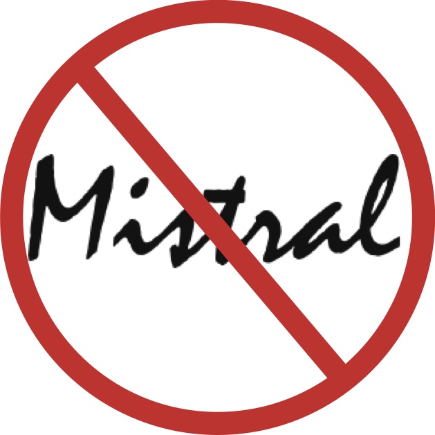
Least Favorite*: Mistral
Note: “Mistral is the Comic Sans of Script fonts and it should be outlawed.”
*Becka’s favorite font is Avenir Light. However, her hatred for Mistral outshined her love for Avenir.
Meg
Favorite: Courier
Note: “I’ve always been fond of Courier. I think I’m drawn to it because it resembles the classic typewriter look, and I think that’s real pretty.”
Nina
Favorite: Century Gothic
Note: “I’m a Sans Serif kind of girl, all the way. Century Gothic has a way of being friendly, modern and even a bit classy. It’s basically Justin Timberlake as a font.”
Whether you’re choosing a font for your Word document, your birthday invitation or your brand’s logo, it’s important to understand that each typeface evokes a different mood, voice and visual presentation. As designers, writers and creative enthusiasts we take pride in sculpting the perfect message, supporting it with the perfect font and then presenting it with the perfect design.
Check out more typeface personalities here.


