Can A Website Determine Where You Travel? Small Town Edition
Over Labor Day weekend, I took a trip to Fairfield, Iowa, a small town with a thriving artist community that’s night and day from the hustle and bustle of Chicago. Before any trip I take, I like to look on the tourism website for the place I’m planning to travel to. It never fails to give me a great first impression of where I’m heading.
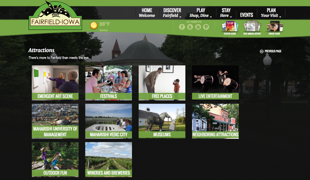
Fairfield’s a town of less than 10,000 people, so I wasn’t expecting anything too fancy from its tourism website. So I was rather surprised and delighted by the amount of content I found, as well as their use of professional photography.
As a follow-up to my post from last year on beautifully designed tourism websites, I’ve compiled a list of five of my favorite small-town travel sites, along with what I liked best about each one.

Fairfield, IA: Content
www.travelfairfield.com | Population: 9,447
While browsing sites for this blog post, I discovered that many are filled with old, outdated content or they just lack meaningful content altogether. Fairfield’s tourism site is chock-full of so many attractions, events, restaurants, places to stay and helpful links that I was able to plan a packed itinerary with just the information I found on the site. The content was helpful and thorough, and was also easy to navigate, which made me want to stay on the site longer.

Estes Park, CO: Logo & Photography
www.visitestespark.com | Population 6,083
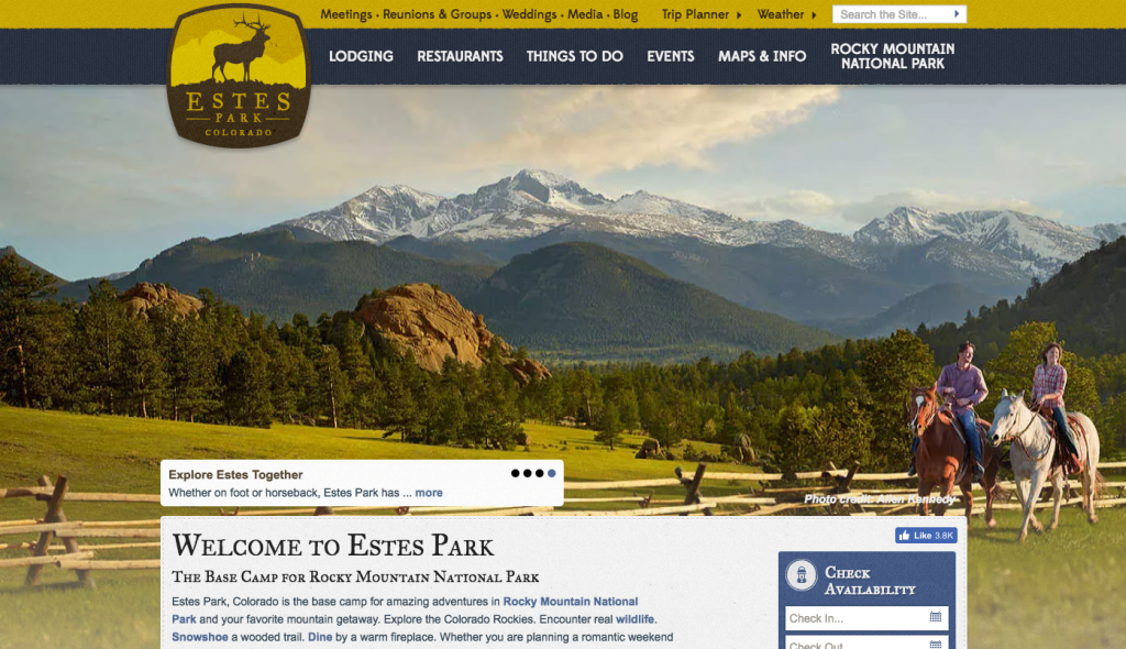
The logo and photography on Estes Park’s tourism site really pull their design aesthetic together. The sophistication of the Estes Park logo gives me a positive impression without knowing anything about the city itself. The picturesque images only enhance this feeling and make me want to discover more about everything Estes Park has to offer and what I can see if I travel there.

Town of Mammoth Lakes, CA: Personality
www.visitmammoth.com | Population: 8,073
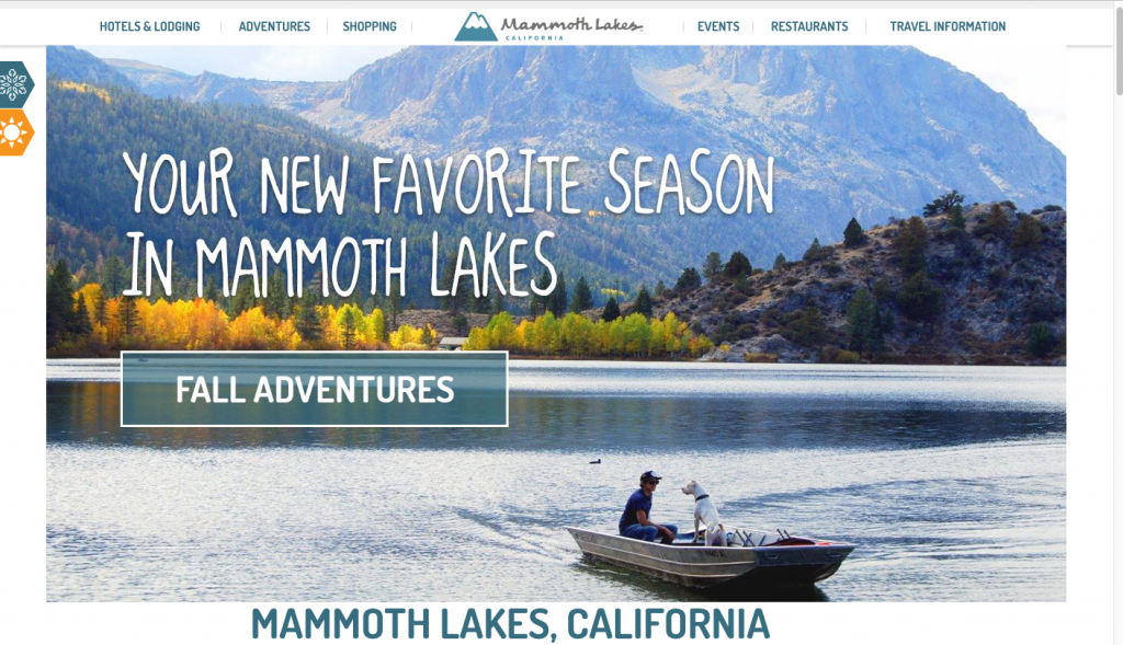
What I love about the Town of Mammoth Lakes website is that it’s not afraid to use a unique font to show off what makes this town different. The large, quirky font over the scenic image really draws me in to start clicking through the site’s navigation to learn more about what makes Town of Mammoth Lakes different than any other small town. I also love that the graphical, rustic styling of their logo is brought through to some of the interior images on the site. This really gives me a sense of the city’s adventurous personality that I would expect to find while traveling there.

Hot Springs, AR: Navigation
www.hotsprings.org | Population: 35,680
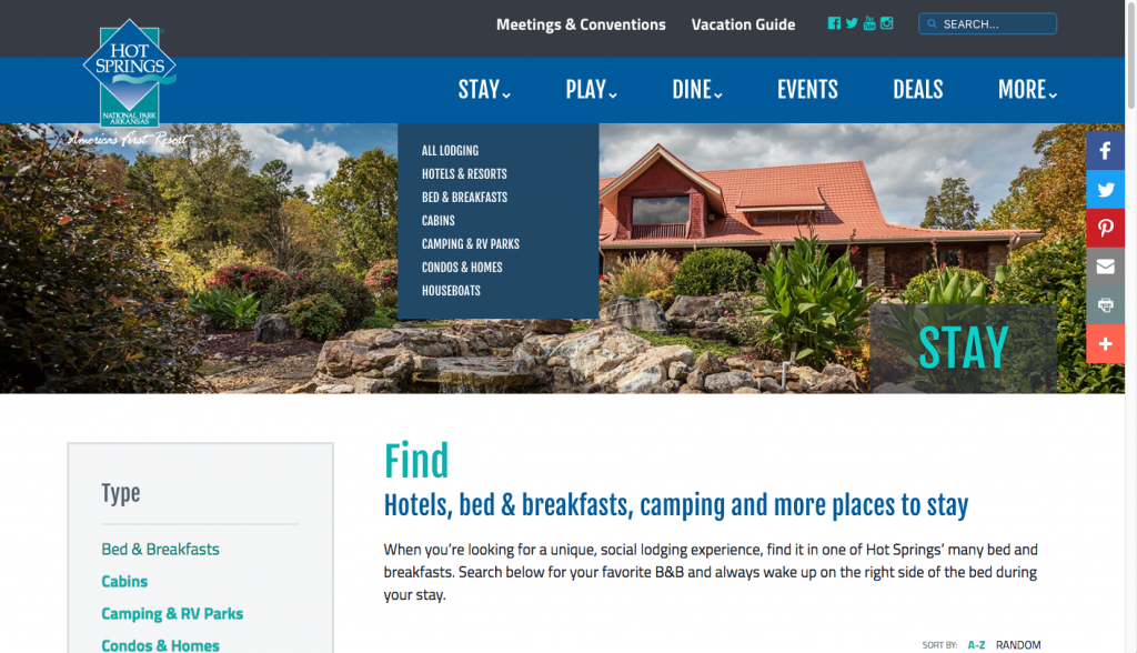
The clean and simple navigation of Hot Springs’ site makes it easy to find what you’re looking for with minimal effort. The fact that there isn’t a lot of clutter really helps user-friendliness and makes you want to stick around. With some tourism websites I found, I became frustrated that the content wasn’t easy to locate, and I left the site pretty quickly. Not only did the easy-to-follow organization keep me on Hot Springs’ site, I also found myself planning my trip to Hot Springs in my head as I explored each section!

Calistoga, CA: Video
visitcalistoga.com | Population: 5,254
While a little less graphically pleasing than some of the other websites on this list, the Calistoga website still feels alive and inviting thanks to the video that appears on the homepage. This video drew me in and I wanted to find out more about the event it’s promoting—and Calistoga in general. In addition to video, the Calistoga website makes great use of professional and vibrant photography.
While a tourism website isn’t the only factor at play when deciding my next trip, it definitely has an impact when making my travel decisions. Are you more enticed to travel to a small town if they have an engaging, easy to use or beautiful website? Leave a comment and let us know!
Insights From the Intern: Facing Fears
Join Team Green
6 Questions for: Kelly Terlau


