The Best Way to Create Information Architecture

We’ve all experienced the frustration of navigating a website and being unable to find the information we need. That’s what usability test sessions are for. As a participant in one of these sessions, I helped test the usability of a photography studio’s website. One of my tasks was finding the price for a family shoot on the site. As I sat there navigating the menu, five minutes passed and I began to feel very frustrated and nervous, even doubting myself because I still couldn’t find the price list.
But that wasn’t my fault. It was because the information was not organized properly, otherwise known as the information architecture. The information architecture is the skeleton of a website, and without a good skeleton, no matter how fancy the cosmetics are, the site will never serve its true purpose.
To create a beautiful information architecture that makes a site easy to navigate and attracts more visitors, we use a scientific method called card sorting, as opposed to having our team members brainstorm without asking actual users.
To help understand where card sorting sessions come into play, let’s look at the high-level process for interaction design.
The High-Level Interaction Design Process
We can assume some user research has already been conducted. Its deliverables include some combination of the following:
- Personas
- Use scenarios
- Content samples
- Feature lists and priorities
Below are the possible design stages and deliverables. Some stages are not always present.
- Content inventory
- Content samples
- List of content types
- Approximate frequencies
- Develop concept models
- Create high-level flowchart
- Create information architecture
- Consider possible organization schemes
- Card sorting
- Create site map
- Wireframe main content pages
- Wireframe navigation pages
- Develop detailed flowcharts for complex tasks
- Wireframe screens for complex tasks
The Methods and Benefits of Card Sorting
Card sorting is a tool for creating navigation, helping designers better understand the users they are designing for. There are two types of card sorting—open card sort and closed card sort.
The open card sort method involves writing down the potential website content (ex. wine tasting classes, cottage comforts, etc. for a destination website) on a set of cards, then asking target users to sort the cards into groups according to their similarity and describe the choices behind the groups they make.
In contrast, the closed card sort method involves giving target users content cards with a set of predefined category groups and asking them to sort the cards into the most relevant groups available.

Figure 1 An open card sort

Figure 2 A closed card sort
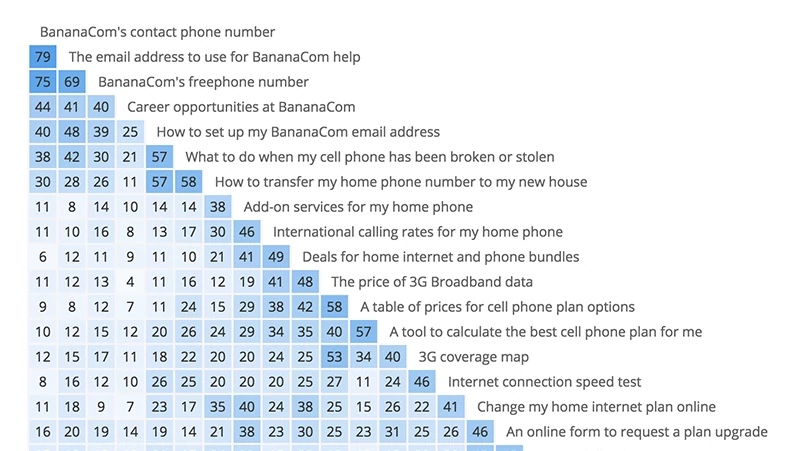
It’s a simple method, but it can be very powerful. The results contain insight into how users understand your content, the reasons behind their grouping and how they describe each group. Both quantitive and qualitative data are collected from card sorting, and therefore, scientific data can be used to analyze the results. This could be a similarity matrix, which clusters together the strongest card groups, or even dendrograms, which visualize content groups and cluster them by participants.

Figure 3 A similarity matrix (strongest card groups along the diagonal edge, the darker the stronger)

Figure 4 A dendrogram
As a web designer or developer working on the redesign of a large website after already getting familiar with the content, it can be hard to get a fresh perspective and create a new organizational scheme. That’s the beauty of a card sort. It gives you insight into how first-time visitors organize the information, and that external perspective helps you to design an organizational scheme that is as useful as possible for the people who will be visiting the site most often.
And when your categorized groups of content are set, naming the label of those grouped items is just as important as the group itself. This is the category name that appears in your site navigation, and a bad name could convey the wrong idea to users. Your best bet is to use common words, like About, Blog, etc., as it is always more effective and informative than using special name (it might not look as cool, but function over design, right?).
At the end of the day, that is our sincere aim. We design and develop websites not only with an outstanding eye for design (as always) but with the science to back up our decisions and make them truly functional for the people who matter most: the users.
References
- Craig Miller. (2017). Interaction Design and Information Architecture. Lecture
- Donna Spencer. (2009). Card Sorting: Designing Usable Catagories
- Dan M. Brown. (2nd, 2011). Communicating Design
Why 2025 Should Be the Year You Pick Up a Book
A Creative's Guide to Collaboration
Six Questions for Amy Clardy


