Creativity in Modern Illustration

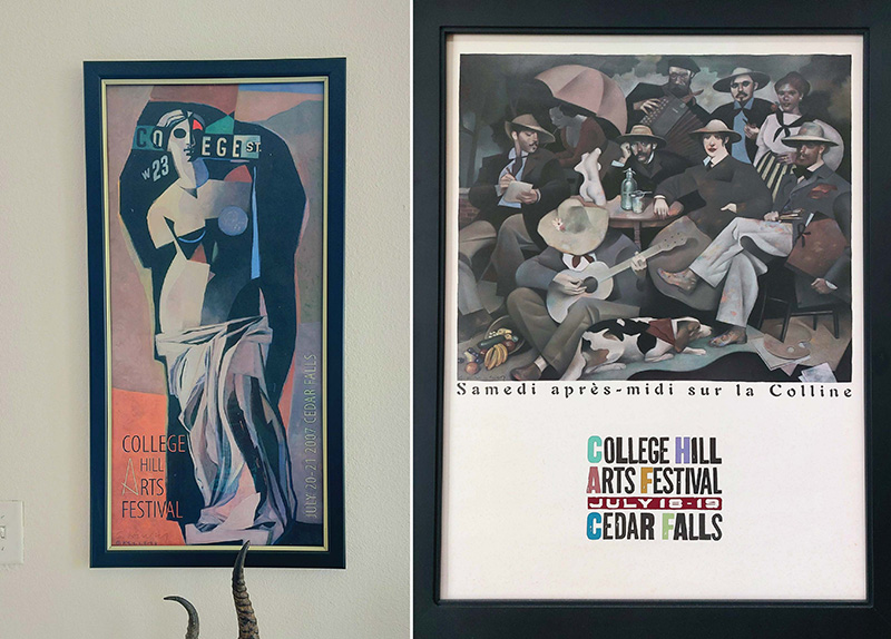
Illustration has been the go-to solution for marketers to convey ideas, attract curious eyes and differentiate brands for centuries. Up until the mid-20th century, illustrations were used for almost every image out there! Until photography became a solid and cost-worthy solution for imagery, there was an artist sketching and painting every idea under the sun! (Ah, those were the days). Back then, corporate art could be ART. Think about all the vintage Coca-Cola ads or Guinness prints you see hung around your local brewpub or the Alfonse Mucha prints in 20-year-old girl ’s’ apartments. One of my personal favorites from this generation of illustrators is Gary Kelley (Gary Kelley Studio), an accomplished designer and fine art illustrator (and we’re both from Iowa!). You’ll likely recognize his mural work from your local Barnes & Nobles (as well as from THIS 20-year-old girl’s apartment).

Photo credit: Art from my personal collection by artist, Gary Kelly
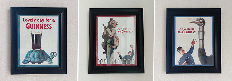
John Gilroy is a close second. His iconic campaigns for Guinness have made their way into the public’s heart and my home. His cartoonish illustrations featured a myriad of animal characters who framed their beverage in a warm, friendly and idyllic light—quickly communicating to a viewer that every day is a lovely day for a Guinness. His art brought an immense amount of value to the Guinness brand, nearly doubling their profits, and laying the foundation for their ads for years to come. (Fun fact: The “zookeeper” character is a self-portrait of John Gilroy himself).
Even though both examples are advertisements, they don’t feel cold or corporate in any way, shape, or form. They feel warm and, well, like art!

Photo credit: Art from my personal collection by artist, John Gilroy
Bringing it back to today, where high-end digital cameras are abundant, illustrations have experienced a shift in style and sensibility. Art for advertisements isn’t dead— the craft has evolved, possibly for the better! If done right, illustrations can be 1000% times more effective at conveying a message than an image from a photograph can capture. Even better news for illustrators, since photography handles real-world images, illustrators are free from the tedious grind of drawing every image under the sun. Instead, illustrators are utilized to handle abstract concepts, and are given the freedom to convey ideas in a wide range of styles, with as much creativity as they please.
So please, if you’re an aspiring illustrator or brand manager, GET CREATIVE. The more original your illustrations, the more ownability you have with your brand.
Now, I’m not one to bad-mouth specific kinds of art because I believe (almost) every style has its time and place but knowing the connotations of your design style is vital to understanding how people will perceive your brand. If you’re not a design dork like me, you may not have heard about the “corporate art style,” but I bet you have seen it. If you haven’t, crawl out from under your rock and take a peek now.

Photo credit: Artist, GoodStudio on Shutterstock.com
I’m not saying I dislike how this style looks, per se, and I completely understand its popularity; it’s inoffensive, easy to look at, easy to replicate and easy to edit. I can see how, at its conception, it was a favorable option for many big tech corporations. Since their product offering had value that couldn’t always be photographed, implementing supporting illustrations was a no-brainer route to go. In the beginning, it was a creative solution and honestly looked nice! (I mean, I wouldn’t hang it in my house, but still nice).
It is important to take into context what this style has evolved into. Lately, the public has gained awareness that this style isn’t being used by just one or two brands—it’s seen almost everywhere! The constant bombardment of this flat, colorful, oversimplified imagery of people with small heads and big hands has caused enough of a stir that people have started to create parodies. As you can see here – Corporate Art Style Woman Devouring Her Son | Corporate Art Style | Know Your Meme.
The widespread usage of one distinct style by tech giants, all under the guise of creating a clean, friendly brand, will begin to lose its uniqueness and heart. And, unfortunately, render the style disingenuous. This is an example of how illustrations aren’t always a “one-size-fits-all” solution.
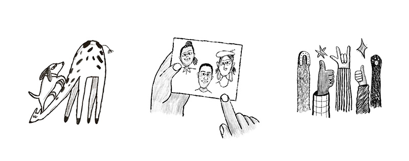
One example of a modern web-based company that I believe is doing a great job is Mailchimp. Across their website, they use customized illustrations sparingly but effectively. They approach their art with a child-like lens. Careful but relaxed brush strokes combined with soft, scribbly shading, and depictions of friendly and whimsical characters help their clients feel at ease. I’m not their brand strategist, but I think it’s very clever that they went with a purposely imperfect approach. They use a laisse-fare yet strategic style to make sending a thousand-recipient email campaign feel comfortable and approachable for their clients.

Photo credit: Mailchimp.com
Another company that just released a fresh new look is Harvest. Although their illustration approach is very modern and simplistic, they successfully tailored the style to be a custom fit for them. Solid shapes with a limited dark grey color palette look striking paired with a thin, white line treatment that can rock both a wavy and hardline approach.

Photo credit: Harvest.com
Crafting the perfect illustration style isn’t always a luxury a brand can afford. If you’re a small brand and can’t afford to customize your illustrations just yet, then the corporate art style can be a reliable route to go due to its clean nature and abundance on royalty free websites (and honestly, it’s better than nothing). If that’s not you, and you have the funds to invest in creating a unique brand for your business, then I have one key takeaway for you. Be purposeful and be creative. Find out what your brand needs and set out to discover what style will best fill that need and elicit the desired reaction from your audience. Mailchimp knows people are stressed about sending emails, so they crafted a style that feels relaxed. Guinness Beer, sales were down, so John Gilroy created posters to elicit a quick reaction to make users feel warm and happy and associate Guinness as such! You don’t need to make a bonkers off the wall, once-in-a-lifetime design for your brand. All you need is to put thought behind your strategy and think about how your style will deliver on your needs. Maybe on the way, give those illustrations a little spin, make a style that’s ownable by your brand and your brand alone. See this creative freedom as a privilege that our predecessors didn’t always have (since they were too busy drawing every detail as realistically as they could. Thank GOD for cameras).
So please, if you’re an aspiring illustrator or brand manager, don’t be afraid to be a little different with your branding. Or even better, hire BatesMeron, and we’ll get creative for you.


