Trading Technologies Brand Book
Trading Technologies is a global company that’s been developing electronic trading platforms since 1994. In 2015, it was time for their brand to enter a new era and better represent the diversity, intelligence and brilliance of their people and their products.
They’d just rebranded and had a lot of great material to work with. There was a messaging platform, gorgeous graphical treatments and a rich palette of color and texture—a creative team’s dream.
Trading Technologies asked BatesMeron to create a Brand Book to use at their Kickoff Meeting. This was to be the official launch of their new brand and website—and they were entrusting us to convey the new message in an impactful way. They wanted a book that would tell the story of where they came from and where they were going with their brand—something with value and meaning that would stick around after the event. We couldn’t have been more honored (or excited) to take on such an important project.
The first step we took was to immerse ourselves in the new Trading Technologies brand. We studied the guidelines until we knew them by heart. Why? Because the brand is the heart and soul of a company, and without a strong connection to that brand, we’d never be able to fully herald its arrival in an authentic way. After our whole team had lived inside of the brand—and really explored all of its elements— we were raring to unleash our creativity and pursue endless possibilities for their book.
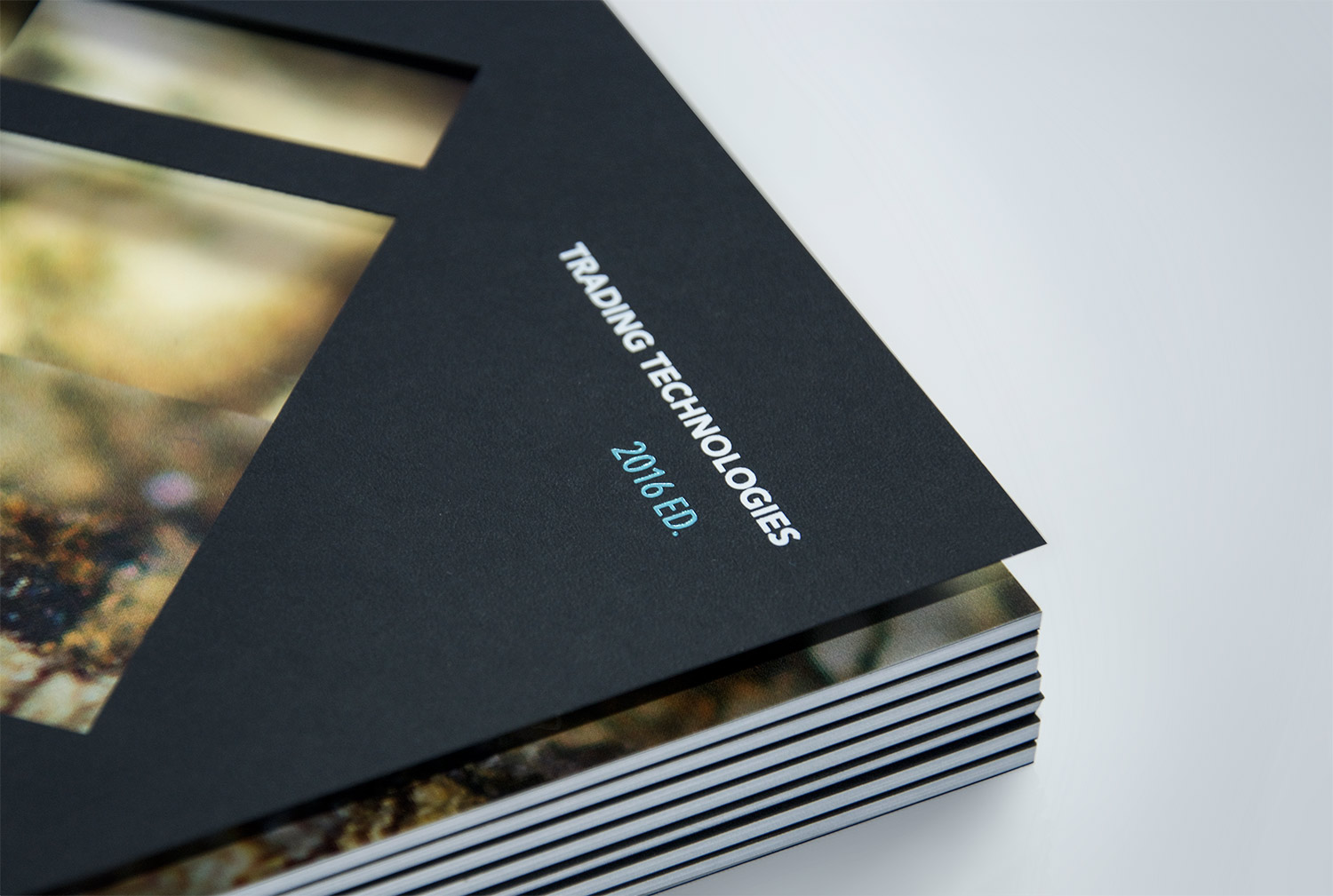
Once we’d created concepts aplenty, we collaborated with some of the best printers in Chicago. These relationships are crucial to help us bring our clients the best ideas for print production. New papers, exciting printing techniques, surprising details—all the things that blend perfectly as a platform for our designs to really come to life. In the end, Jeff Hernandez from Classic Color found us the perfect mix of stocks, foils and bindery to create a timeless piece.
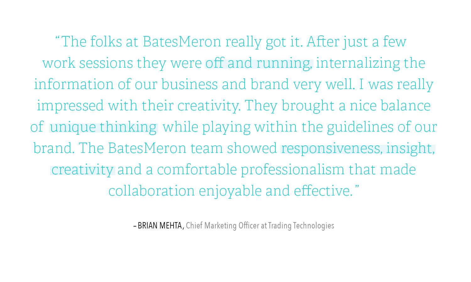
When designing this piece, it was crucial to respect the minimalist and elegant new brand that Trading Technologies fell for by creating page layouts utilizing generous white space and thoughtful details. This brand isn’t about decorative embellishments—its about sleek efficiency. Working with Brian Mehta, Trading Technologies’ Chief Marketing Officer, we were able to develop short, purposeful copy that kept the reader from being overwhelmed, but still had impact and gravitas.
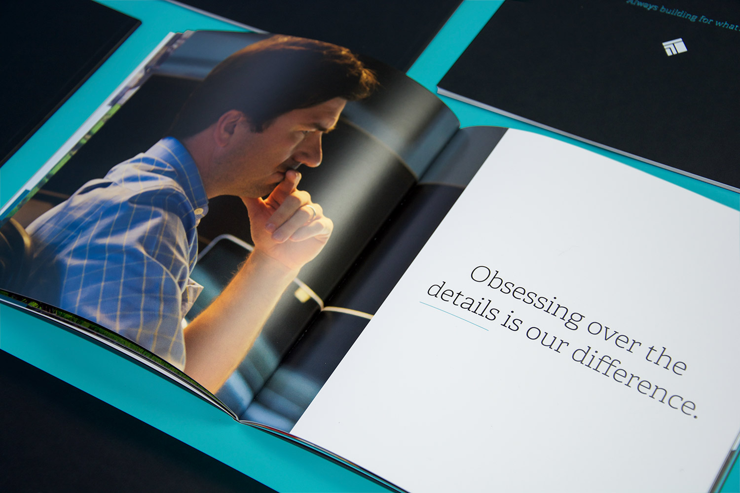

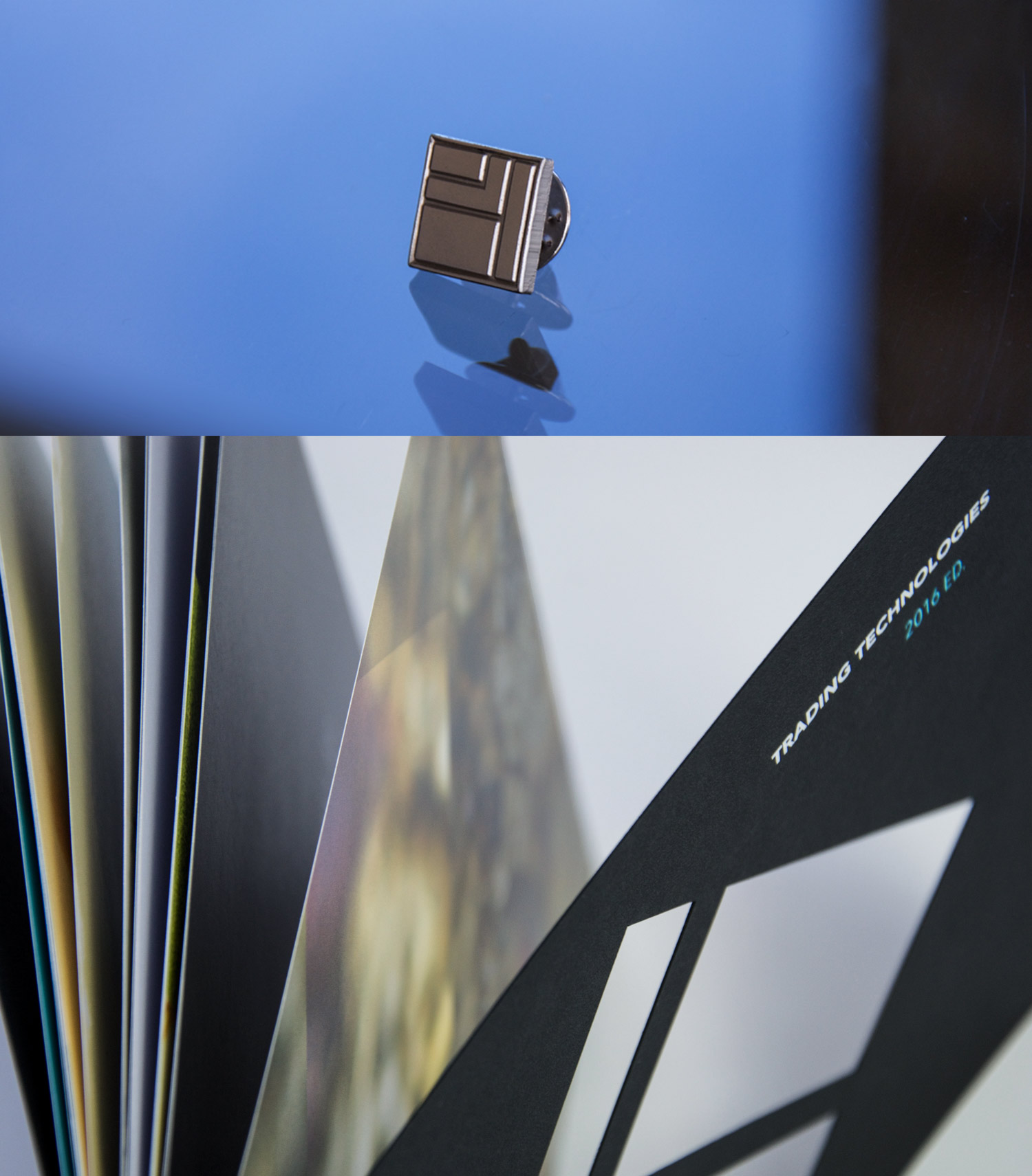
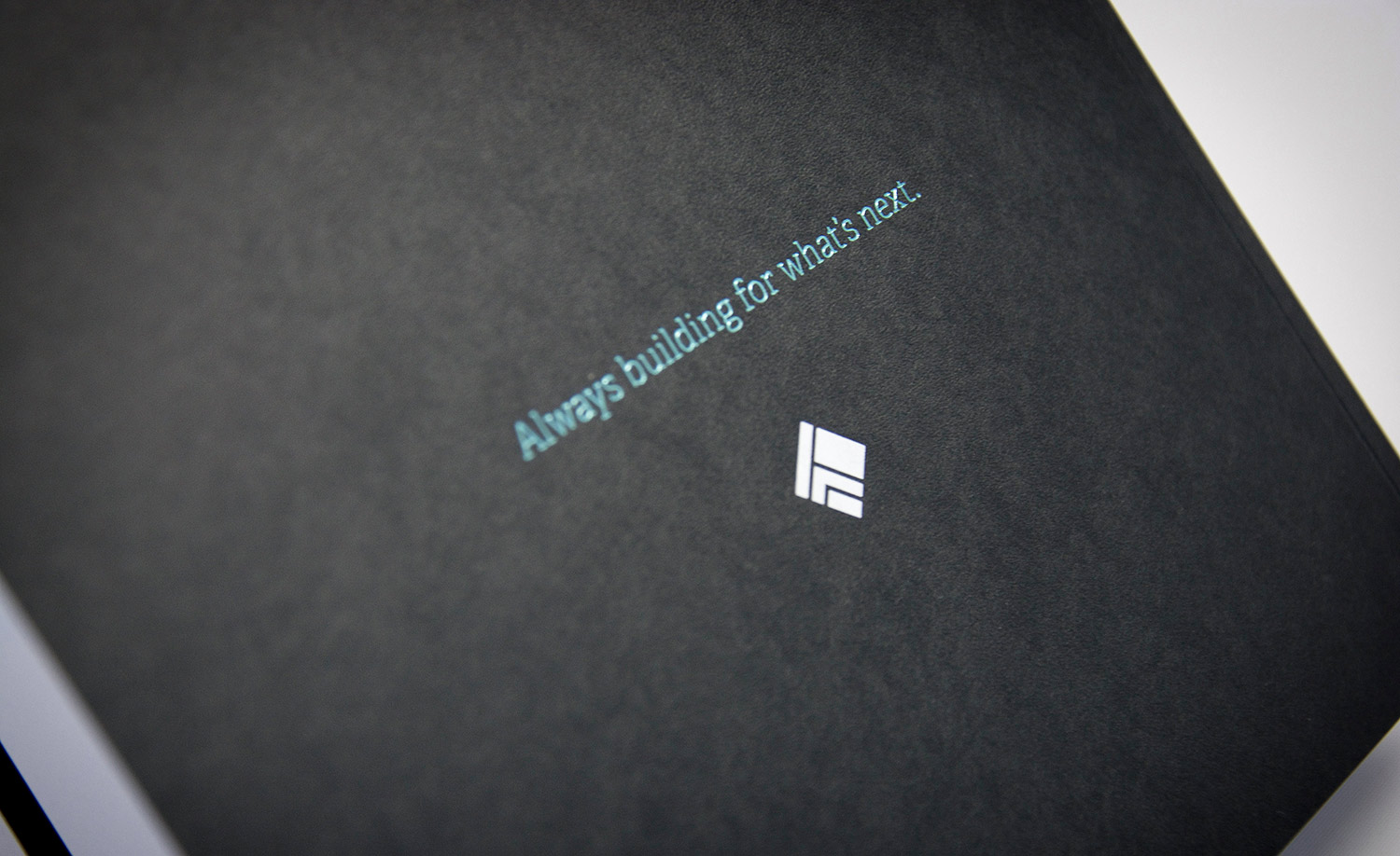
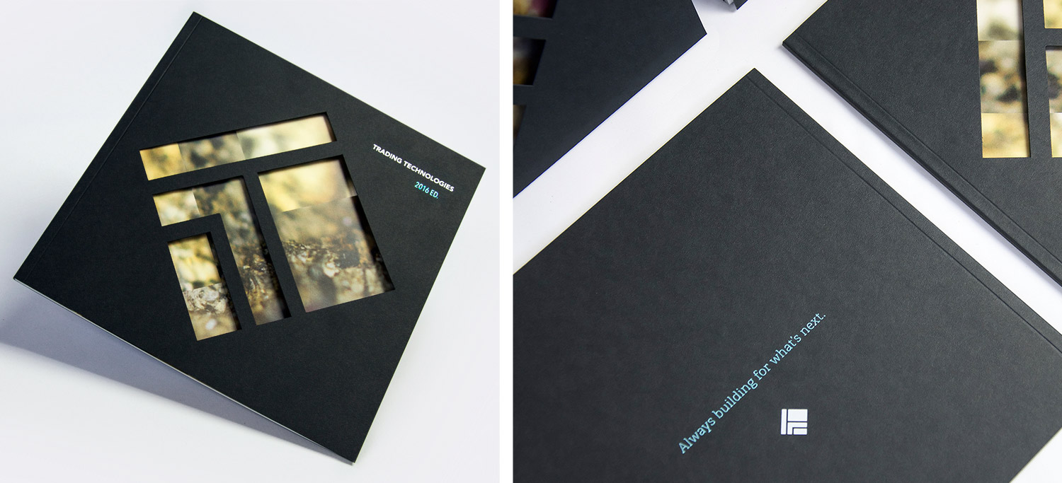
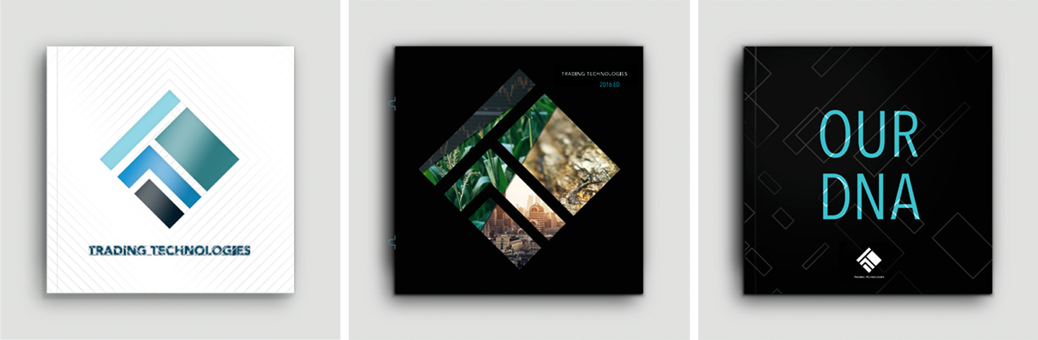
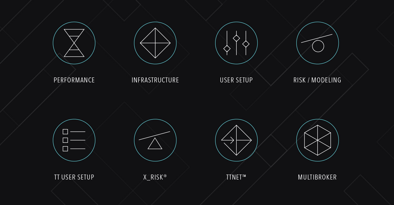
We pushed the graphic standards to new creative heights by combining brand-inspired graphical photo treatments, stunning photography, iconography and an electrifying blue foil stamping. We showed their depth by combining an ultra-thick, Epic Black textured cover with smooth, rich coated interior pages. Perfect bound and elegant—their clean, geometrical logo was die-cut from the cover, urging the reader to come inside and see what’s next!
Part company history, part brand vision and a touch of brand guidelines—the final piece for Trading Technologies was the perfect complement to their thrilling reveal of the new brand and website. And it proudly resides, here and there, on desks around the world