RCN Neighborhoods Campaign
When RCN, one of Chicago’s top providers of cable, phone and internet services, asked BatesMeron to create a campaign based around the city’s neighborhoods, we were excited to create something fun and fresh. RCN wanted to remind Chicagoans of their longtime, reliable commitment to serving local communities. The service provider has been working in these neighborhoods for years already, so they understand and can address residents’ needs better than their competitors.
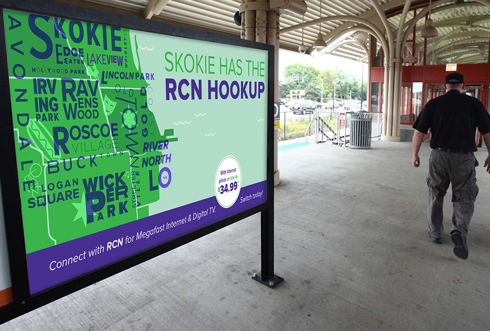
Our inspiration first came when we looked at a service map for RCN. The map provided a strong, visual representation of RCN’s service reach in Chicago, but it was missing a robust and eye-catching design that could celebrate the neighborhoods themselves. But that’s our specialty here at BatesMeron, and we brainstormed how we could infuse our signature, creative spin into the preexisting map. We wanted to give each neighborhood special attention, lending each its own unique identity and style.
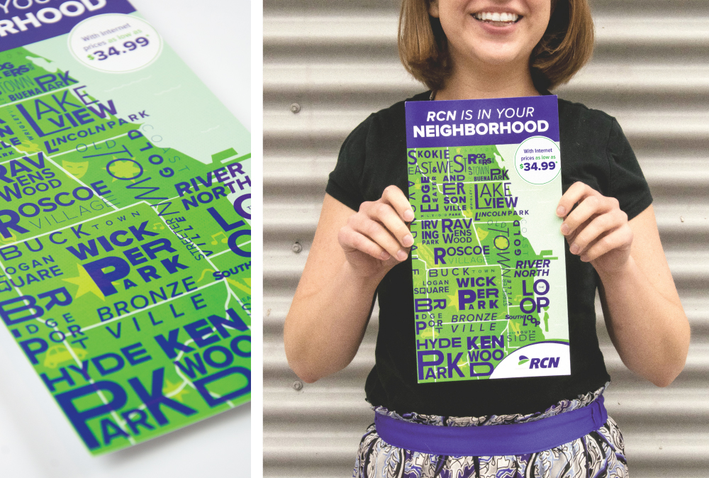
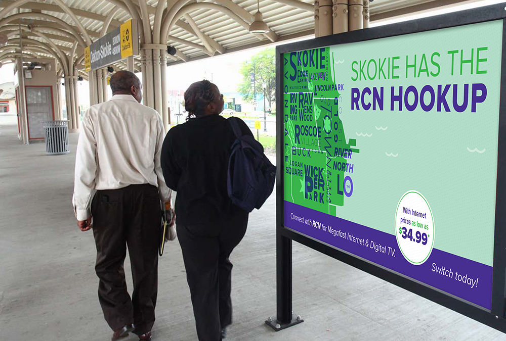
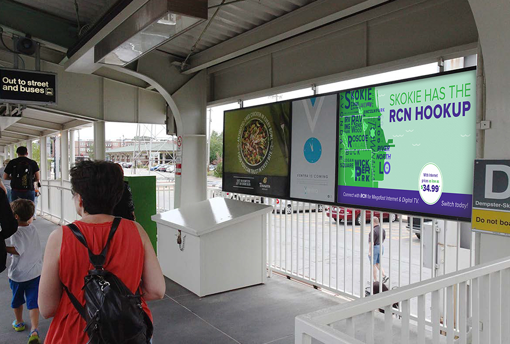
We designed a bold, graphic and somewhat abstract map. Since Chicago stretches along the coast of Lake Michigan, we had to get a little creative with fitting all the neighborhoods onto the image. Each neighborhood that RCN reaches was included with unique lettering and spacing that’s roughly geographically accurate. Behind the lettering, we incorporated sticker-like images that signify what it means to be a local Chicagoan. We kept RCN’s signature colors, fonts and logos, but we added a complimentary aqua color for the lake to give this ad a new element and a fresh feel. We brought each neighborhood to life in order to let residents know that RCN really does know them better than the other providers.
The design of the mailers was also meant to reflect the posters produced at a classic print shop. Though all materials were digitally printed, we used a half-tone pattern with an imitation of play between opaque and transparent pigments. We tried to make the poster reminiscent of the layers of paint produced with a silkscreen process by using overlays that create dimension even in a digital process.
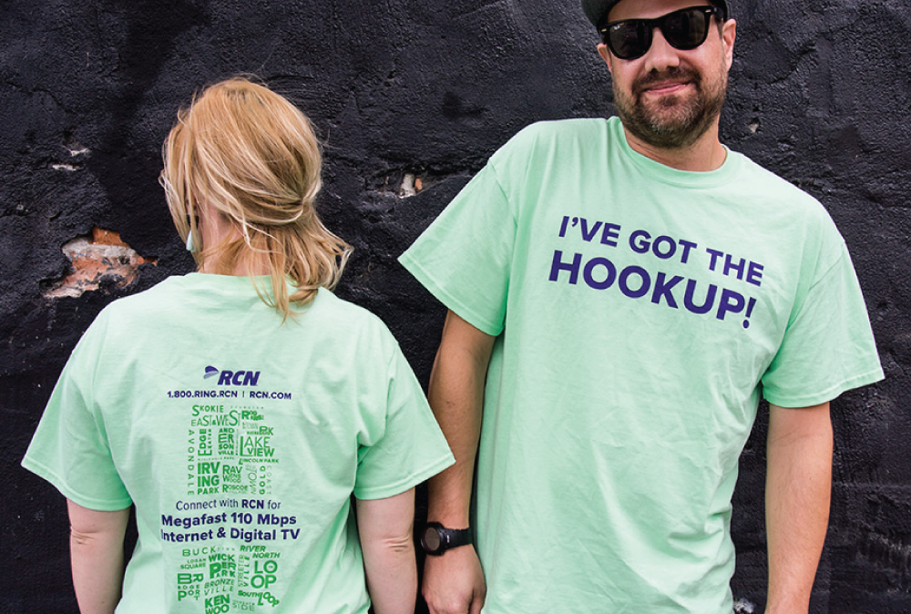
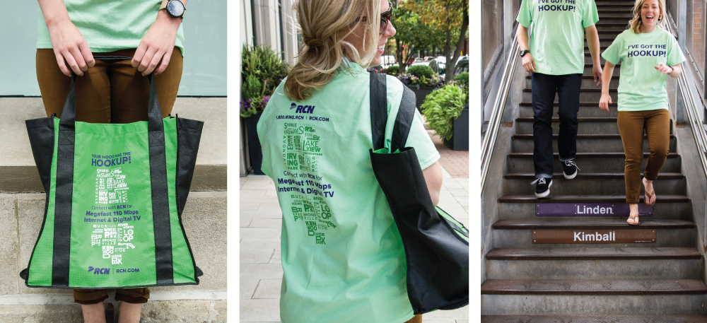
The result was a fun image that fit well with all of RCN’s past branding materials while simultaneously providing something new and slightly unexpected. We also pulled the design onto fun t-shirts and tote bags. RCN was really pleased with how our work revitalized their consumer base and renewed a sense of community with their customers.
