
Sability – Website
Sability is a premier UKG partner with decades of experience guiding organizations through complex HCM and workforce management systems. As their firm continued to grow, their website no longer reflected the sophistication of their expertise or served as an effective tool for their sales team. They partnered with us to create a digital presence that would clearly communicate their differentiators, elevate their brand and support business development. Together, we built a website designed to do exactly that.
Sability is a premier UKG partner with decades of experience guiding organizations through complex HCM and workforce management systems. As their firm continued to grow, their website no longer reflected the sophistication of their expertise or served as an effective tool for their sales team. They partnered with us to create a digital presence that would clearly communicate their differentiators, elevate their brand and support business development. Together, we built a website designed to do exactly that.
Strengthening a Sales Engine
As Sability continued to grow, there was an opportunity to refine how their expertise was presented online. Their website had the foundation in place, but it could work harder to clarify their differentiators, better organize their complex service offerings and more fully support the conversations their sales team was having every day. The new experience needed to function as a strategic business development tool, equipping their team with clear messaging, intuitive pathways and compelling proof points that would help move prospects from interest to action.
SERVICES: brand refresh / website refresh

Outgrowing the Old Experience
Sability’s previous website had served them well for many years, but it no longer reflected the cohesion or modernity of the firm they had become. The experience felt fragmented and visually dated, making it difficult to tell a unified brand story. They were ready to move away from static pages and long lists of bullet points toward a more engaging, narrative-driven approach.
Equally important, the new platform needed to be intuitive for users and manageable for their internal team. Sability wanted the flexibility to update content easily, add new resources quickly and remain agile as their resources evolved, without relying on heavy developer support.
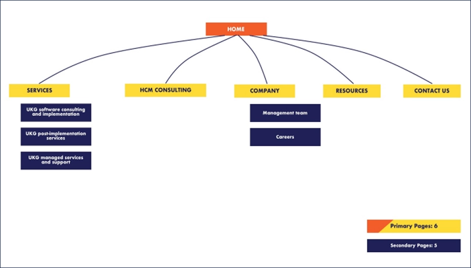
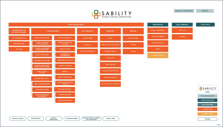
Reimagining the Structure
We began by reevaluating the site architecture to ensure it aligned with how prospects actually engage with Sability’s services. The new sitemap expanded key sections, clarified service pathways and created a more intuitive flow from high-level positioning to detailed capabilities.
By thoughtfully reorganizing and elevating content, we built a structure that supports both discovery and depth. The result is a website that guides users naturally through complex offerings while giving the sales team clear entry points into meaningful conversations.


Iconography as Specialized as Sability
Sability needed an icon system that felt distinctly their own. We developed a custom set designed to reflect the depth of their expertise while bringing clarity and cohesion to complex offerings.

Iconography as Specialized
as Sability
Sability needed an icon system that felt distinctly their own. We developed a custom set designed to reflect the depth of their expertise while bringing clarity and cohesion to complex offerings.


An Elevated Look, Engineered for Use
Beyond aesthetics, we built a system designed for real-world application — one that empowers Sability’s team to execute confidently across every marketing material.

An Elevated Look, Engineered for Use
Beyond aesthetics, we built a system designed for real-world application — one that empowers Sability’s team to execute confidently across every marketing material.


Designing for Discovery
A critical piece of the redesign was the navigation. With a broad range of services, industries and product expertise, Sability needed a system that could house complexity without feeling overwhelming. We created a fully expanded, thoughtfully organized mega menu that transforms navigation into an experience of its own.
Option 1:
Simple and straightforward with all services organized in one view

Option 2:
A journey-led navigation that relies on color and iconography for clarity

Rather than hiding information behind layers of clicks, the new menu surfaces key pathways at a glance, guiding users by journey stage, service type, product and industry. The result is a structure that feels elevated and intuitive, allowing prospects to quickly find what’s relevant while reinforcing the depth and breadth of Sability’s expertise.

Designing for Discovery
A critical piece of the redesign was the navigation. With a broad range of services, industries and product expertise, Sability needed a system that could house complexity without feeling overwhelming. We created a fully expanded, thoughtfully organized mega menu that transforms navigation into an experience of its own.
Option 1:
Simple and straightforward with all services organized in one view
Option 2:
A journey-led navigation that relies on color and iconography for clarity
Rather than hiding information behind layers of clicks, the new menu surfaces key pathways at a glance, guiding users by journey stage, service type, product and industry. The result is a structure that feels elevated and intuitive, allowing prospects to quickly find what’s relevant while reinforcing the depth and breadth of Sability’s expertise.

Guided by Design
We knew from the start that this site would carry a lot of information. The challenge wasn’t just organizing it, but making sure it never felt heavy. Through clean layouts, generous breathing room and subtle animation, we created a rhythm that gently guides users from section to section.
Instead of overwhelming visitors with everything at once, the content reveals itself in thoughtful moments. The result is an experience that feels intuitive and fluid, helping users move through complex information with ease.
Simple Animations to Create Interest
Sability wanted to make the best first impression with their homepage. As masters of many UKG avenues, we added a scrolling animation to highlight everything they do.

Implementation Experts
Organized Information
With such a dense website, we implemented tab systems to help condense information while keeping visual interest.

Built to Perform
57 pages later, we had a revitalized website.
Guided by Design
We knew from the start that this site would carry a lot of information. The challenge wasn’t just organizing it, but making sure it never felt heavy. Through clean layouts, generous breathing room and subtle animation, we created a rhythm that gently guides users from section to section.
Instead of overwhelming visitors with everything at once, the content reveals itself in thoughtful moments. The result is an experience that feels intuitive and fluid, helping users move through complex information with ease.
Simple Animations to Create Interest
Sability wanted to make the best first impression with their homepage. As masters of many UKG avenues, we added a scrolling animation to highlight everything they do.
Implementation Experts
Organized Information
With such a dense website, we implemented tab systems to help condense information while keeping visual interest.

“BatesMeron took our content and shaped it into a beautiful, strategic site that’s now a real sales asset. They were responsive, organized and top-notch throughout.”
“BatesMeron took our content and shaped it into a beautiful, strategic site that’s now a real sales asset. They were responsive, organized and top-notch throughout.”


