Bartkowski – Branding, Messaging & Positioning
Since 2010 Bartkowski Life Safety Corp has strived to rethink and rework the meaning of fire and life safety. Over 10 years since its founding, the company has expanded the range of work and services provided to customers—so the team called on BatesMeron for new branding to match.
The Bartkowski Difference
Every company aims for customer satisfaction, but the Bartkowski team made it their mission to deliver the very best. This led to countless referrals and an already strong presence in the fire and life safety space, but there was so much more the brand could do. General and specialty contracting were strong capabilities that encompassed the entire team, but their additional skills often were overlooked as it wasn’t what the company had become known for.
SERVICES: discovery / logo / branding / messaging & positioning / tagline / name extension
We hosted the Bartkowski team for an in-depth Discovery session to help jumpstart brainstorming with insider information of all the ins and outs of their business. From competitor analysis to color and font exploration to guiding us through their process, it was quickly apparent what set them apart—everyone at the company is genuinely passionate about bringing customers the very best work possible.
We hosted the Bartkowski team for an in-depth Discovery session to help jumpstart brainstorming with insider information of all the ins and outs of their business. From competitor analysis to color and font exploration to guiding us through their process, it was quickly apparent what set them apart—everyone at the company is genuinely passionate about bringing customers the very best work possible.
Proud to boast low change orders and high attention to the finer details that often get overlooked, we knew this would be key to their new brand look and messaging.
Proud to boast low change orders and high attention to the finer details that often get overlooked, we knew this would be key to their new brand look and messaging.
From all sides of the business, Bartkowski was capable and their work resulted in high customer satisfaction. The key was to ensure both present and future clients understood every service the company had to offer.
From all sides of the business, Bartkowski was capable and their work resulted in high customer satisfaction. The key was to ensure both present and future clients understood every service the company had to offer.

Paving a New Path & Position
BatesMeron got to work, crafting messaging and positioning documentation that would place Bartkowski as a leader in the contracting space. Their work in fire and life safety combined with specialty contracting was often mis-interpreted as one or the other, rather than a team that could handle anything—and had numerous successes to back it up.
Three variations of customer-facing messaging, along with a bright, helpful persona were put front and center of the new brand. Understanding and empathetic, yet strong and guiding, along with a healthy dose of relatability and charm constructed the Bartkowski tone of voice.
Industry Inspiration
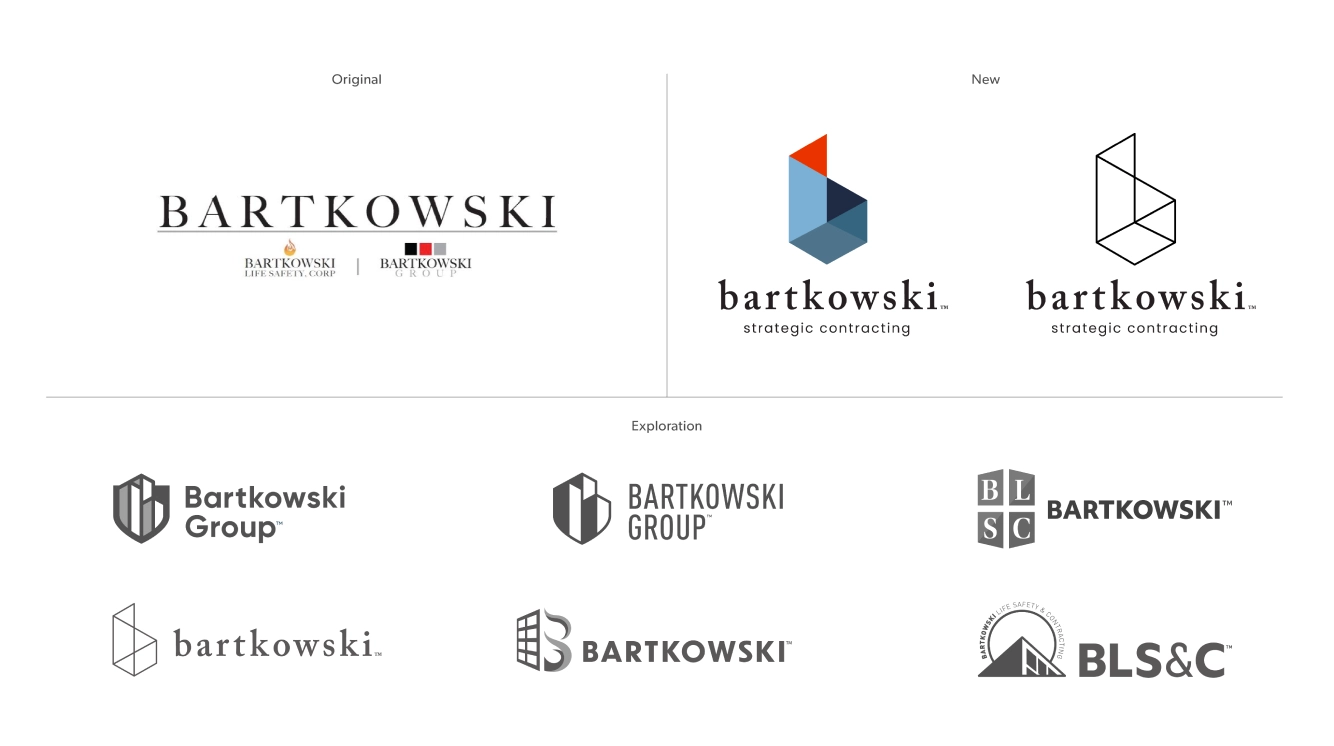
Our designers gathered the inspiration photos, colors and fonts from the Discovery session and began ideating logo options. We wanted just enough of the old Bartkowski look and feel to remain with a healthy touch of new—ensuring Bartkowski remained trustworthy while modernizing the full brand experience.
Our team drew from the strength and security of Bartkowski’s work, setting their sights on the shapes, corners, and even colors of buildings. Fire barriers and windows came into play, along with visual representations of safety, protection and light.


A structured, geometric “b” rose to the top. A subtle “flame” at the tip of the shape and color palette paid homage to where Bartkowski had been, with strong angles and an alternate black and white option keeping it decidedly modern. The new Bartkowski logo was powerful and secure, demanding safety and promising high-quality work at every turn—everything the team already delivered daily.

Power in a Name
With insights from our Discovery and the Bartkowski team, we knew that the brand was already a familiar and respected name—to both customers and competitors. The name became central to the identity of the rebrand. With a new logo, refined messaging and a reintroduction of services, we knew that a familiar name would diffuse any confusion that may arise. To further ensure clients understood the team could take on any task required, Bartkowski Life Safety Corp became simply (and elegantly) Bartkowski.

A structured, geometric “b” rose to the top. A subtle “flame” at the tip of the shape and color palette paid homage to where Bartkowski had been, with strong angles and an alternate black and white option keeping it decidedly modern. The new Bartkowski logo was powerful and secure, demanding safety and promising high-quality work at every turn—everything the team already delivered daily.

Power in a Name
With insights from our Discovery and the Bartkowski team, we knew that the brand was already a familiar and respected name—to both customers and competitors. The name became central to the identity of the rebrand. With a new logo, refined messaging and a reintroduction of services, we knew that a familiar name would diffuse any confusion that may arise. To further ensure clients understood the team could take on any task required, Bartkowski Life Safety Corp became simply (and elegantly) Bartkowski.

We knew there would be moments when further context was needed for those not yet familiar with the brand—from new business proposals to networking and beyond. So, we crafted a name extension that clearly states the team’s purpose: Bartkowski Strategic Contracting.
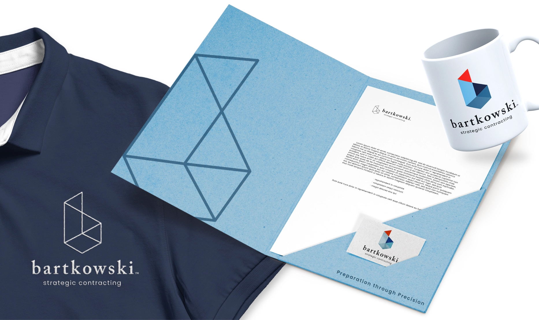
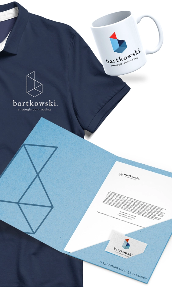
Still, more messaging was needed to make the Bartkowski brand rock-solid. We wrote, tested and rewrote taglines until we landed on one that best upheld the brand’s value proposition, key selling points and—most importantly—main differentiator: their service. “Preparation through Precision” speaks to the fine touch and attention to detail the Bartkowski team is known for. As a tagline it stands as a reminder for clients of all the hard work Bartkowski has and will continue to do, and it holds up as a rallying cry for the team both on jobsites and in the office.


When paired with the new logo, the refreshed Bartkowski brand easily rises to the top, showing customers both old and new they can handle whatever is needed for any job—and that they won’t rest until everything is done exactly right.
When paired with the new logo, the refreshed Bartkowski brand easily rises to the top, showing customers both old and new they can handle whatever is needed for any job—and that they won’t rest until everything is done exactly right.


“Working with the BatesMeron team was a seamless experience. We all felt heard and well cared-for in the Discovery session, which produced a Messaging & Positioning document to help guide our brand through its refresh. The new logo design and brand standards that came next exceeded any expectations we had and we cannot wait to implement them as soon as possible! The team was collaborative, understanding and highly communicative. Any concern we had was answered and met in a timely matter and stellar attitude. BatesMeron is a fantastic team and any brand that works with them will be more than lucky—and extremely smart—to do so.”

“Working with the BatesMeron team was a seamless experience. We all felt heard and well cared-for in the Discovery session, which produced a Messaging & Positioning document to help guide our brand through its refresh. The new logo design and brand standards that came next exceeded any expectations we had and we cannot wait to implement them as soon as possible! The team was collaborative, understanding and highly communicative. Any concern we had was answered and met in a timely matter and stellar attitude. BatesMeron is a fantastic team and any brand that works with them will be more than lucky—and extremely smart—to do so.”


