Unboxing Parse & Parcel Spring 2017
Here at BatesMeron, we have a deep love for all things print and paper. So, when we found about about the subscription service Parse & Parcel, we had to sign up and see what it was all about. Parse & Parcel delivers quarterly boxes of paper inspiration to help give designers a better understanding of paper and print production techniques.
Included in our first box were promotional items produced by paper companies and samples of exceptional print pieces. The best part is that each item inside came with detailed production notes attached. They outline all the papers and processes used to create the piece as well as some background information about why the piece was created and the thought behind it.
I bet you’re curious to see what we got!
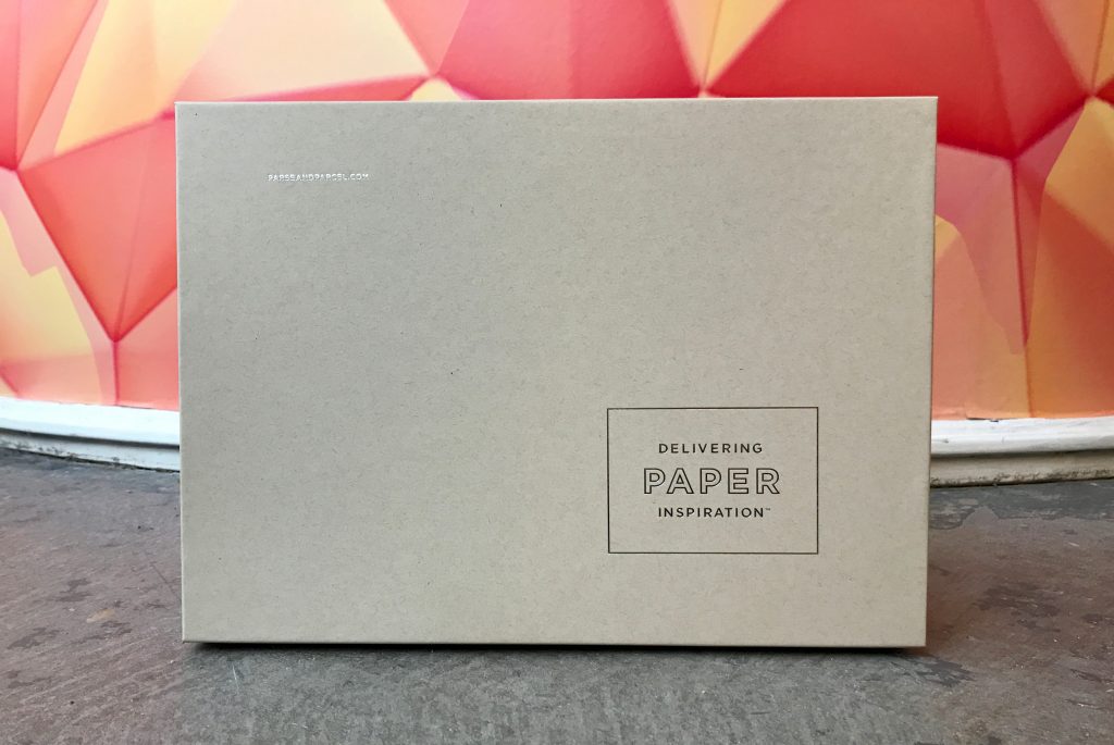

A Parse & Parcel exclusive planner note pad
This was my favorite item in the box I think! It’s something that will be super useful for helping me stay organized, and the foil printing on each and every page makes it feel extra special.
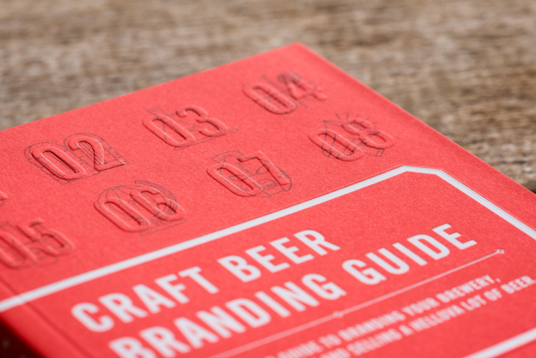
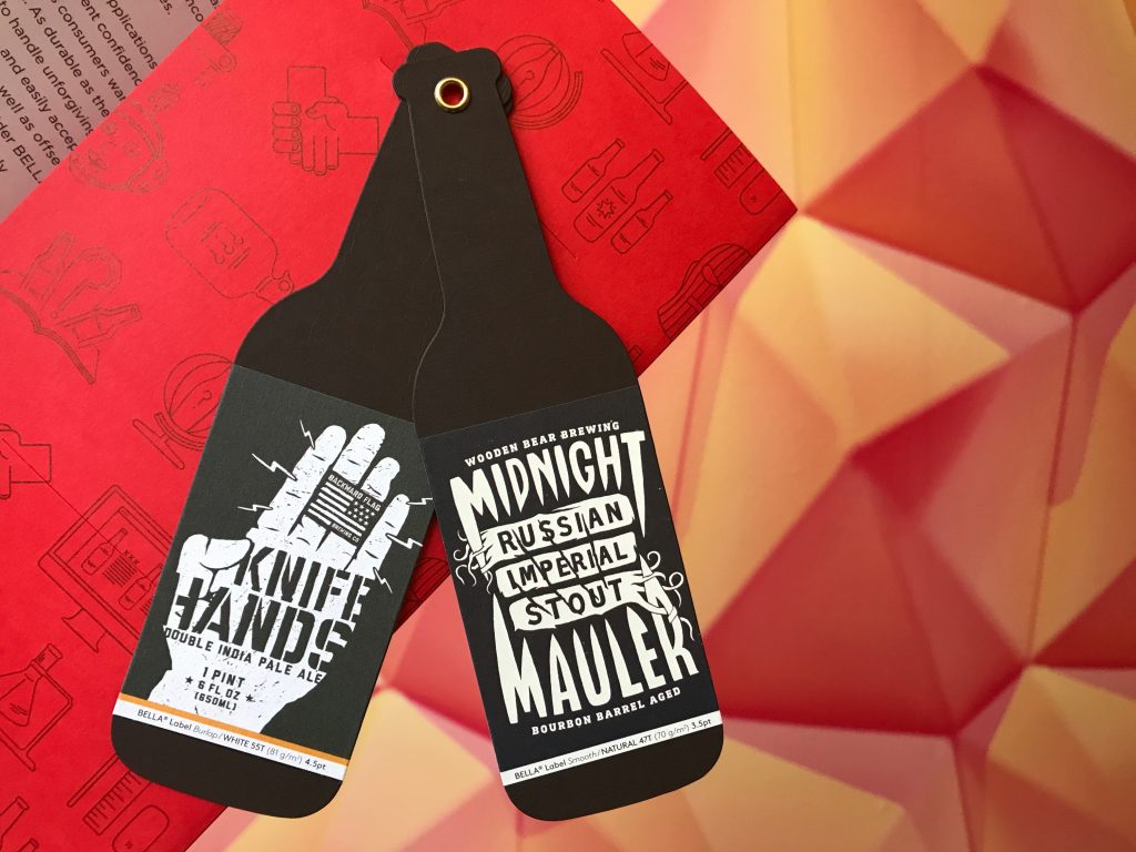
Craft Beer Branding Guide – Neenah & CODO Design
I got really excited for this one too. The colored paper and blind emboss are so fun and the content couldn’t have been more spot on! As a huge lover of craft beer, I’m just waiting for the day that I get to merge my passions for design and expertly crafted brews! Going to read this one cover to cover for sure. If you are reading this and have a budding beer company that needs branding, give us a call. No seriously.
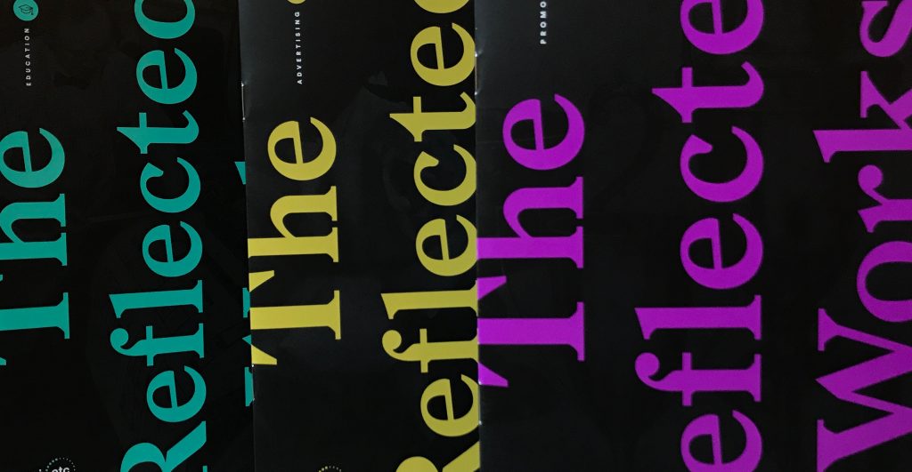
The Reflected Works – Sappi
This collection of educational and promotional pieces from the Sappi archives are pure eye-candy. The metallic silver ink and use of clear foil stamp in this piece make it a delight to flip through.

Maker Quarterly Issue No. 11 – Mohawk
I’ve been a huge fan of Mohawk’s Maker Quarterly series since its inception and this issue raises the cool bar even further. The five signatures each printed on a different stock with a rough-edge trim and smyth-sewn binding instantly had me drooling!

Platinum Welcome Folder – Progressive Insurance
This folder uses Neenah classic stipple paper, which is unexpected and luxuriously tactile, paired with a registered emboss and foil stamp. It was designed by their in-house team, which is also really wonderful.

Blueline Magazine – Domtar
To me, the value of this magazine is definitely more in its content than its presentation. It’s always exciting to read about the designers and other creatives behind stellar campaigns, so the feature stories really jumped out at me. I was also psyched to see an article feature Hatch Showprint, another favorite of mine!
Overall, this was a super fun package to open and explore. My only critique is that many items included in the box are items you can acquire for free from paper companies and their representatives. So I wouldn’t say the package is an ultra great value from a bang-for-your-buck perspective.
What it is great for, is getting a really thoughtfully put together package that makes you sit down, do some reading and experience some stellar print pieces. It felt like Christmas opening it up, breaking the seals and sorting through its contents.
I think the best take away we got from Parse & Parcel is the reminder that: “Great design doesn’t require hip clients, unrestricted deadlines or unlimited budgets, those are luxuries few have. But great design does require thoughtful execution of all the details—and that includes paper and production.”
This statement is something we at BatesMeron wholeheartedly embrace. On every print piece that comes across our desks, we try to push the boundaries of what we can produce for our clients. We are designers who understand the importance of a tactile experience in this highly digital age.
We nerd out on getting to create pieces that people touch and interact with. The magic of print truly is in the details. It’s amazing what selecting just the right paper, using a unique fold, the perfect die-cut or placing an unexpected sticker can do to make something more memorable and meaningful. Parse & Parcel has given us some great ideas for future projects and we can’t wait to put them to use!
Here’s a fun little video I made of the unboxing. Watch for a closer look at some of these beautiful pieces!
Can A Website Determine Where You Travel? Small Town Edition
Building a Manifesto (part 3 of 6)
Imagine If...

