Audiovisual: When Record Labels & Designers Come Together
In the design world, there has always been a balance between the needs of a client to have their goals served in a particular way and the potential for a designer to explore their capabilities to make resonant and effective design. The music industry is no exception. Indie labels have always had a penchant for permissiveness with their musical artists and their relationship with visual artists and designers. In this post, I’ll explore some labels with relationships to designers that have led to them creating effective and memorable work.
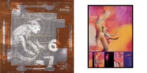
4AD
4AD has spearheaded the indie and alt rock movements since its origins in 1980, with alumni including Pixies, Cocteau Twins and Bauhaus. Beginning in the mid-‘80s, 4AD began working with designer Vaughan Oliver to create much of their album art and marketing materials. Surreal imagery (taxidermized monkeys, teeth, eels), an approach to typography that is at once experimental in layout and balanced and lots of strange textures give Oliver’s work a mysterious, evocative quality. As 4AD’s catalog of critically lauded albums stacked up, it became apparent that they had a distinct aesthetic voice, sonically and visually. By allowing design and music to form a symbiosis, 4AD has left a distinct mark on listeners, and have remained an important and influential label as a result.

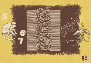
Factory Records
Factory Records, formed in 1978, was at the forefront of the post-punk and new wave movements. From their inception, they worked with designer Peter Saville to create their visual aesthetic, cover art and posters. Saville’s use of iconic images, paired with a distinct approach to typography and composition informed by geometry and industrial aesthetics, made Factory, like 4AD, both a musical and visual force. Most strikingly, Saville designed covers for Joy Division and New Order that have been parodied and re-spun countless times. Saville and Factory worked mutually, cultivating consistency while making individual catalog items unique, and are all the better for it.

Numero Group
Numero Group is a newer label that focuses on reissues of forgotten records from all eras of time—from ‘60s soul to ‘90s experimental rock. They often re-release works with original cover art, but also create compilations of material and give them the Numero visual treatment. Numero’s approach lets imagery speak for itself, while refined typography and a distinct cataloging system make their releases reminiscent of a library. Numero has become a distinct and oft-praised name in the reissue game for their meticulous quality and exhaustive research, something their visual approach reflects. As a result, they are as prominent as any artist with a devoted fanbase.
These are just a few examples of labels that have done design right, but there are countless others. What makes these labels successful is a combination having interesting, high-quality wares and a presentation that speaks to the essence of them. These labels worked with designers to make work that’s clear in its perspective and have made their mark as a result. Any labels or album covers come to mind? Let us know in the comments!
What We Learned: Brand New Conference 2017
The Inspiring Work of Our Most Charitable Clients
Navigating the Feedback Loop

Made with ♥ in the 312

1006 S. Michigan Ave. Suite 601
Chicago, IL 60605