The Art of the Presidential Campaign Poster
Happy Election Day! Don’t worry, we won’t get political on you. Instead, we’re discussing a more fun aspect of the elections—presidential campaign posters. In doing research for this blog post, I was hoping to find a collection of really awesome, inspiring designs. I did find a few of those, but what I also discovered was a treasure trove of unexpected and sometimes super bizarre posters.
Let’s begin with everyone’s fave, Abraham Lincoln. To me, this poster falls into the category of “unexpected” because in an era of overly ornate Victorian design, it stands out as dramatically simple and modern. An American flag backdrop, simple typography and a design that can work vertically or horizontally—in all things, Lincoln was ahead of his time.

Moving along quite a few years in history to what are arguably some of the LEAST simple presidential campaign posters in existence. These Nixon posters from the 1968 and 1972 elections really speak to the era in which they were designed—gaudy and ornate. And of course it wouldn’t be the 1970’s if there wasn’t a little wood paneling thrown in for good measure.


Of course, the 1960’s were also an era of awesome design. Minimalist, mid-century design takes center stage with these Kennedy and LBJ posters. Classic red, white and blue, a clean sans serif typeface, the disembodied head of John F. Kennedy, what’s not to love?


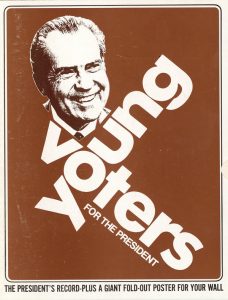
As we all know, the youth vote really matters. Here are some interesting attempts at garnering “cool points” with America’s young people. Nixon’s approach: Direct. Bobby Kennedy’s approach: Acid


And just because things weren’t already weird enough with psychedelic Bobby Kennedy, let’s talk about some posters that really beg the question “who thought that was a good idea?”
What a remarkably fortuitous coincidence that Jimmy Carter’s initials are the same as that of Jesus Christ, else we would not have this piece of political history. And you know, every campaign needs a good pop culture joke, right? I can’t say for sure if The Fonz would have voted for Ford, but he definitely would not have been cool with him ripping off his style.


Surprisingly, the ’80s and ’90s saw a pretty serious drought in interesting presidential campaign posters, at least according to the Google machine. So I’m going jump ahead to what is absolutely the most iconic presidential campaign poster in decades: street artist Shepard Fairey’s ‘Hope’ from 2008. This poster became a viral phenomenon and the defining image of President Obama’s campaign.
To describe it as “unexpected” is an understatement. Street art is possibly as far from presidential as you can imagine, but it worked. It struck a chord and gave a whole generation of voters just what the poster says.

From classic to cooky to downright cool, these are my picks for the best and weirdest presidential campaign posters. Happy Voting!
You Need Some Rules
The Top 12 Ad-spired Halloween Costumes
Worldly Design Inspiration


