The Art of Japanese Design Techniques
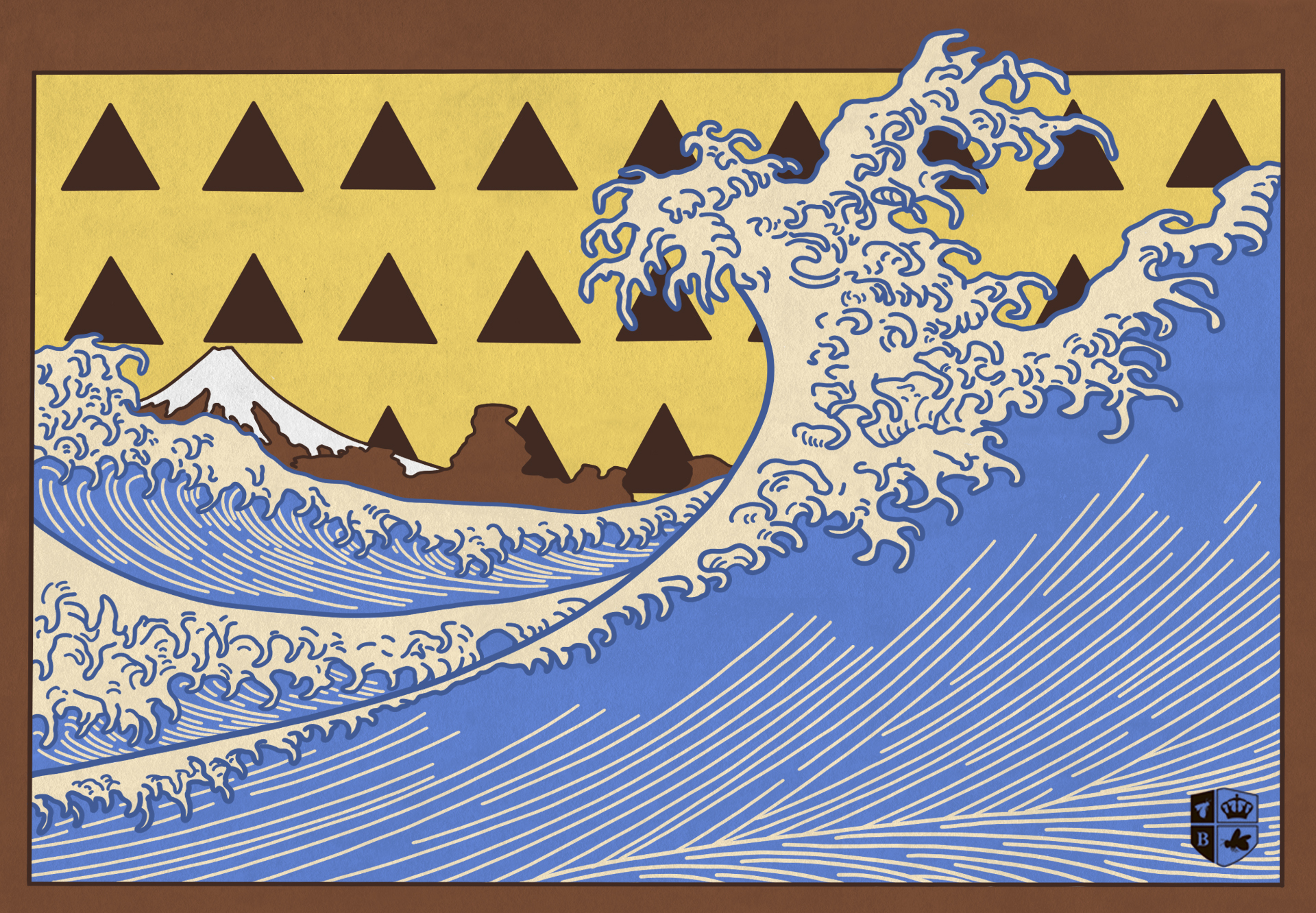
If there’s one thing western design has benefitted from, it’s Japan. Design has always been a cross pollination of ideas, and the influence of Japanese design, art and architecture on creative forms in Europe and the Americas has been powerful. For a better grasp on this influence, I’ve centered on the techniques specific to Japanese design that make it effective, resonant and beautiful—techniques that we can use to our advantage to make our designs more effective too.
Illustrative Style
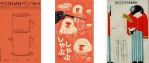
Commonly seen in Japanese art and design is clean, simplified illustrations. These tend to have large, flat fields of one color (for example, in the second piece, the monkeys’ faces being all one color and their fur being another, rather than colors being interspersed or gradating). Another popular style of illustration is constructing subject matter from very simple geometric forms. Both of these approaches reduce and idealize forms in a particular way that make the Japanese aesthetic distinctive. Designers everywhere can take cues from Japanese illustration for both its excellent idealization of forms and fine detail, as well as its ability to reduce down forms to a recognizable ideal, no matter how complex the illustration.


Color
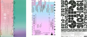
Japanese design is notable, too, in its use of color. Designers in Japan also tend to use a ton of different colors in one design that tend toward the pastel or the oversaturated. This lends a high-energy charge or distinctive mood to a design. Large fields of color with some central object breaking up the visual field are common. So, too, are gradients, often used to add a feeling of dynamism, movement and futurism to designs. Gradients are also an effective, simple way to create a geometric illustration or pay homage to traditional woodblock printing.
Hierarchy and Density
Japanese design can be thought of as architectural in many ways. There is often a very strong sense of hierarchy present, easily separated into primary, secondary and tertiary levels. Like in all effective design, the eye is drawn toward a central point of visual activity or prominence before moving down through the other information. If you keep a solid hierarchy, you can still pack a ton of information into a limited space while keeping a design functional at its root. This density of information is often paired with adventurous or asymmetrical compositions or visual effects to create something distinctive.

Layering
The handmade is often a source point for a design’s overall aesthetic and approach in Japan. This is present in brush strokes, the aforementioned use of color and illustration as well as elsewhere. One particular aspect of the handmade that is brought over is layering. There is a particular way Japanese designs are arranged and layered wherein many elements are at play, but are balanced with hierarchy and color blocking to become understandable. As a result, we get designs that are lively and thrilling to look at, while still totally functional.
As designers, one of the greatest resources at our disposal is other designers—especially those from different eras and different locations. These techniques I’ve mentioned above are in no way contained to one specific realm of design or nation (Japan is no homogenous aesthetic mass, and the U.S. certainly isn’t either), but their prominent use, and the fact they are often used in conjunction, distinguishes Japanese design. As such, we can draw on these techniques and approaches to become better designers, typographers and illustrators. Here at BatesMeron, we look for effective techniques and integrate them into our design whenever possible, and Japanese design is certainly one place we return to continually in order to remind ourselves what design that gets it right can look like.

