Fovea, Peripheral Vision and Web Design
I have learned a small fun fact about our eyes. Hold your arm straight out and look at your thumb. The size of your thumbnail is how much your eyes can see in high resolution, which is your focus vision. Everywhere around your thumbnail, you can only see in low resolution. When we look at one word like “here”, we only clearly see that word and maybe the word next to it. The other words around it are only blurry shapes.
This is because the center 1% of our retina area, called the fovea, has very dense retinal cone cells. The brain’s visual cortex devotes about 50% of its area to input from the fovea. The other half of the visual cortex processes data from the remaining 99% of the retina, which is our peripheral vision (FIGURE 1).

FIGURE 1 The resolution of our visual field is high in the center but much lower at the edges.
The peripheral vision is more useful than you might expect. It guides our fovea, detects motions and let us see better in the dark. This fact affects how we design websites, too. Take readability, for example. If the font size of a paragraph is too small, then more words fall into the fovea area, our eyes capture more than one line at once, we easily lose our place on the current line and our reading is interrupted.
On the other hand, if the font size is too big, our eyes can’t catch all the letters in one word. When this happens, reading requires more brain process, forcing our brains to remember the first few letters until the fovea catches the last one of the word, then connecting all the letters and processing them into a word. For this process, sometimes, our vision needs to jump back and forth multiple times to help the brain remember all letters of the word, obviously taking a longer time. Therefore, the proper size of a font should let our fovea capture one to two words, allowing our peripheral vision to detect the next word and guide our fovea.
Here is another interesting fact about our visual field: Cover your left eye, move your face near the screen and focus your right eye on the +. Move your head slowly away from the screen, staying focused on the + (FIGURE 2). The @ will disappear at some point.

FIGURE 2 To “see” the retinal gap.
This is because there is a small area in our vision where we are blind. When the image of an object in our visual field happens to fall on that part of the retina, we don’t see it. But we also don’t realize it because our brain fills in the space with the surrounding content. Think of it like a graphic designer using Photoshop to fill in a blemish on a photograph by copying nearby background pixels.
Have you ever encountered a situation where, after you hit a link or button, no action happens? Only after you look around the page, ah-ha, the error message is thousands of miles away from the object you hit (FIGURE 3). You missed it because the error message appeared in your peripheral vision or probably fell into your blind spot.
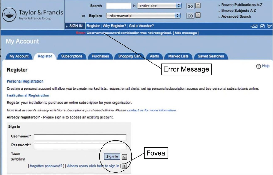
FIGURE 3
Knowing what we now know about our own bodies’ limitations, our job as web designers and developers is to prevent these occurrences and design around the abilities of our anatomy. Here are some common methods of making messages visible:
-
- Put your message where users are looking
- Mark the error (highlight the error field) to grab attention
- Use an error symbol
 ,
,  or
or which makes the error message more visible
 - Reserve red for errors. By convention, in interactive computer systems, the color red connotes alert, danger, problem, error, etc. Using red for any other information on a computer display invites misinterpretation. For websites that use red as their dominant color, such as with one of our clients, we use another color for errors, mark them with error symbols or use stronger methods (pop-ups, sounds, blinks).
Not only should our websites be powered by our designers’ outstanding skills, but they should accommodate the science of how we process what we see as well. Are there any websites you know of that employ any of these tactics? Or know of any tactics not listed here? Tell us about them in the comments!
How to position your brand for success as we head into the New Year
Beyond the Ribbon: Fighting Pinkwashing with Meaningful Marketing
Designing an Isle (of Dogs)

