E3 With Me: An Aesthetic Review of New Games
The Electronic Entertainment Expo, more commonly known as E3, was held last week in Los Angeles and boy did that give video game fanatics everywhere something to cheer about. In the world of gaming, motion graphics and animation are at the core of the value of the product, but it’s the game covers that are often what grabs your attention first.
Over the years, I’ve developed a tight list of favorites that I’ve enjoyed playing since I was a child. After all these years, many of my favorites are still around. I keep coming back to them because of the way they immerse players into their virtual worlds, carry on the core values and mechanics and therefore cause the player to feel connected to the stories characters, heroes and villains.
A few of the series from my early gaming years made a showing of their future releases at E3 this year. It’s no surprise that I was more than excited to check out what was coming, and what we usually get to see first—before the shoot’em ups and world building—we see the game covers, which is what I’ll be giving my honest opinion on here.
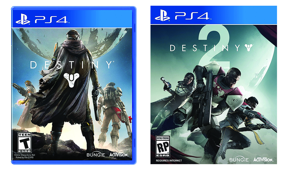
Destiny 2
One of my favorite titles is Destiny, which is officially dropping its first sequel in September. For its updated look, they’ve gone bold and added a large two under the original logo lock-up where some would expect the designers to play it safe by moving the two to the right like most titles do traditionally. Playing with scale, transparency and overlap helps this cover design feel fresh and exciting. I can’t wait to add this to my collection.
Anthem
While we are on the topic of futuristic sci-fi shooters, Anthem was announced this year! This is one of the few big titles to come out of E3 that is not tied to an existing game franchise. Clearly, the marketing team behind the design and advertising still wants the title to feel familiar. They created a very edgy and clean title type treatment that masks out sections of the lettering. This is very pleasing. We’ll see if the game can follow suit.
Super Mario Odyssey
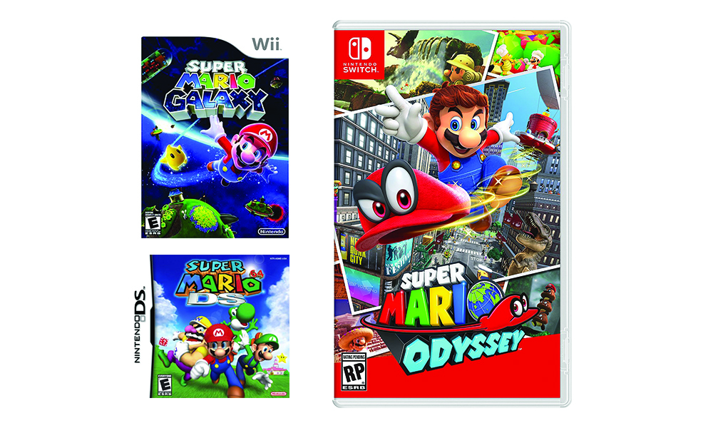
The Super Mario titles do a great job of building on the brand equity they established in the classic Nintendo days, while creating solid opportunities to incorporate new themes and adventures into the game cover design.
Super Mario Odyssey, which is scheduled to release in December, is the first of the Super Mario games to use more than one visual plane when rendering the type. The title design twists and turns, creating a different style of three dimensionality than we’ve seen from Mario’s previous branding. And since the game is about traveling through alternate dimensions, this look ties perfectly to the context of the game.
Metroid
Im a huge fan of the Metroid series, so when development for Metroid Prime 4 was announced I completely geeked out. The game cover has yet to be released but I’m disappointed to report that their teaser logo is a little underwhelming. I was gearing up for a look that was lighter and more futuristic. I’m holding out hope that they take a more creative approach with the official cover design. Fingers crossed.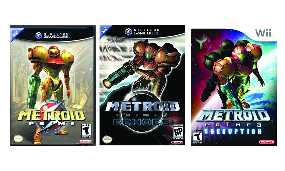
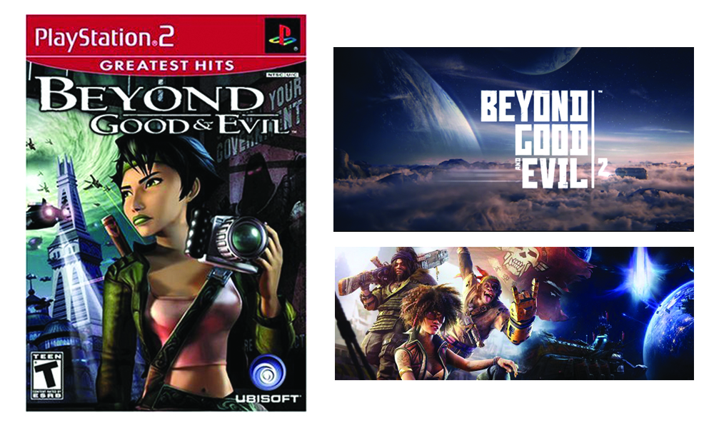
Beyond Good and Evil
I haven’t spent a ton of time with the game play for Beyond Good and Evil, but one look at the updated branding for the sequel and you immediately see how it’s light years ahead of its predecessor. Beyond Good and Evil came out in 2003 and 14 years of technological advancements have created what appears to be an incredible game with a gorgeously rendered atmosphere. Fourteen years of progress in the typography world have never looked so good.
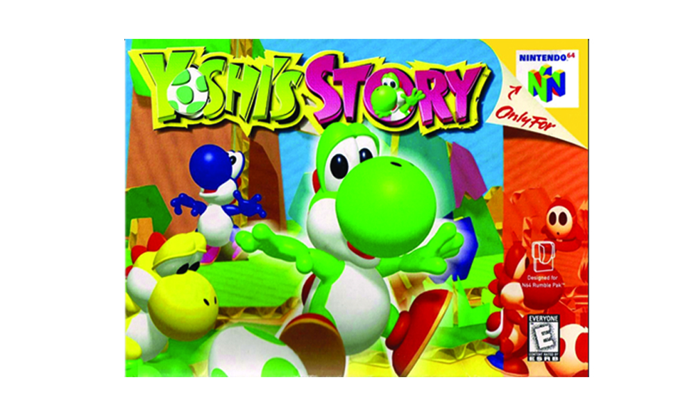
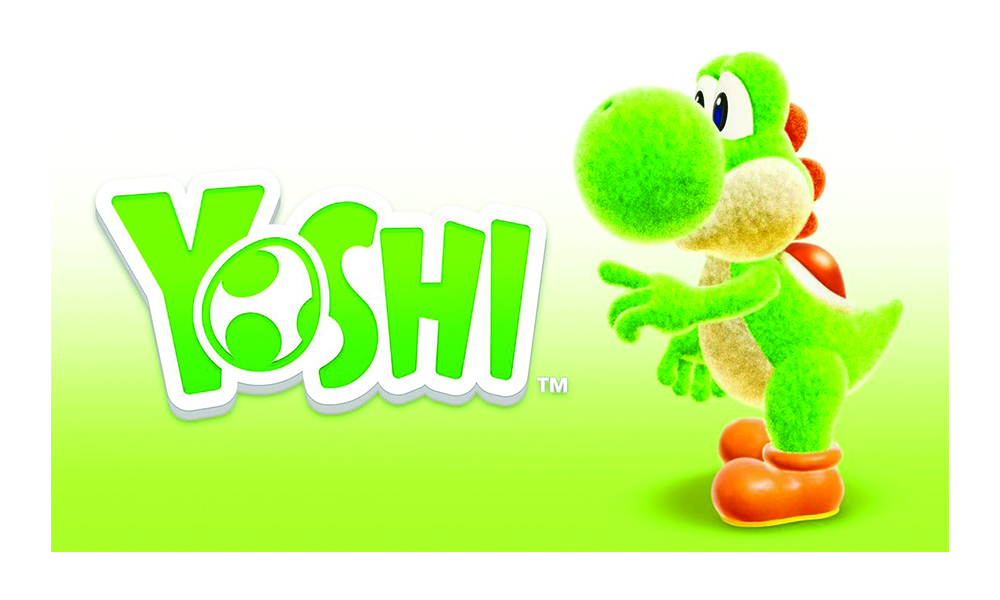
Yoshi’s Story
Who doesn’t love a Yoshi in their favorite color? When a new Yoshi game was announced, I set aside $60 of my hard earned dollars for this lovable Dinosaur. The Yoshi title takes one from the Mario playbook with a cleaned up and refreshed logo that maintains its original playfulness, with a more polished design.
Do you have any favorite titles announced this year? How’s their branding? Sound off in the comments and let us know.
Celebrating National Love Your Pet Day
Restaurant Branding in 2022: 5 Things You Need to Know
You Need Some Rules


