We Picked Our Favorite Logo Design of All Time
The logo is the keystone to the brand. It’s the piece that holds the whole mess together. The tag. The calling card. The fingerprint. The mark that says everything there is to say about a brand—packed into a square inch of space. It can convey, among other things, a reputation, a tone, history and values. It’s a brand’s introduction and signature all in one. As pros in branding and logo design, we deal in the creation and evolution of logo marks every day. It’s a task we don’t take lightly—and after an introduction like that, how could we?
Logo = Big Deal
It’s not an understatement to say that the pressure is on when it comes to designing an identity. No matter how visionary a creative you are, a logo carries a whole lot of weight and requires an acute attention to detail and a ton of care in its crafting.
Recently, I happened upon an article where top designers in top agencies were asked which logo design they considered to be the best. In essence, what is the most successful logo of all time? Ohhhhh, how exciting, I thought to myself. This is like the Olympics of logo design and only one mark is going home with the gold. Who will be the ultimate champ, crowned the most iconic, memorable, sensational logo of all?
Well, that’s not quite how it went. The responses ranged in accordance with each designer’s particular taste and aesthetic, which brought to mind my own team of talented designers, writers and account servicers at BatesMeron and how our opinions on the subject might differ. So, I turned the tables and asked each of them, what logo design tops your list and why?
Logo Design: It’s Opinion Time
Carlie: I really like the hidden meaning behind Amazon’s logo; the arrow from A to Z subtly hints that amazon sells everything—clever!

Clever, indeed Carlie! What about you, Josh?
Josh: I love to geek out about space stuff, so NASA’s heritage logo design won out at the end of the day. It’s actually kind of involved for a logo but I love the way all the pieces orbit one another—zing!—and it’s iconic like any great logo has to be.

That’s out of this world, Josh! Todd?
Todd: I guess you could say that I have a bit of an emotional connection to my favorite logo. Since my days of youthdom, I’ve been surrounded by athletic competitions and activities, with every top athlete donning the NIKE brand. Naturally, I wanted to be just like them. It’s a very inspirational logo stemming from the Greek god of Victory that has propelled itself into global recognition. It also reminds me of my childhood, which makes me feel really good.

Thank you for that, Todd. Anna, what’s your pick?
Anna: My winner is the Penguin Books logo. I like that it is simple and for me, it immediately conjures up cozy feelings of snuggling up with a book. I also like that it has stayed very consistent over the years.

Ah, yes, that logo gives me the warm fuzzies as well. Becka?
Becka: My favorite logo, if I’m forced to choose, is the Maserati logo. The bold trident not only provides a nod to an upside down “m,” but it’s a symbol of the city of Bologna—where these beautiful machines were originally crafted.
There’s nothing like having the emblem of Poseidon, God of the Sea, gleaming in a flash of chrome as this car makes you whip your head around to catch another glance.
The typography paired with the trident logo is elegant and regal—like the cars they represent. (Yes, some people think they’re too flashy, whatevs.)

Here, here! Tarah?
Tarah: I chose Coke’s logo design because it’s simple, classic and extremely recognizable.

A respectable choice. Let’s hear from Katie.
Katie: I’m going to go with one of fashion’s most iconic logos, the mark for Chanel. The logo was designed in 1925 by Coco Chanel herself and has remained unchanged ever since.
Featuring a custom typeface with C’s that have perfectly circular counters, it sets up a perfect balance that I love. It’s stark black on white presentation immediately evokes feelings of luxury, elegance and exclusivity. It’s interlocking C’s are so iconic, fashion fans have given this logo life and meaning all its own, with a knock-off culture that manipulates the logo and creates a cult-like fan club. It’s a unique phenomenon where the logo is almost more popular than the brand itself.

Simply faaaaabulous.
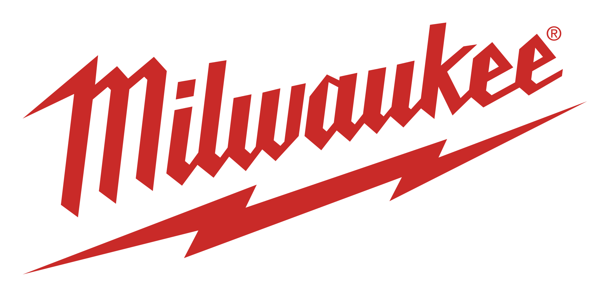
As for me, my choice for the best of the best is the typographic mark for Milwaukee tools. Weird, right? I’m not on fire for their products or anything, it’s just always stood out to me. It’s cool… but wholesome in some way. And I like that it feels a little imperfect. I appreciate that it stands out from other tool brands you see on the shelves at hardware stores–it has personality. And a righteous lightning bolt, so, duh.

Buh-Bye, Baby Bump: The Banished Words of 2012
XML: The Sweet Spot of Data Sorting
6 Questions for: Erin Pine


