A Brutalism Renaissance: the Good, the Bad and the Ugly
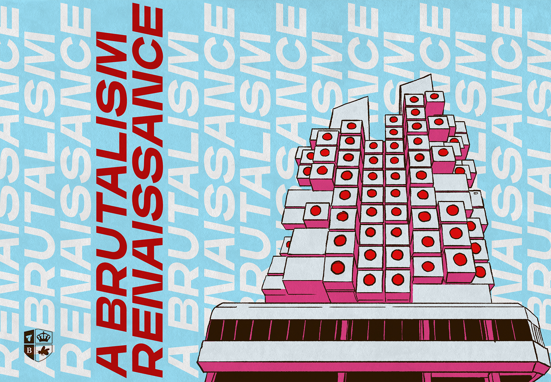
History has a funny way of repeating itself—and design history is no exception. Decade after decade, we see quite an array of design trends come and go, only to come back again. We also see that often, architecture lies at the heart of these trends’ inspiration.
Such was the case with brutalism, an architectural design trend that became popular in the 1950s. And it’s the case now, with brutalism making its way back into popularity. But how does brutalism, an oxymoron that translates to “raw concrete”, fit into our world of design, finding its way into the brands of 2020? To understand the impact of brutalism’s renaissance, we have to dive into the good, the bad and, dare I say, the ugly.
The Background on Brutalism
Snuggled right between the “high tech” industrial trend beginning in the 1930s and the phenomenon of organic architecture in the 1970s, brutalism style emerged in the 1950s, growing out of the 20th century modernist movement and Bauhaus teachings. With traditional forms and a solid underlying grid, the architectural style reflects its French meaning of “raw concrete”.

HABITAT 67 BY MOSHE SAFDIE. 1967, MONTREAL

ROYAL NATIONAL THEATER BY SIR DENYS LASDUN. 1976, LONDON
Yet architects created a real disruption for cut-throat modernist design rules in developing our lovely brutalist style. During its era, brutalist architecture made complete sense— it was affordable, it was functional and pieces of brutalist structures could be mass produced. But when the style eventually made its way to our world of design, artists and designers took creative liberty in interpreting what it meant to them, cultivating a totally new type of brutalism along the way.
Today, some designers are happily rollin’ with this eccentric new wave of experimental design, and others are saying “no, thank you” to what they see as borderline-nauseating websites and art installations. To understand where this divide occurs, and take your own stance on the matter, this site contains a collection of brutalist websites, including many tasteful and not-so-tasteful examples to explore.
Don’t get me wrong, I absolutely respect the style. It’s thought provoking, visually interesting and, many times, truly beautiful. To be honest, I’m inspired by the experimental nature of this design style, and I wish I had the hutspah to make some badass, brutalist web designs or posters in my free time. But as a young designer with open eyes and a craving to put my art into the world, I often question how one can combine a style so broad, yet so ridged into a brand identity. Best said by our very own Becka Bates, “ It’s so frustrating to see marketing dollars blown on a random, illegible billboard, poorly executed digital campaign or even a website where you can spend a full 3-4 minutes (far longer than your average consumer’s attention span) trying to figure out what they’re all about, what they do and what they stand for, before giving up and moving on to the next search listing.”
Taking a gander at the examples found at the link above, there are tons of cool, interactive interfaces—but are they able to translate into a working brand identity? Is it possible to maximize the great aspects of this design style and bring them into branding without distracting from the greater brand core or message?
Throwing Away Some (But Please Not All!) Rules of Design
In a word, yes. It’s no doubt tricky, but it’s possible. The Designer’s Notebook hosted by Medium has the perfect definition of the hurdles of brutalism when used in design: “A myriad of web safe colors, system fonts, irritatingly positioned images, a plethora of micro-interactions and hover effects, no distinctive hierarchy, lack of symmetry, very simple or no animation, *place anything that evokes a headache.” Harsh, but not untrue.
Now of course, this is referring to web-based platforms, but these hurdles can easily speak to any preliminary design rules. For example, I love the idea of reimagining typography and experimenting with the ability to reformat its given shape with brutalist design practices. And yet, I have to keep in mind that typography and composition are all about sensitivity to layout, the grid, making sure color and type are working together and not against each other. That’s the way designers learn graphic design! From what I found, it is possible to merge both polar opposite styles, eccentric brutalism and the standards of design rules, into one tasteful brand—when done methodically.
And when it comes to brand messaging?
They say “brutalism is the way it’s written”. Very raw and straightforward language, especially when interacting with a web or mobile platform, is iconic to brutalist style. What you read is what you get—no bullshit. This is vital to building a brutalist brand. Having a cohesive and interesting tone will capture customers and keep them on their toes, and if the brand leans brutalist, that tone should follow suit. If there’s one thing I’ve learned in my time as a young agency designer, it’s that copy and design go hand in hand. Successful in both areas, an amazing brutalist brand can be both timeless and fun to work on.
The Best of Both Worlds: A Brutalist Brand Case Study
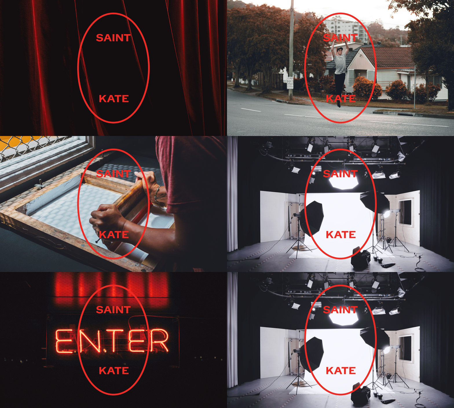
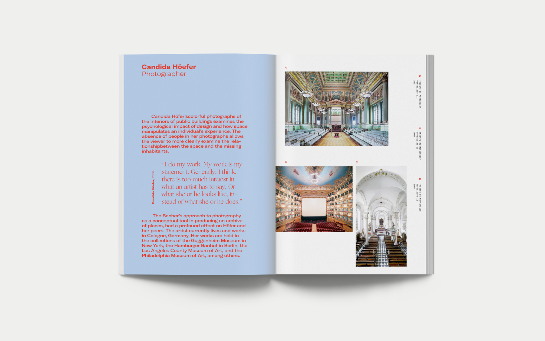
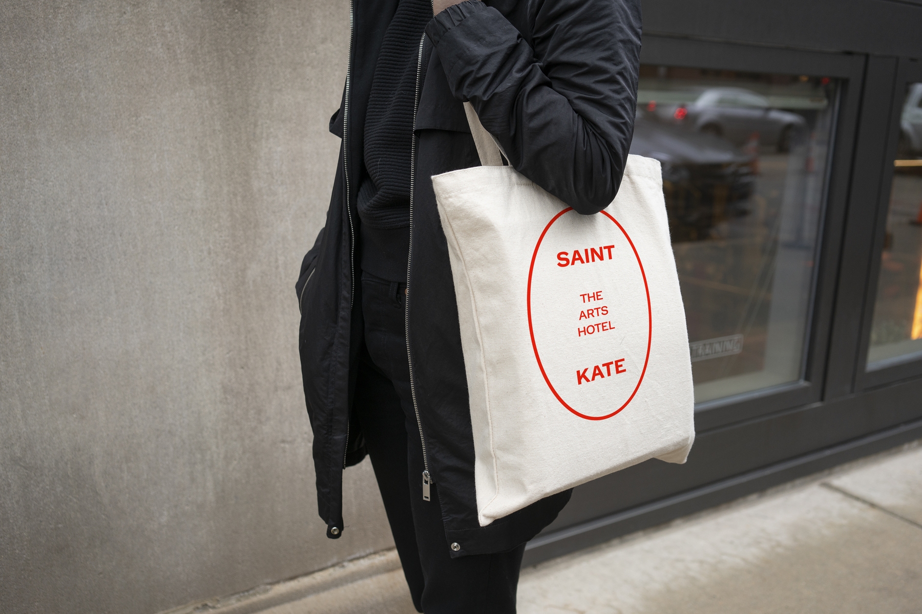
Need to see the perfect mix of brutalist and traditional design for yourself? One Design Company’s rebrand of Saint Kate, Milwaukee’s Arts Hotel, marries experimental typography and traditional design quite carefully. The brand expands in print and digital collateral, as all brands should, and it’s a nod to the hotel’s commitment to being “a living, breathing, evolving space”. The Saint Kate collateral uses a primary color, but experiments with palettes and compositions outside its defined brand elements. One Design Company had no fear in breaking the grid, tastefully, and bringing in a whole lot more than just a simple logo. Saint Kate’s messaging is bold and straight-to-the-point while providing all the needed information. It is brutalist branding at its best.

Through all the controversy surrounding the brutalism renaissance, we walk away with a valuable lesson to carry into the new decade of design. Opposite styles can work together, brutalism is not the enemy of structure and experimental and traditional design can coexist. Actually, they already do coexist—and brands and designers should keep an eye on this growing trend if they want to stay on the forefront of the future of brand identity.
6 Questions for Maggie Curran
6 Reasons I Got My WBE Certification
Building a Strong Understanding of Graphic Design through Urban Arts


