Spring-Fill – Branding
The Future of Fill
As the largest, in-stock decorative loose-fill manufacturer in the US for almost 30 years, Spring-Fill has developed a great reputation. But they noticed that even though the company was constantly innovating, the branding and website were not accurately reflecting that. They came to BatesMeron looking for a brand as colorful as the product and as lively as the leadership team, but with a more timeless appearance.
SERVICES: brand messaging / visual identity / brand collateral / photography / website / ongoing marketing
BatesMeron sat down with the team and discovered just how fun-loving they were, making it a no-brainer for how the voice of the brand should sound. Our team toured their facilities in Northbrook, IL and saw firsthand the colorful, shimmery world of Spring-Fill Crinkle.
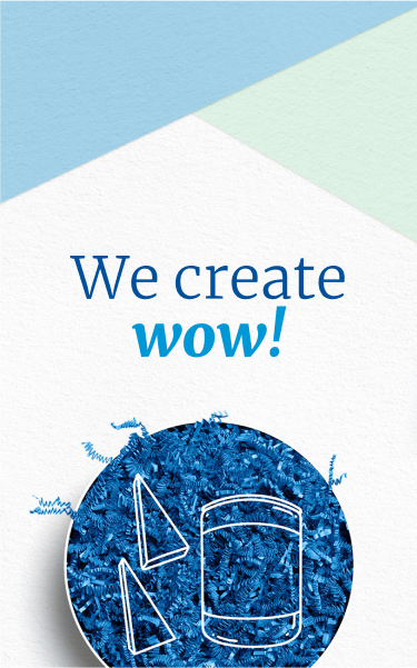
This product and team bring the wow factor—and we knew that needed to be the focus of all messaging and imagery to come.
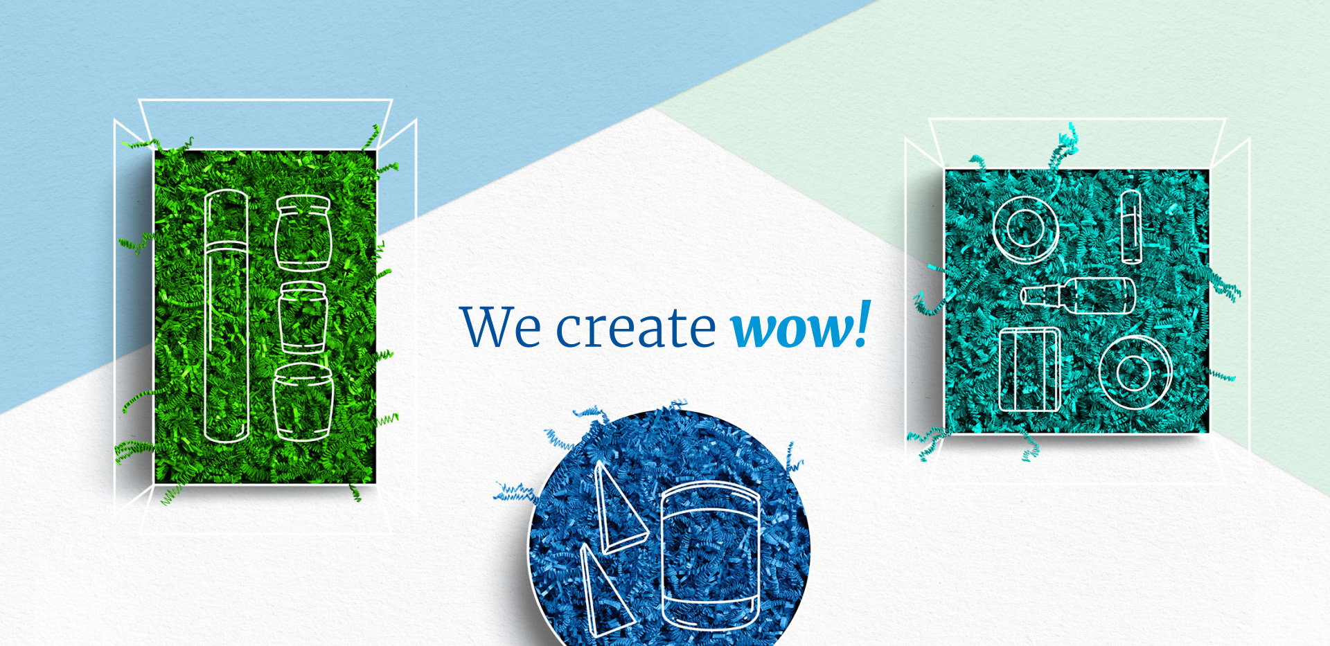
To start, we worked on discovering the perfect tone for Spring-Fill. With an audience spanning distributors, retailers and curators, this was no easy task. We had to craft a voice that was both authentic to Spring-Fill and appealing to each market. Speaking B2B with a fun flair is not commonplace in the packing industry, but it is one of the traits that makes Spring-Fill so one-of-a-kind.
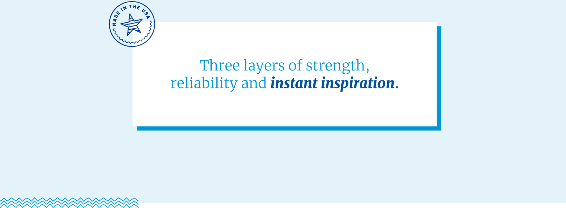
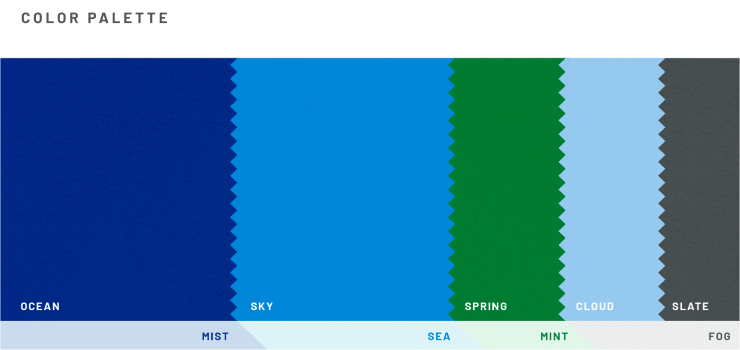
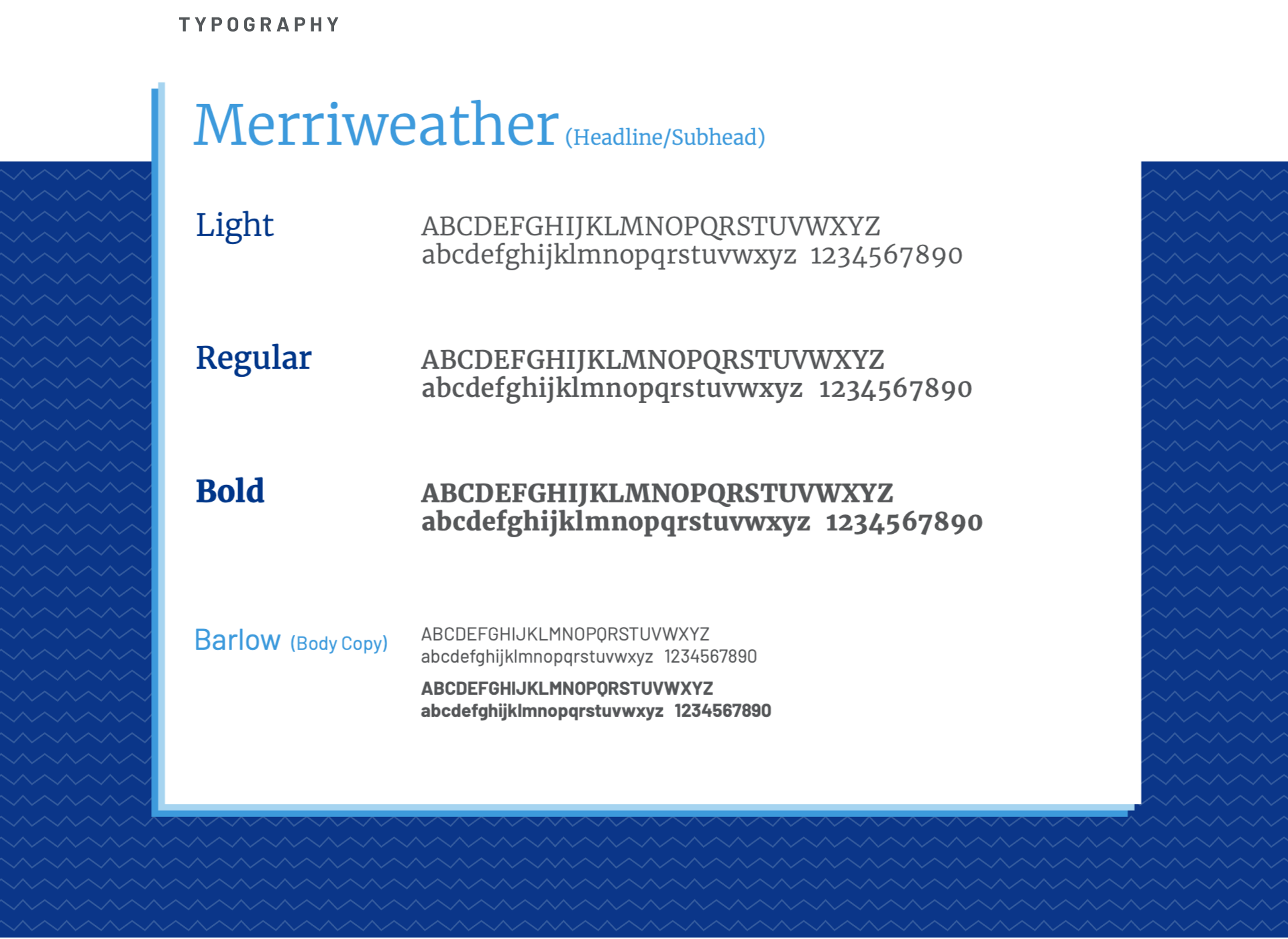
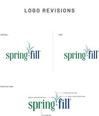
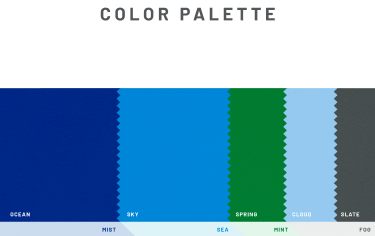
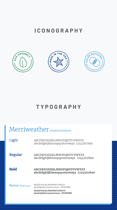
It was time to develop a visual brand that matched the fun personality of Spring-Fill. The ownership loved their logo, so after making small adjustments to the size, shape and web-friendliness, we used it as the true north for the entire brand—designating complementary colors and typography to define sturdy brand standards for their team to use going forward.
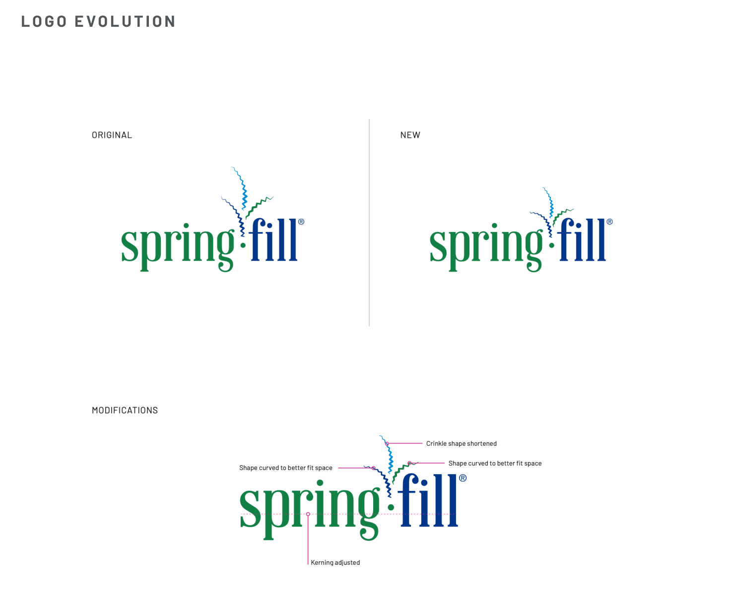

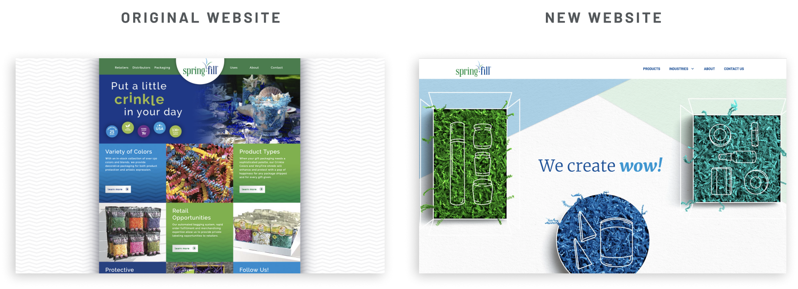
In the end, a beautiful brand and site came together. We replaced the original layout with a fresher, more easily navigable, end-to-end user experience. Colors were kept to a minimum so the backgrounds and fonts wouldn’t absorb any important information, and each image would really pop off the page.

“I cannot say enough about working with the BatesMeron team. Our initial session with them was integral to help Spring-Fill clarify what we wanted to accomplish with our new website. We also needed to explore how we wanted it to function on the web. At our weekly meetings that followed, I couldn’t contain my enthusiasm for their creativity and copywriting. The finished product exceeded our expectations, and our team takes great pride in our clear messaging and branding.”

BatesMeron sat down with the team and discovered just how fun-loving they were, making it a no-brainer for how the voice of the brand should sound. Our team toured their facilities in Northbrook, IL and saw firsthand the colorful, shimmery world of Spring-Fill Crinkle.
This product and team bring the wow factor—and we knew that needed to be the focus of all messaging and imagery to come.
To start, we worked on discovering the perfect tone for Spring-Fill. With an audience spanning distributors, retailers and curators, this was no easy task. We had to craft a voice that was both authentic to Spring-Fill and appealing to each market. Speaking B2B with a fun flair is not commonplace in the packing industry, but it is one of the traits that makes Spring-Fill so one-of-a-kind.

It was time to develop a visual brand that matched the fun personality of Spring-Fill. The ownership loved their logo, so after making small adjustments to the size, shape and web-friendliness, we used it as the true north for the entire brand—designating complementary colors and typography to define sturdy brand standards for their team to use going forward.


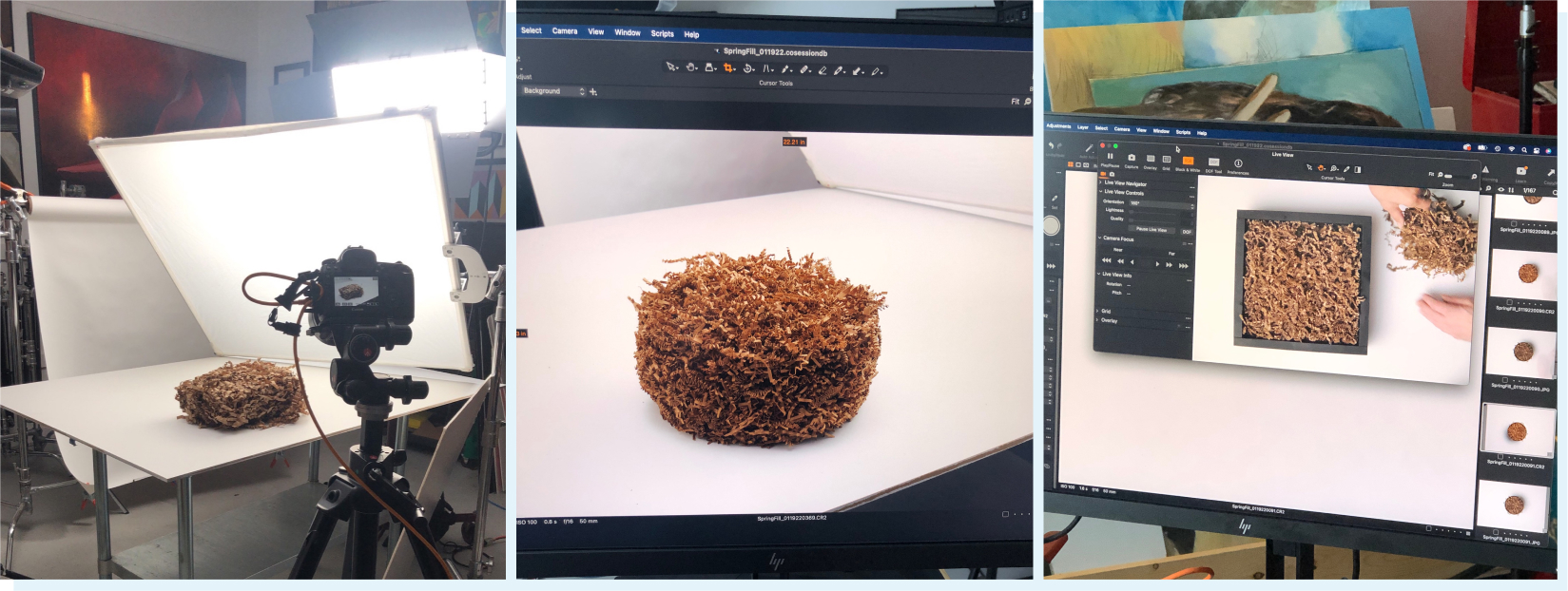
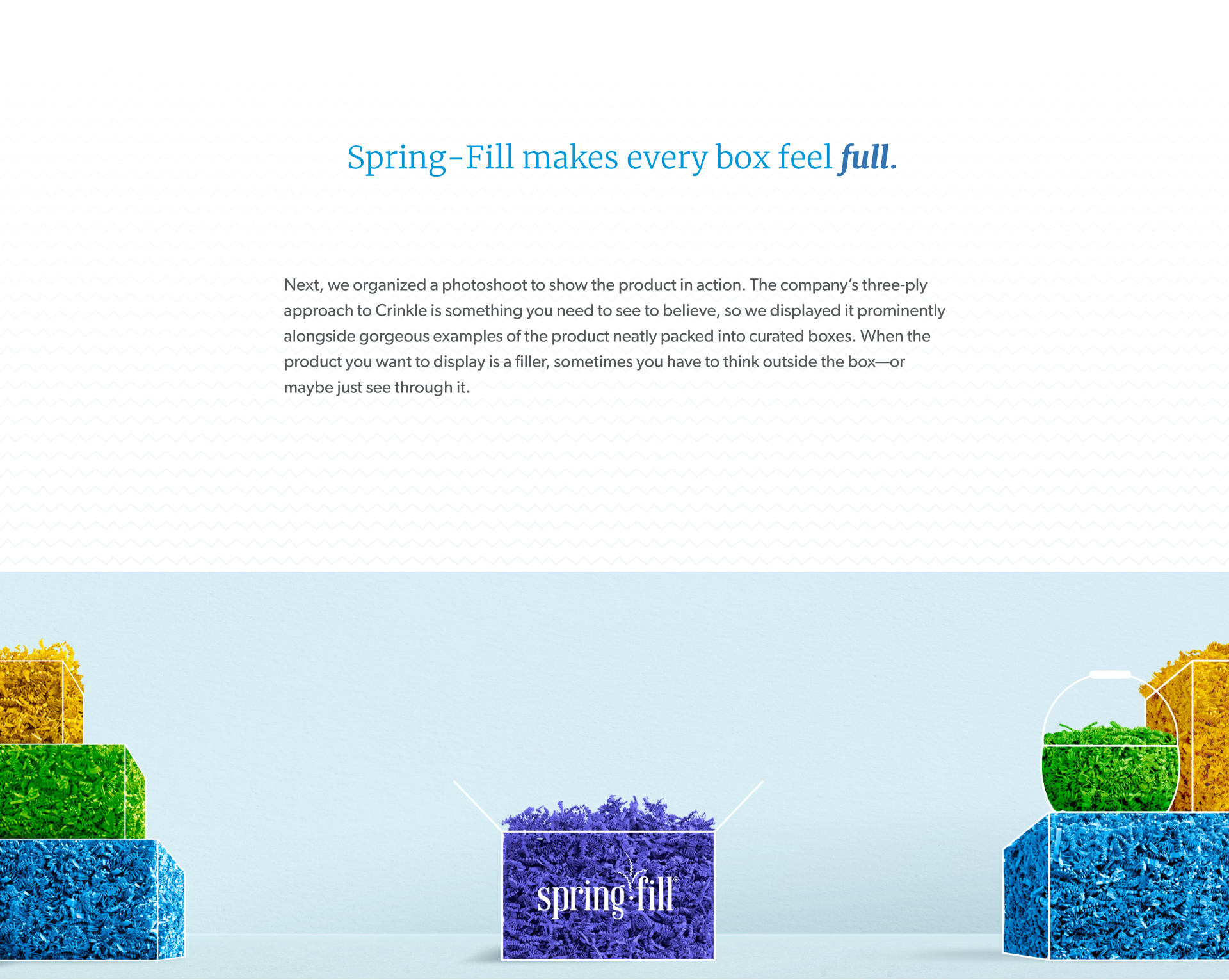
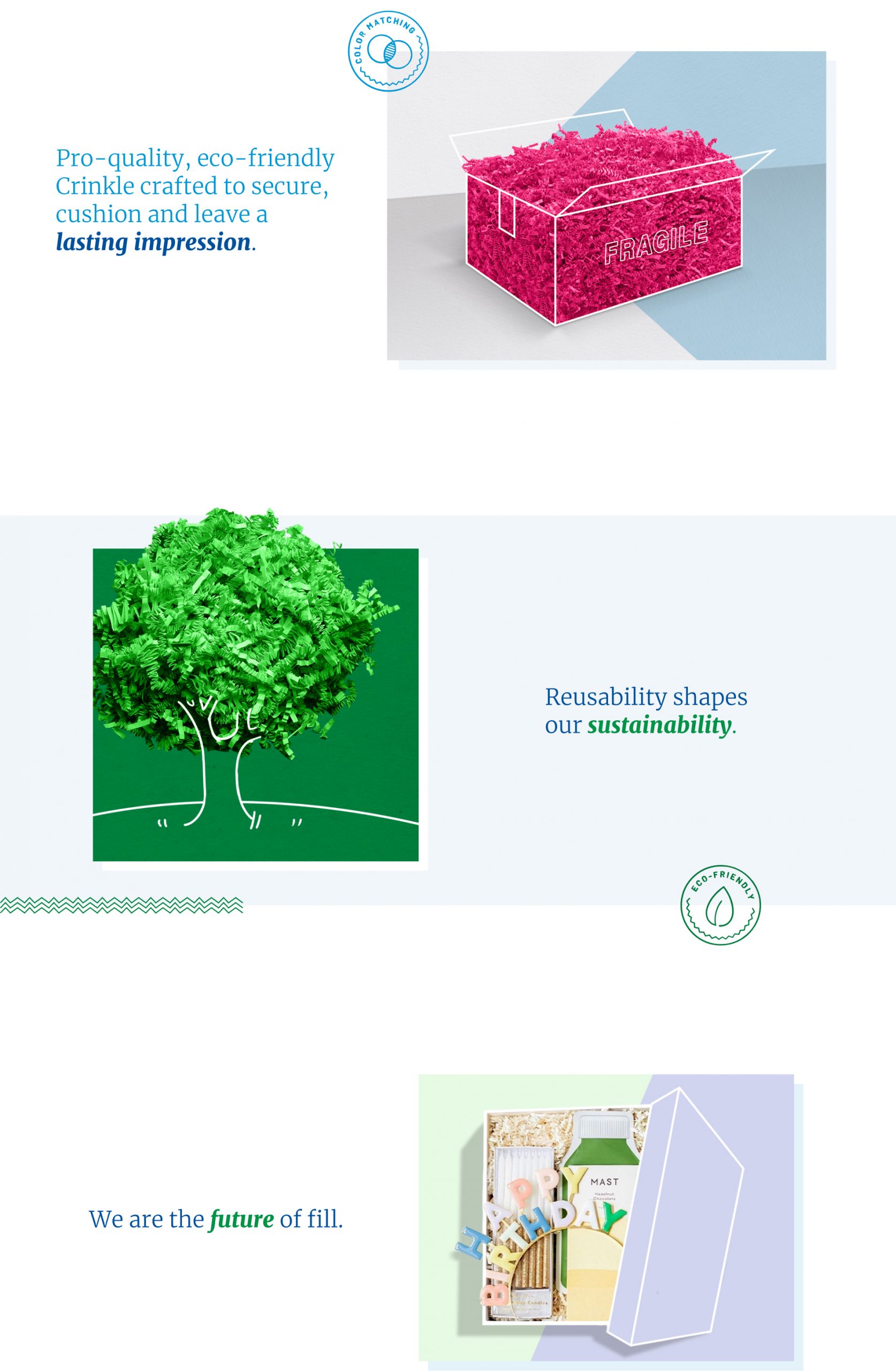
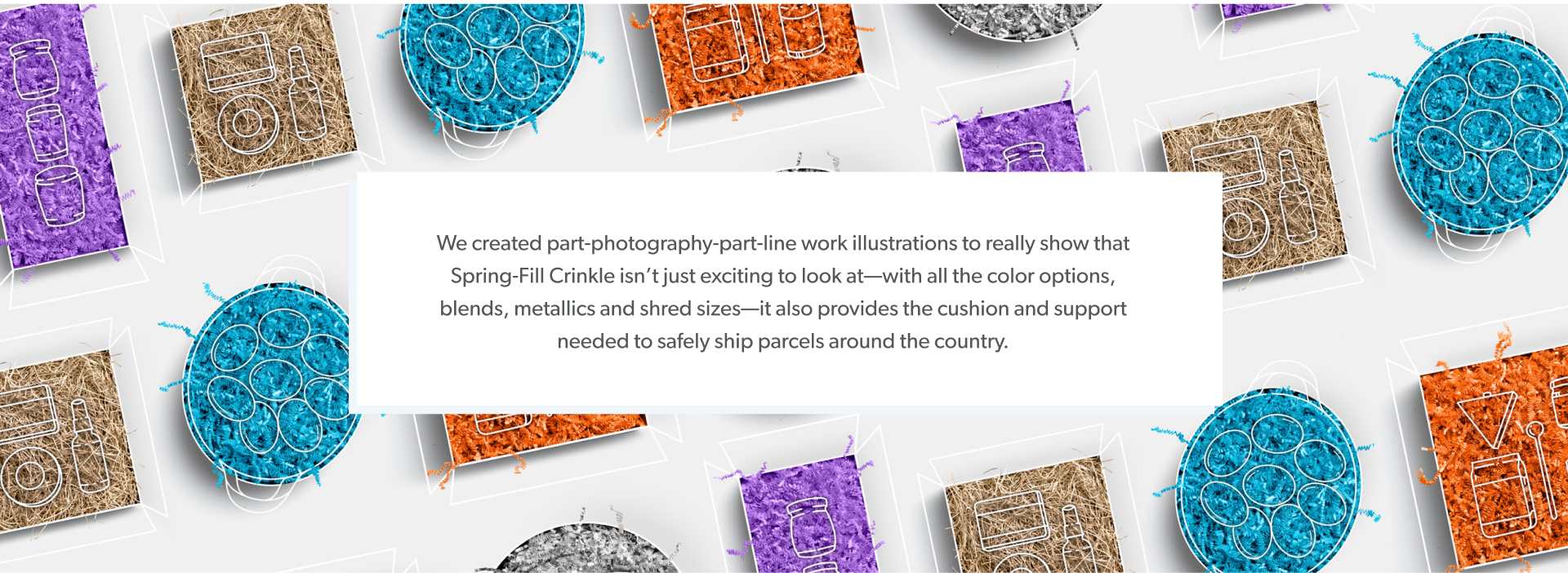
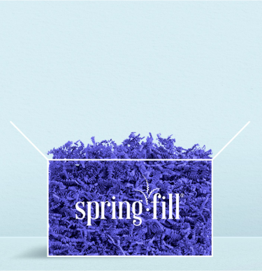
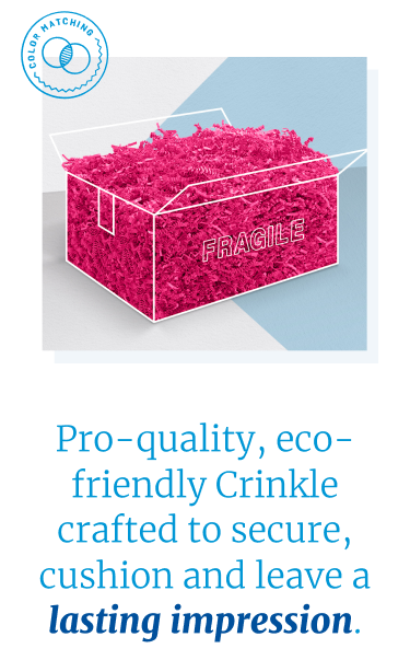
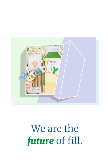
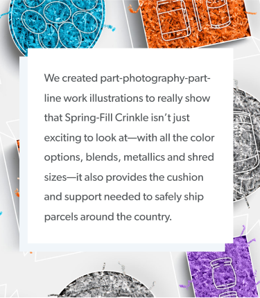
Next, we organized a photoshoot to show the product in action. The company’s three-ply approach to Crinkle is something you need to see to believe, so we displayed it prominently alongside gorgeous examples of the product neatly packed into curated boxes. When the product you want to display is a filler, sometimes you have to think outside the box—or maybe just see through it.
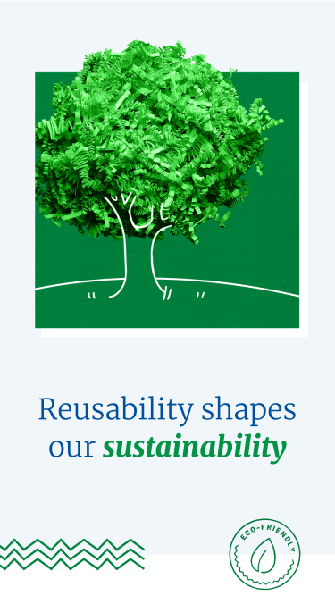
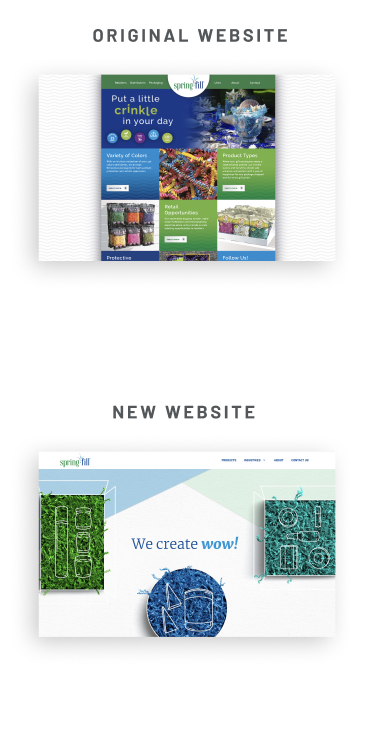
In the end, a beautiful brand and site came together. We replaced the original layout with a fresher, more easily navigable, end-to-end user experience. Colors were kept to a minimum so the backgrounds and fonts wouldn’t absorb any important information, and each image would really pop off the page.

“I cannot say enough about working with the BatesMeron team. Our initial session with them was integral to help Spring-Fill clarify what we wanted to accomplish with our new website. We also needed to explore how we wanted it to function on the web. At our weekly meetings that followed, I couldn’t contain my enthusiasm for their creativity and copywriting. The finished product exceeded our expectations, and our team takes great pride in our clear messaging and branding.”


