Antique Ads: Ghost Signs in Chicago
One of the great things about our recent move to the South Loop neighborhood of downtown Chicago—aside from the new digs themselves—is all the amazing street art and ghost signs that can be found in the area. Thanks to the vintage buildings we’re surrounded by and the artwork in the Columbia College and the Wabash Arts Corridor, a joint effort to beautify the business district we’re in, there are lots of reasons to look up.
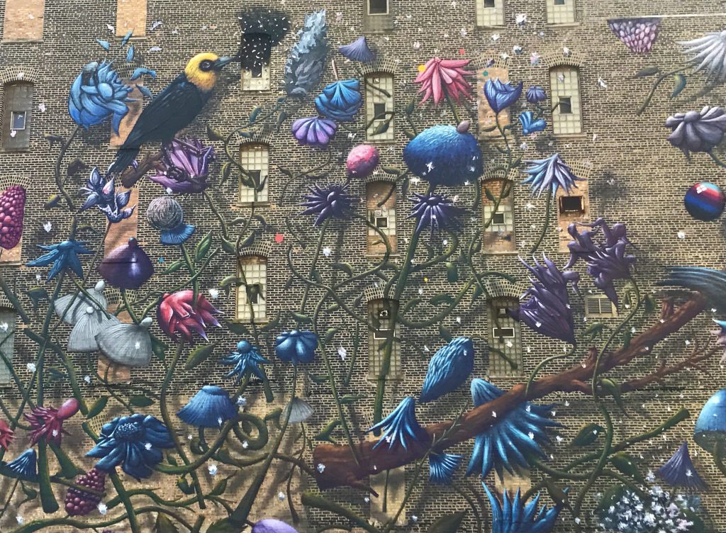
The side of our new building has an incredible mural of birds and flowers swirling around the raw brick. The mural is the work of Colin Van Der Sluijs, a painter from the Netherlands. One recent morning, while I was admiring Van Der Sluijs’ larger-than-life work, a strange detail on the side of our building caught my eye.
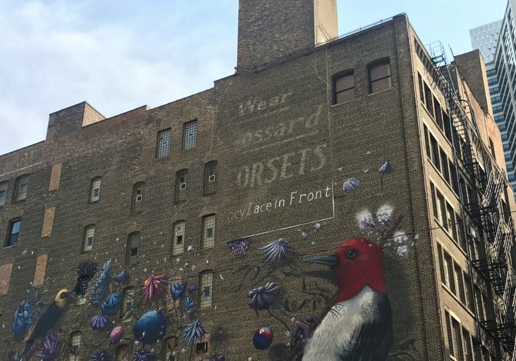
In the upper right corner I noticed a faded sign. It was hard to make out all the words, but after some inspection I deciphered “Wear Gossard Corsets – They lace in front!” Corsets?! How long has that been there? Scanning the building, I noticed a few other faded signs. How cool! I couldn’t wait to research them when I got into work.
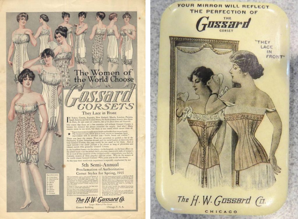
The first thing I looked up was the Gossard company. Gossard started in Chicago in 1901. At the time, they specialized in front-lacing corsets that were intended to give women more independence since they could lace them without needing a helping hand. They also claimed the front-lacing style to be better for your health. Although not as popular in the US, Gossard is still in business today and is a popular brand in the UK.
It turns out these antique ads, faded remnants of some of our country’s earliest billboards are called ghost signs. According to Wikipedia, “a ghost sign is an old hand-painted advertising sign that has been preserved on a building for an extended period of time. The sign may be kept for its nostalgic appeal, or simply indifference by the owner.”
These historical leftovers have been present on buildings since the early 20th century. Sometimes they don’t get revealed until a neighboring building is torn down. I love them because they are like a little peek into the past—not just seeing what products and companies were advertising, but also what graphic and typographic styles were popular.
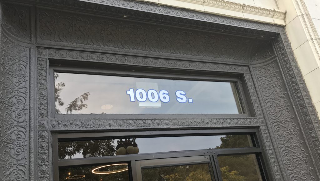
Back to our building! 1006 S. Michigan is the Lightner Building. The building itself was designed by Edmund R. Krause and built in 1906. It was originally called the Graphic Arts Building and was purchased by Otto Lightner, owner of Lightner Publishing Corporation, in 1948. “Lightner Publishing Corp.” is seen multiple times on the building.
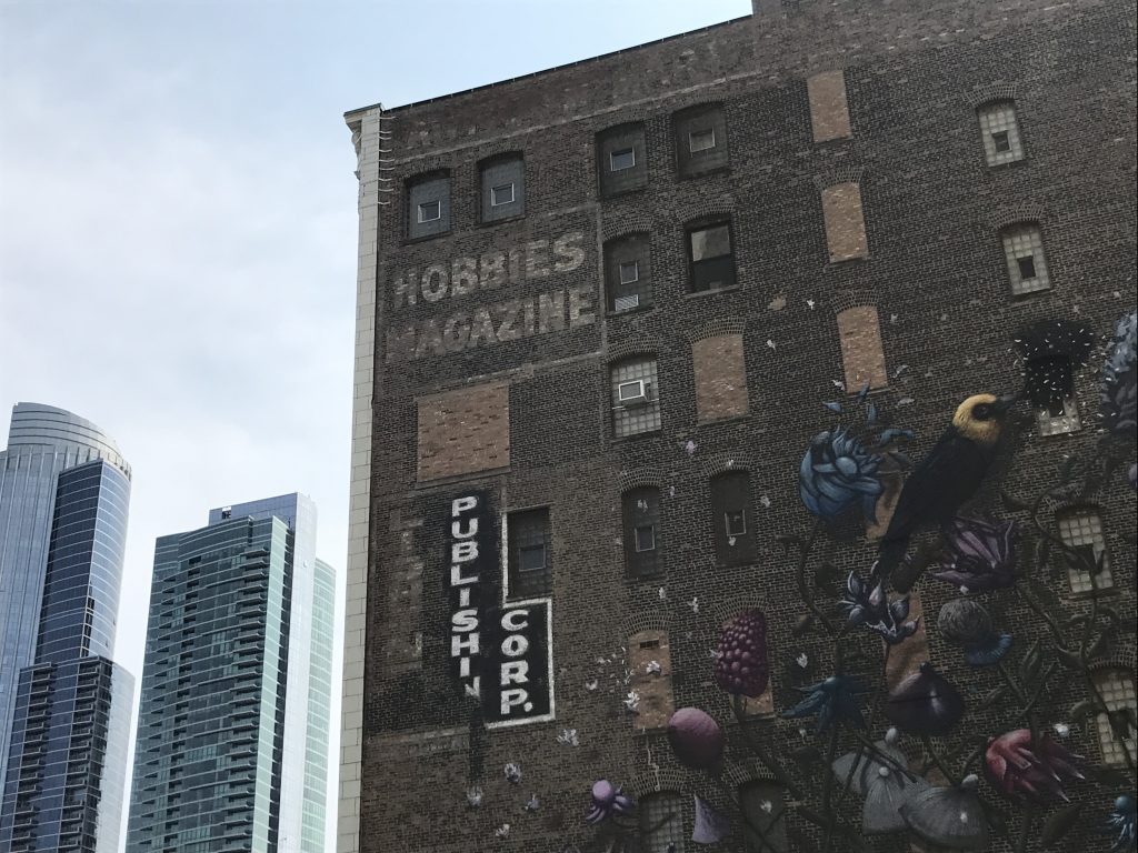
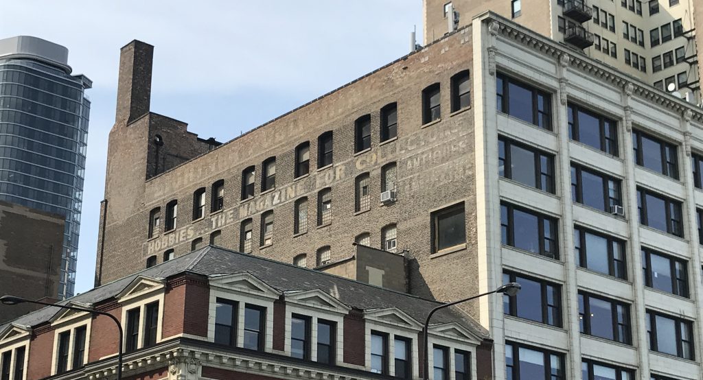
Evidence of a popular Hobbies Magazine they published in the ’40s and ’50s is visible on both the north and south side of the building. The sign on the south-facing side reads “Hobbies…The Magazine for Collectors.”
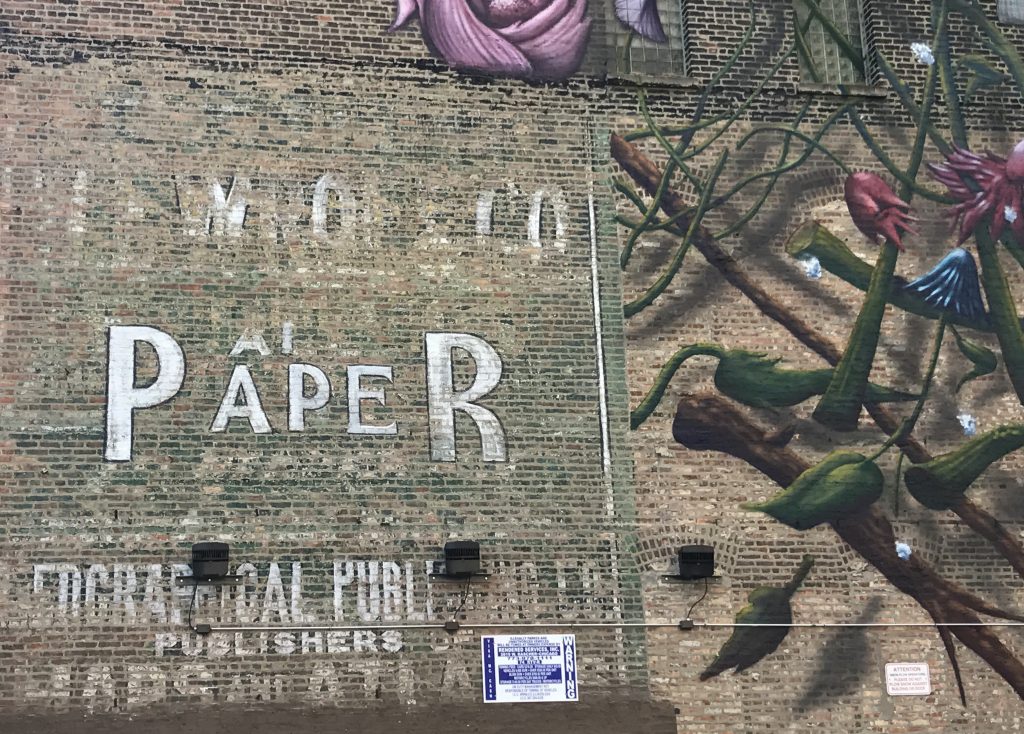
An ad for another former tenant, Geographical Publishing Company, who produced maps and atlases, can also be seen on the north side of the building.
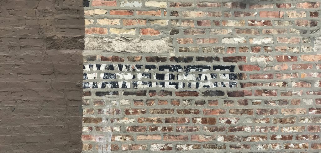
Here’s a another small remnant, a portion of a name, half covered by paint. I haven’t been able to solve the mystery of who or what it was promoting, so please tell us if you have any ideas!
I think it’s very cool to to be working in a building with such rich history, especially history that is relevant to the graphic arts! It’s even cooler too see visible evidence of these early design pioneers each day when I walk into work.
Have you spotted any ghost signs around your neighborhood lately? They’re all over Chicago, it’d be great to see ones you’ve spotted here or in your home town. Drop us a note in the comments if you have any you’d like to share.
2018 Project Vision Board
5 Tips for Aspiring Designers...& Others Alike!
New Perspective in New Orleans


