10 Famous Logos with Hidden Messages
We’ve been working on a lot of fun branding projects recently where we’ve had an opportunity to explore redesigning our clients’ existing logos. This has sparked a lot of conversation around the meaning behind a logo and what it informs the audience about the brand. I thought it would be entertaining to take a look at 10 famous logos and the hidden meaning behind each.
01 Amazon

The yellow arrow in their logo starts at the letter ‘a’ and ends at the letter ‘z’, implying that they sell everything from a to z. The arrow also represents a smile, with the arrowhead being a stylized dimple or smile line. The smile indicates the happiness people feel when they shop with Amazon.
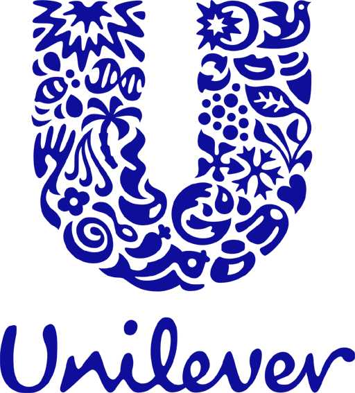
02 Unilever

Unilever makes a ton of products, and to showcase that they created a ‘U’ out of a variety of icons symbolizing some of their core products. It’s a fun way to show they have their hands in a variety of areas.
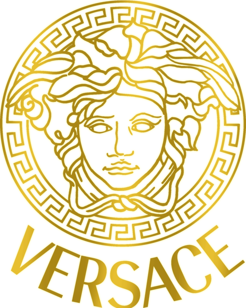
03 Versace

The Versace logo is the head of Medusa, a Greek mythological figure. The logo came from the floor of ruins in the area of Reggio Calabria that the Versace siblings played in as children. Gianni Versace chose Medusa as the logo because she made people fall in love with her and they had no way back.
04 Gillette

Gillette is razor sharp with their logo. The precise cut in the ‘G’ and ‘i’ look as though they’ve been carefully removed with an extra sharp Gillette razor.
05 Porsche

Porsche’s instantly recognizable logo features a black stallion. The logo is based on the coat of arms of the German city of Stuttgart, where the company is headquartered. The horse takes center stage because the city, which dates back to the year 950, was actually founded as a stud farm.
06 Le Tour de France

The Le Tour de France logo features two subliminal messages. The first is easy to spot and is the cyclist portrayed by the o and r in the word tour. The second message is the yellow circle which is intended to represent the stages of the race only take place during the daytime.
07 Dell

Dell has a slanting “E” in its logo representing the desire behind the founder’s wish to “turn the world on its ear”.
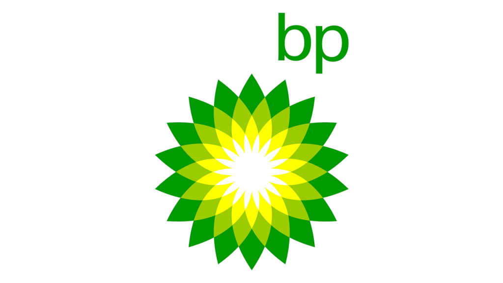
08 BP

The BP logo has its meaning hidden in the color codes chosen. The green and yellow combination is that of Helios, who is God of the Sun. It signifies all forms of energy.
09 National Geographic

The National Geographic logo is simple but strong. The rectangle in yellow depicts a door. A door opening to a sea of knowledge in science, nature, culture and reality. The use of yellow depicts the Sun that is knowledge and light.
10 Wikipedia

Wikipedia has a very smart logo that symbolizes an incomplete globe. It presents the nature of knowledge that keeps on adding and growing. The puzzles that frame the globe has symbols from different languages and countries.
Hiding meanings in a logo (and giving it more than one when possible) is part of the creative joy of creating logos. Do you have any favorite logos with hidden meanings that come to mind? Tell us about them in the comments!


