Your Brand’s Website Has Literally Never Been More Important
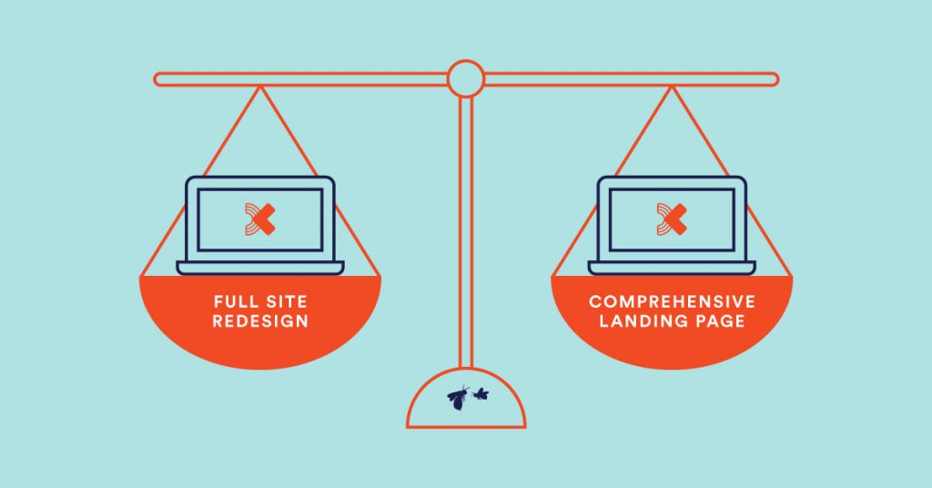
We can’t stress enough the importance of your brand’s web presence. It’s so important to us, we equate it to the front door if your brand was a house (and if you haven’t read that post of ours, you really ought to). A well designed, well organized website is one of the most essential elements of your brand’s identity, and that means no matter your budget or your team’s web capabilities, you need to ensure your site meets the standards of today’s consumers. While finding the web design route that works best for your needs may be a bit of a balancing act, it isn’t without incredible ROI to show for it.
It takes .05 seconds for users to form an opinion about your website, and 94% of website first impressions are design related. If users deem the design unattractive, 38% of them will leave your website altogether. If they do leave, 88% of them won’t come back after having a bad experience on your site.
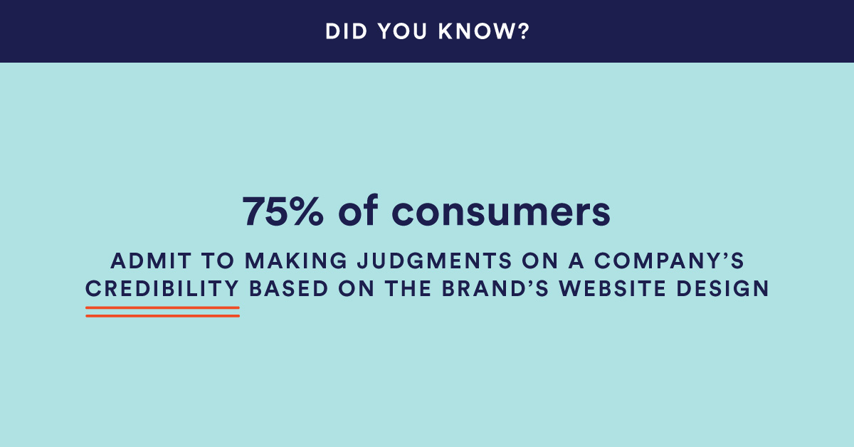
A bad experience doesn’t always mean slow loading times or hyperlinks to a 404 error—in fact, 94% of negative website feedback in one study was solely design-related. And that result isn’t the only of its kind: 75% of consumers admit to making judgments on a company’s credibility based on the brand’s website design.
TLDR; Your website is proven to tell potential customers far more about your brand, your offerings and your credibility as a business than any other tool at your disposal. Period.
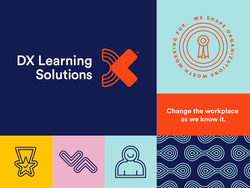
DX Learning Brand Identity (Completed in 2019)
This is the same staggering information we shared with DX Learning Solutions when we finished a rebrand with the team last year. We designed a new logo, new messaging, a new color palette, new typography, new icons, the works—a completely overhauled brand for the transformational leadership coaching organization based out of Chicago. But the brand’s website? That was a different story.
Brilliant Web Design is No Small Feat
The DX Learning website needed work, to say the least, but not for lack of DX trying. Unfortunately, their internal marketing team was spread thin and unequipped to take on a major website renovation, let alone take one on in addition to their actual full-time responsibilities.
Certain fonts didn’t carry over into design. Images, mostly stock photography, were getting cut off on mobile and tablet screens. The site map was less than intuitive, making it difficult for users to navigate information about DX, their programs and their team. Pre-rebrand remnants crept up here and there, page after page. It didn’t look like the old DX, and trust us, it didn’t look like the new DX either.
Our design-devoted hearts were breaking watching a brand we treasure take a giant misstep with its most important marketing tool. We knew what we had to do.
Grand Plans for the New DX Learning
Make no mistake, a website project is a huge undertaking for both an agency and its client. On the agency side, there are countless hours spent researching, auditing and planning, organizing and reorganizing, writing and designing, rewriting and redesigning, developing and then finally, reviewing and launching. It typically takes several months for an agency team to create a revamped website from scratch.
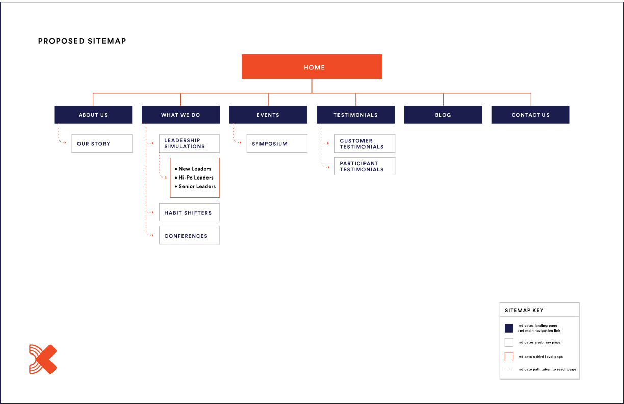
Proposed Sitemap for the Redesigned DX Website
On the client side, the process is just as involved. Meetings with the agency are regularly scheduled to review and gather information on anything from strategic planning materials, to rewritten site content, to full page designs and more. There’s also the natural stress (and not to mention the price tag) that comes with taking on a project this large. In every way, a website redesign is a very big deal for a brand—and DX’s website would be no exception.
With this is mind, we knew that simply suggesting a complete website overhaul—to a client that hadn’t planned on one, no less—was maybe, just maybe, a tall order. So, late last year, we made our pitch: three types of website redesigns, all falling within varying budgets with different degrees of complexity. This gave DX the wiggle room they needed to land on a plan that worked for their business, and the BatesMeron team was off to the races.
When Shit Hit the Fan
The project was going well. Really well. Our goals, issues, strategies and tactics (a process we call G.I.S.T.) were laid out to keep us on a strategic course. We created our new site map with reorganized content for better usability. Google Analytics were set up and an audit of all broken links, 404 errors, plug-in issues and more was conducted to get everything up to snuff for our new design.
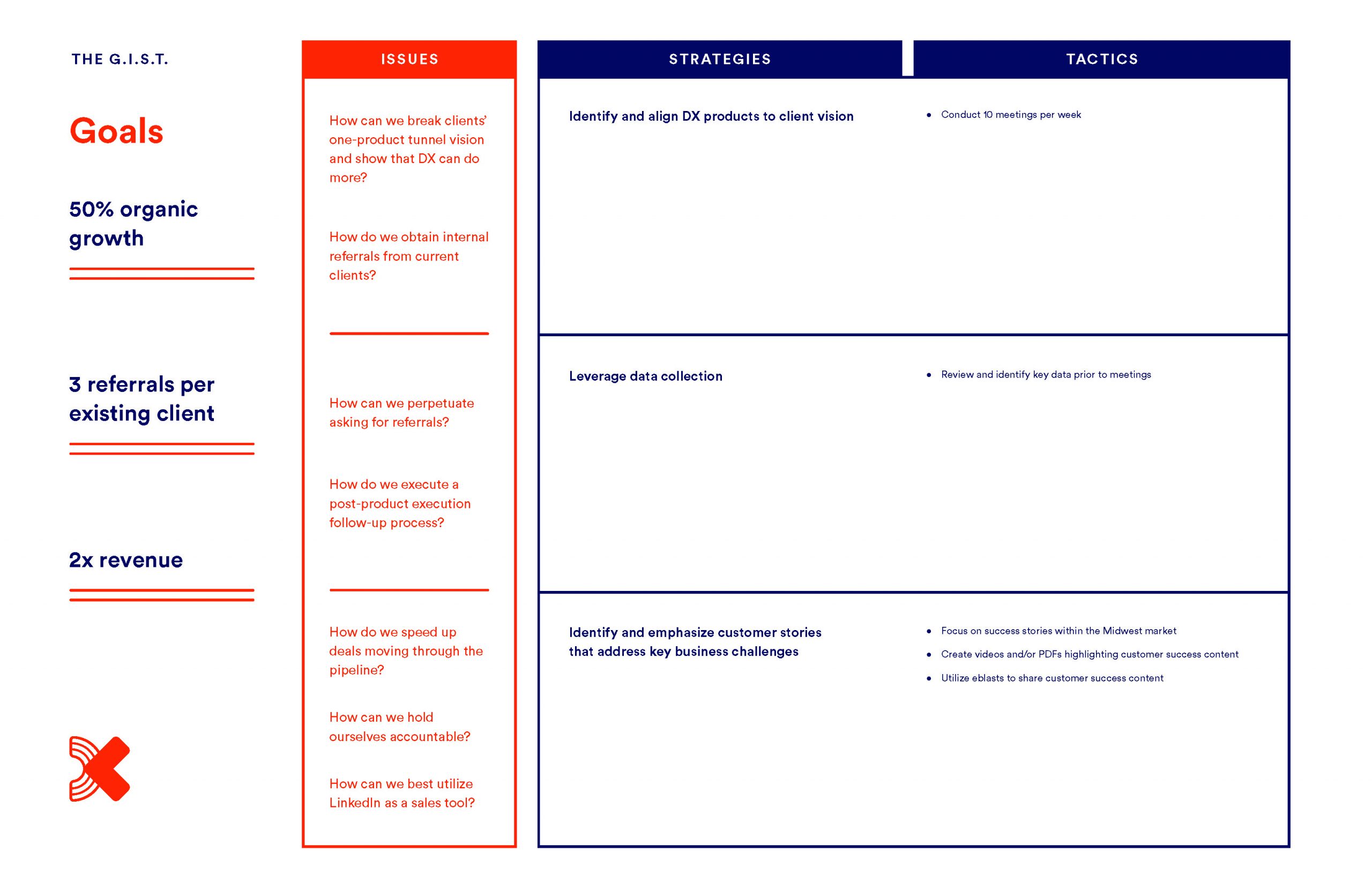
DX Learning 2020 G.I.S.T.
We were at the most central part of the next phase of the project, content creation, when the horrible thing that happened to everyone happened: coronavirus. Just before DX Learning’s fifth anniversary, on track to double their revenue in the first quarter, things went from getting better and better to getting worse and worse—not by the day, but by the hour.
It’s important to note that DX’s business model was built on live, in-person leadership programs and simulations centered around hands-on, interactive learning-by-doing (although DX was on their way to expanding into digital programs and tools, and the new website was a large part of that). Needless to say, with the spread of COVID-19, in-person, hands-on learning opportunities became nonexistent.
Alex Draper, the CEO of DX Learning, was in line to board a flight to Los Angeles for a leadership conference when he got the call. The conference was canceled, and within three days, so was everything else DX had on the calendar for the coming months. With that news, Alex called us.
Coronavirus Course Correcting
You can imagine where this is going. DX simply couldn’t prioritize a complete website overhaul when funding so badly needed to be allocated to other areas. They had us hit pause on our work, and of course we understood. We were in this together, and more than anything, we wanted to be a source of help and guidance for the DX team during these trying times. The issue, for us, became obvious.
We couldn’t continue building out a new and drastically improved, robust, head to toe website redesign. We also couldn’t let DX’s online presence (now more vital than ever with the world going remote) continue to be put to shame with its existing sub-par look. And while DX was already hard at work developing online offerings, they would now need those offerings much sooner to cater to a workforce working from home.
Our solution lied right in the middle: a temporary, cost-effective landing page, designed with the new DX branding, but far less involved than a full website makeover. With approval from the DX team, we sprang into action, ready to do whatever it took to get the landing page up and running as quickly as possible.
Designing (& Writing & Programming) Against the Clock
First things first, we had to assess the necessities. The new landing page may be just that, a page, but it had some big shoes to fill. From this one page, we needed to give potential DX clients an overview of the brand, an understanding of their services, proof points of success, the ability to connect with their team and access to information about upcoming news and events. Like we said, quite a lot for one page.
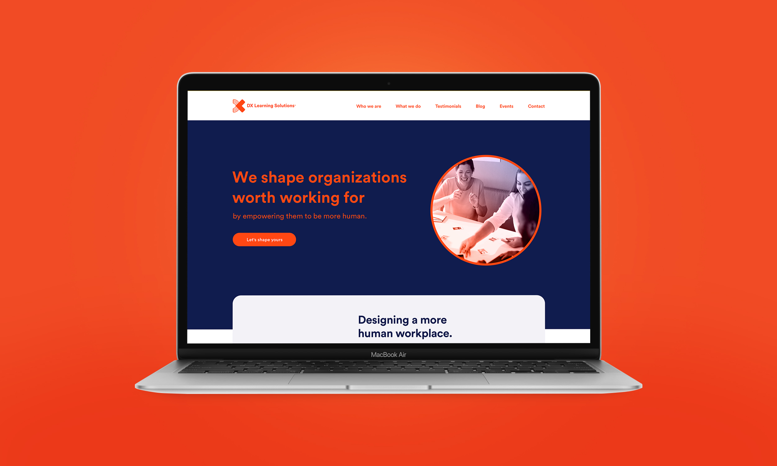
Homepage of the New DX Learning Landing Page
Using a content planner, we kept track of our must-haves and arranged them accordingly before moving into writing. The brand voice was pulled through to messaging that encompasses who DX is and what DX does, while link outs to the DX Learning brand brochure and sell sheets provide more detail on the specifics of each program offered.
As for event and news information, DX established their own Eventbrite page and external blog linking from the navigation on the page. Everything else was made easily accessible from the navigation menu with anchor points leading to corresponding sections. Moving down the page, the best of the best client testimonials were pulled from the existing site into our new design. In addition, a slider of DX client logos, accompanied by a statistic-filled headline, speaks to the team’s experience.
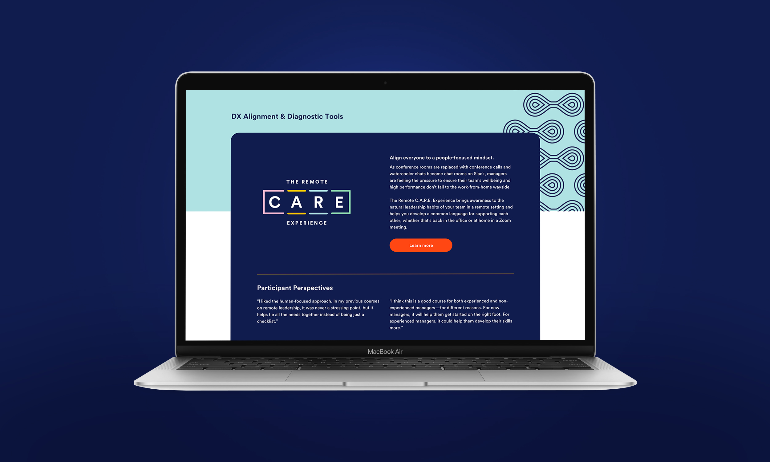
The Remote C.A.R.E. Experience
We also made sure to give the star treatment to the Remote C.A.R.E. Experience, the new remote leadership alignment tool that DX quickly finished development on to address the changing nature of our world’s workforce. The Remote C.A.R.E. Experience takes center stage as the most prominent program offered on the site, with two testimonials to back it up.
Full DX Learning Landing Page
Lastly, both above the fold and at the bottom of the page, clear calls to action to contact DX Learning are prominent, with information about DX’s location, phone number and mailing list located in the footer. A yellow hello bar at the top of the page lets users know a bigger, better DX website is still on the way, and of course, every element was crafted with the new DX Learning branding in mind.
Easy? No. Worth It? Definitely.
In just under a month, the landing page was pitched, planned, strategized, written, designed, developed, reviewed and launched (Yes, we all took a much-needed nap when our work was done).
“I cannot thank you enough for the quality, speed and passion you put into this,” expressed Alex when our work was complete. “At a time when we needed to look good, within a budget, you exceeded my expectations and laid the groundwork for an awesome website, with a short-term solution that speaks to who we are and how we can help. Thanks for your partnership.”
Was it the comprehensive and interactive DX website redesign we envisioned from the start? No. Was it the project timeline we always dreamed of? Also no. But did it solve an immediate issue for our client quickly, effectively and beautifully on-brand when they needed our help most? Absolutely. We’d do it again in a heartbeat—and so would DX.
“BatesMeron completely changed the DX website with the landing page. Prior to the landing page, aside from technical fixes, there wasn’t much surface level improvement,” added DX Director of Sales Support & Marketing Emily Markanich. “After the landing page, I can say that DX has benefited greatly and will continue to thanks to the change in how well it aligns with our brand and helps our website come off as much more professional and high-tech.”
It all comes back to our original point, way back when we first made our web pitch to DX Learning: Your website matters, and coronavirus or not, it’s only going to matter more and more as the time goes on.
And if any of this made you take pause about your own website…well, you know what we’d suggest.
Dragon Totem
Lessons from a BatesMeron Design Intern
My Unconditional Love for Our Small Business Community
