Worldly Design Inspiration
Our tendency to seek inspiration from the same places can be what gets us stuck in creative ruts. If you read my last blog post, you may remember that I traveled around Asia just a few months ago. Aside from the amazing sights, one thing that I took away from the trip was the design inspirations that I find myself referencing when I’ve hit my own creative roadblock. The world is such a large place, there is a lot out there that can influence what we do as designers and marketers in fresh and creative ways.
While in Asia, specifically Tokyo, I was drawn to the style of art and design that was on display all around me. The color palettes and smart, minimal layouts were so creatively motivating. So much so that in order to stimulate my right brain on projects at BatesMeron I’ve started looking East often in the design process for inspiration.
Japanese graphic design trends are broad and expressive. Elements, looks and feels that I see repeated range from meticulously streamlined to bold and exaggerated. There’s no shortage of inspiration when looking here for new techniques and ideas.


YamanoteYamanote Poster Project
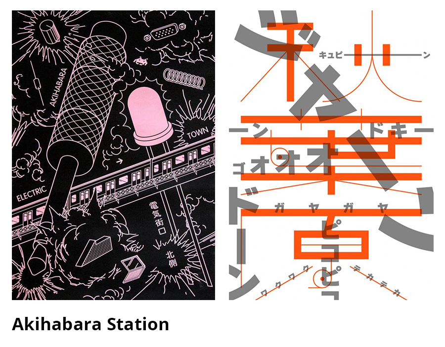
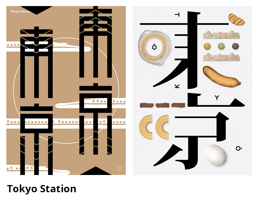
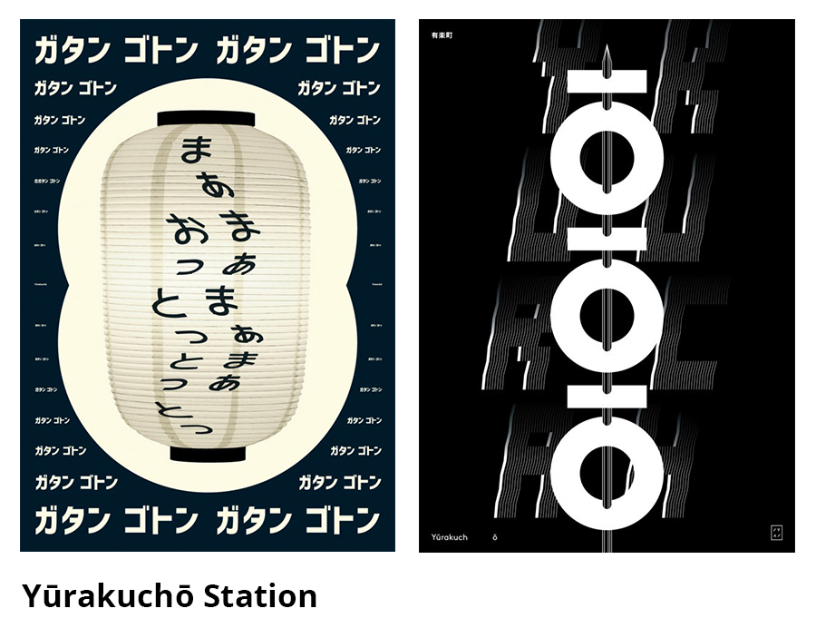
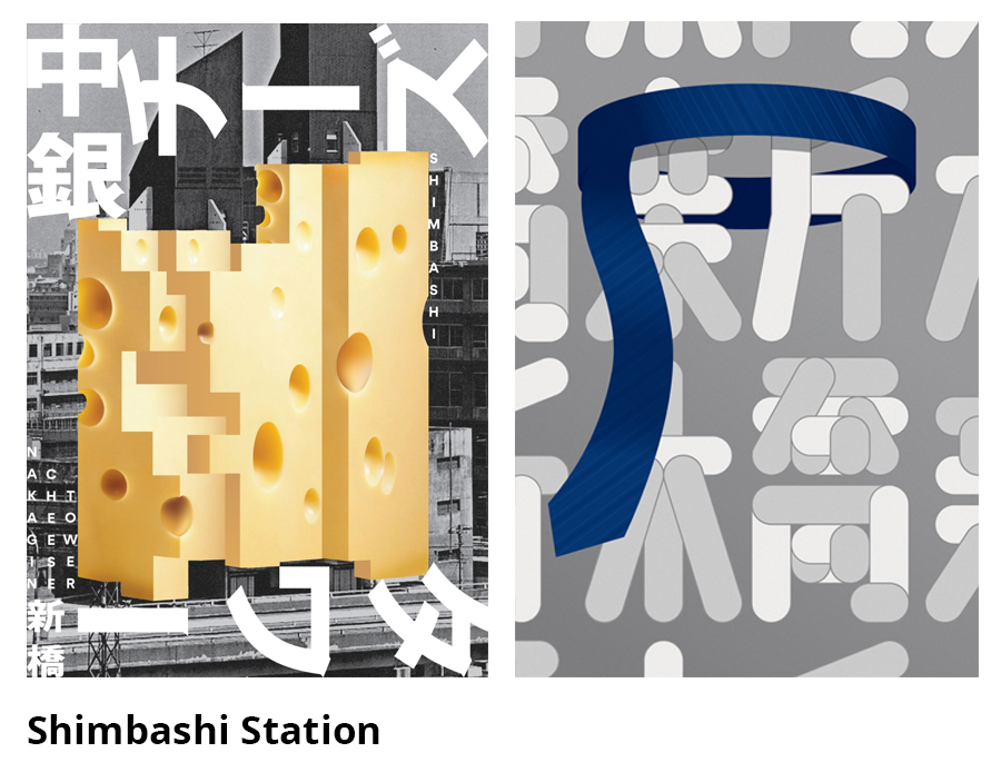
Aside from just being beautiful to look at, these Japanese designs, as with all great designs, depict a clear message. A great example of this can be seen if you look at the YamanoteYamanote Poster Project, where two Tokyo-based Swiss graphic designers each create neighborhood-inspired posters that present all 29 major train stations on Tokyo’s Yamanote subway line.

The Yamanote line is one of Tokyo’s most vital transport arteries. This project was designed to draw more attention to all 29 stations with the build-up to the 2020 Olympics when they will be hosts to millions. So far, there have been 11 designed but I can’t wait to keep checking back over the course of the coming years to see what the others will look like. Here are a few of my favorites, but you can see all the work created so far on the project’s website.
Let’s Get Prepared
A central challenge to many design projects is the challenge of visualizing how to get the message across while at the same time keeping the viewer interested. What if I came to you and said I needed you to create a manual that contains useful information to be “prepared” in the event of an emergency. Pretty boring stuff huh? How do you make something like that interesting and different? Well, a company in Tokyo took on this task and what they came up with is pretty genius.

At first glance it’s fun and instantly grabs your attention. But that’s not what’s genius. What is genius is the way the content is presented. They took cues from everyday life for the colors by using alarming yellow and diagonal strips, best known for hazard signs– and how adorable is the little rhino illustration? It’s a great example of how to think outside of the box to create something people will hold on to.


Has the imagery here inspired you? Did I pique your interest in exploring other cultures and countries to keep your designs fresh? Are there any particular countries you admire for their design aesthetic? Tell us about your favorite places around the world for finding inspiration in the comments.
Skill Up for the New Year
The Proof is in the Portfolio: The Work that Came in Clutch in 2018
6 Questions for Leah Cho


