The World Series: Logos from Our Favorite Pastime
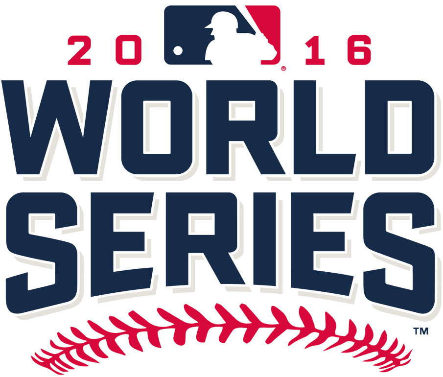 Since the World Series is underway (and my team, the St. Louis Cardinals, is sitting this year out), I thought I’d use my time wisely and look into the history of World Series logos. Thanks to sportslogos.net, I was able to track them all down and share them with you here. But before I do, I want to throw a huge shout out the Chicago Cubs and their organization. I may be a Cardinals fan, but I couldn’t be happier for the Cubs and their die-hard fans. 108 years is a long time to wait for anything. This town deserves a North-side champion. Fly the W! Now back to the real reason you are here, logo talk.
While the first modern World Series was played in 1903, the earliest logo I could track down is from the 1974 series. From what I can tell, it appears that there have been a few trends that can be found in the logo designs.
THE ’70s

When looking at these earlier logos you can see a very strong correlation with period-specific typography. Unlike the World Series logos of late, these all are very unrelated to one another.
Aside from the ’76 logo it looks like all they did was just pick a font, slap on a TM and call it a day.
THE ’80s

Since I was born in ’84, the ‘80s were kind of a blur to me (just kidding). The reason for the blur is because the 80’s only saw two logos the whole decade. (above and below) From 1980’s design all the way to ’86, the only change was the year. Literally just the year!

There was a major change in direction with the ’87 logo design. However, the stagnant design trend was continued through to the ’90s as well.
THE ’90s

In ’92, the logo went under a minor league change (see what I did there??) by adding an image of a globe and adjusting the colors slightly, veering away from the basic colors that are associated with American baseball throughout history.
The ’97 and ’98 logos aren’t really even worth discussing. They just added some perspective from the early ‘90s logos, which just ended up making it hard to read. If you really want to see them you can here.
MODERN SERIES

This was the age of transitioning for the World Series logos. As you can see these logos are much more modern than years past. They kept the globe but incorporated a ball that appears to be orbiting. I can appreciate these logos more than previous years because you can tell that some real effort went into them. However, there can be an argument made for them being over designed.
CORPORATE SERIES

Hello corporate influences! These logos have completely gone away from the idea that this is for a sporting event. These logos all share this modern tech company typographic trend, and if it weren’t for the MLB logo (which is mandatory) viewers could easily be confused as to what this logo is actually meant for.
FALL CLASSIC

This brings us to the introduction of the “Fall Classic” trend, which brought back traditional baseball elements mixed with modern design. The color palette also went through a transition by using more fall colors to make the connection with “Fall Classic.” The one thing I am not sold on is the use of leaves. I get that they were trying to drive home the theme but I really don’t think they are necessary, especially in the 2011 version. Also, look at the colors they chose for the MLB logo—can someone say graphic standards violation?
PRESENT DAY

And here we are with what is, in my option, the best looking World Series logo trends. You can see that they went away from the leaves, which makes the logo immensely better. They also seem to settle on a color scheme. This helps build recognition from year to year.
So as you can see the World Series logos have gone through quite the identity crisis throughout the years. Do you have a favorite year or trend? Let us know.
2018 Project Vision Board
Do You Even Email Bro? Tips on Better Email Marketing
6 Questions for: Kai Ranabargar
