Trading Technologies – Principle Posters
We’ve collaborated with Trading Technologies since 2016 to concept, draw, design and develop an ongoing series of limited-edition posters that illustrate each of the company’s four core principles. In 2020, that process took us to a whole new world.
Some brands have values, and others embrace them in full force.
Fintech innovator Trading Technologies is one of the latter. Dubbed the company’s four principles, these values are central to how TT navigates its industry, its customer relationships and its internal culture. These aren’t merely talking points employees say—they’re deep-seeded beliefs in how the TT team lives and works. So much so, that we annually team up for a series of posters that creatively breathe new life into each of the brand’s four fundamental phrases.
SERVICES: brand Collateral / Illustration / internal Marketing


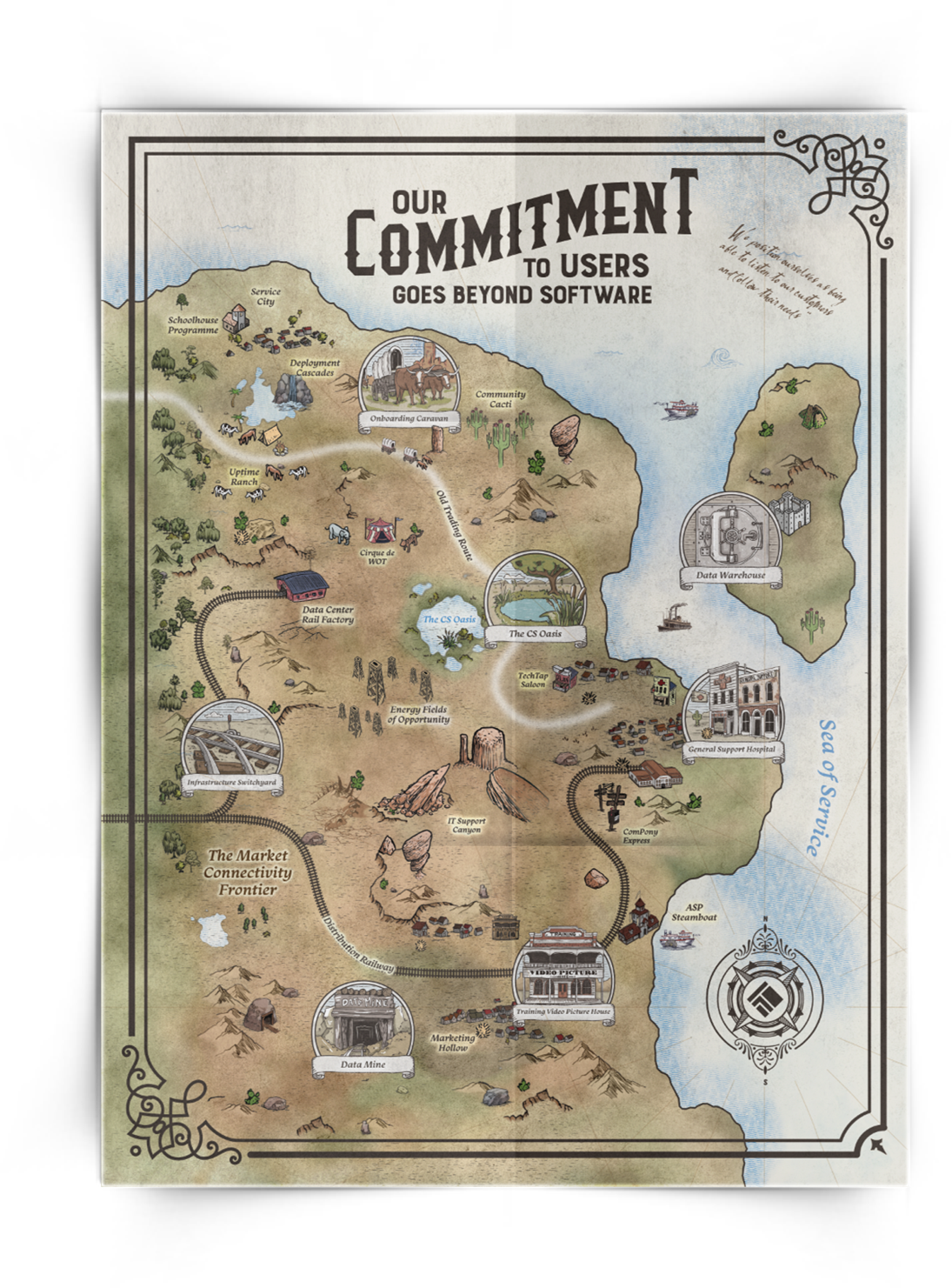
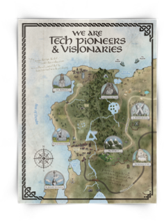
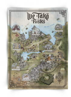
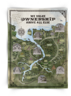
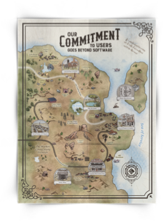
We are tech pioneers and visionaries. We take risks. We value ownership above all else. Our commitment to users goes beyond software.
The same four principles, visualized in a completely different way every year. In 2016, it was a retro-futuristic exploration into outer space. In 2017, we came back down to earth to flesh out four iconic TT locations into vintage travel posters. 2018 saw a shift to photography, with neon treatment and subtle brand easter eggs in every image. And for 2019, our blueprint designs lent a technical approach to company patents and milestones.
But for 2020, we were presented with our biggest challenge yet: Elevating graphic design principle posters into fine art maps that tell the visual story of TT’s history.
But for 2020, we were presented with our biggest challenge yet: Elevating graphic design principle posters into fine art maps that tell the visual story of TT’s history.
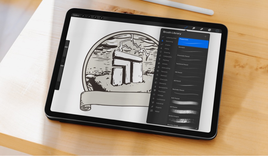
Our first order of business: Exploring as many avenues as possible to bring to life a map-inspired principle poster series. We dabbled in ancient celestial maps, sea charts, transportation grids and even topographic and heat maps—but the TT team was most drawn to our inspiration surrounding layered and terrain maps. We pulled that inspiration through to two wildly different, equally creative concepts for their team to choose from.




“One concept completely reimagined TT as a mythical land with Nordic embellishments, fonts and callouts inspired by actual TT places, people and events. The other was an entirely different approach: A three-dimensional layout inspired by museum wayfinding maps that turned iconic TT brand elements into actual art installations.”
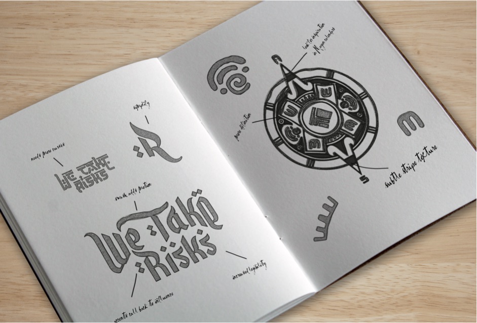
One thing both concepts had in common? The longer a TT team member gazed upon them, the more hidden details, inside jokes and fun surprises they would uncover.
One thing both concepts had in common? The longer a TT team member gazed upon them, the more hidden details, inside jokes and fun surprises they would uncover.
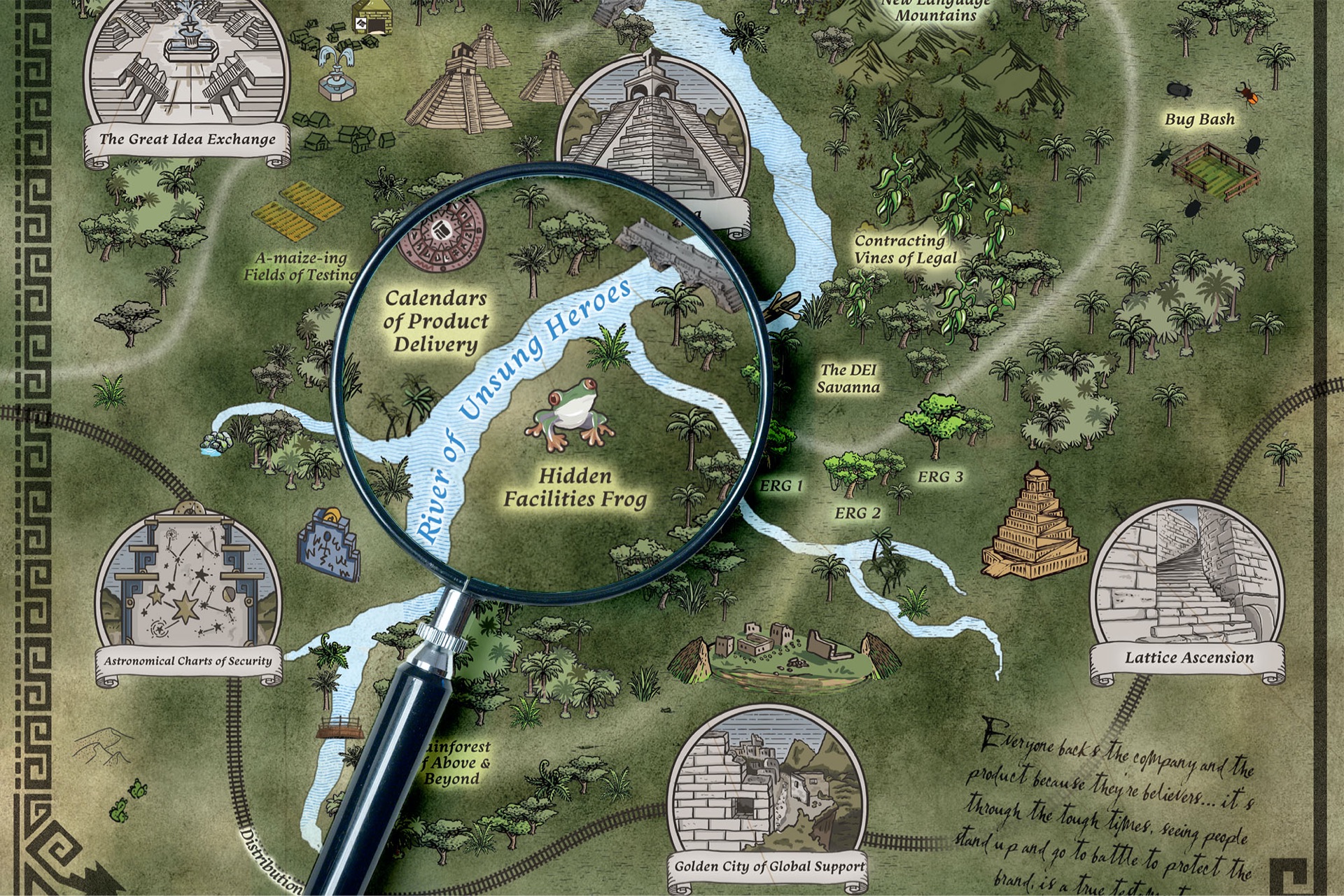
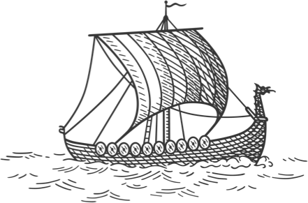

After much deliberation, the team at TT decided the concept inspired by ancient terrain maps would be 2020’s finalist—but they were sure to have us hold on to our other design for a project down the road.
From there, it was on us to pull through the chosen concept to every poster and every principle in a way that was thoughtful, cohesive and most importantly, visually captivating.
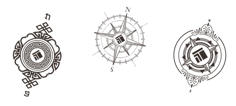


“We scoured through years of TT’s history, awards, milestones and employee interviews to pull out pieces that would tell the story of their team as tech pioneers and visionaries. Now, we needed to dig even deeper into the brand to build on those stories through the lens of the other three principles.”
Leaning on the TT team’s tribal knowledge of their industry, history and countless interviews with employees, we got to work matching brand elements and highlights with the best corresponding principle.
It wasn’t just the story that evolved from poster to poster. While our first design was Nordic-inspired, the remaining three would span inspiration from Feudal Japan, the South American rainforest and the Wild West.
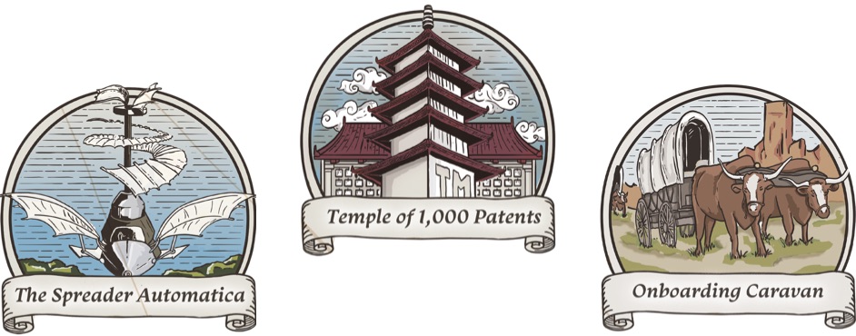
Using a consistent landmass across all four posters, we seamlessly transitioned from each region: A flat coastal territory melds into a rocky plain of mountains, which then turns into a lush forest and finally into a vast desert. Across each, varying font styles and geographic landmarks keep the posters distinct, while our consistent illustration style anchors them in the same mythical world.
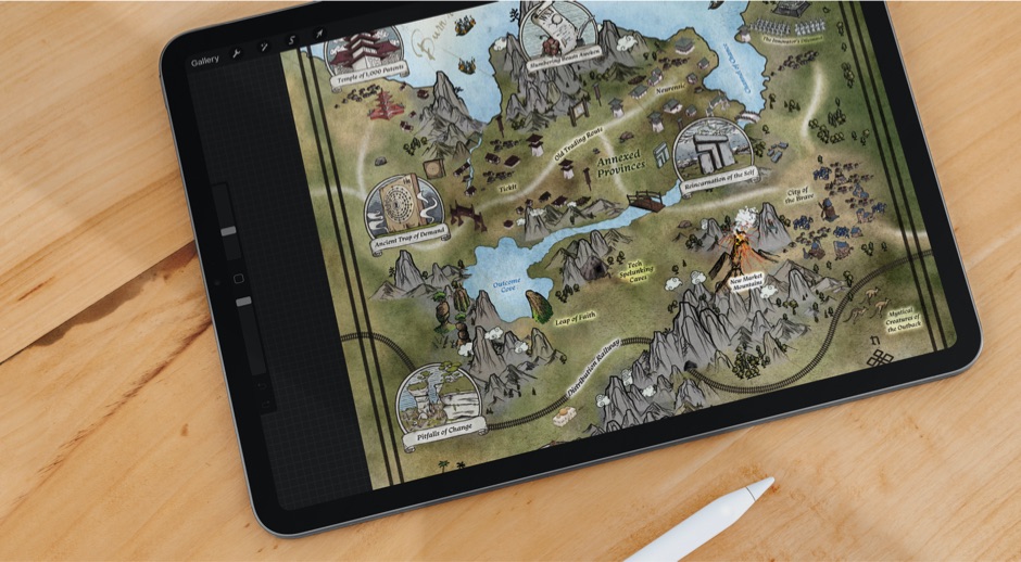
Together, all four posters form one continuous map: A fictitious telling of the lay of TT’s land that spans four distinct regions and eras from our own reality.
Together, all four posters form one continuous map: A fictitious telling of the lay of TT’s land that spans four distinct regions and eras from our own reality.
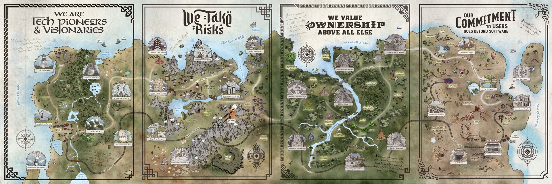
Just as the posters encompass a diverse landscape of our own artistic creation, each also encompasses the breadth of culture, talent, technical aptitude and rich history that TT is known for across its industry.
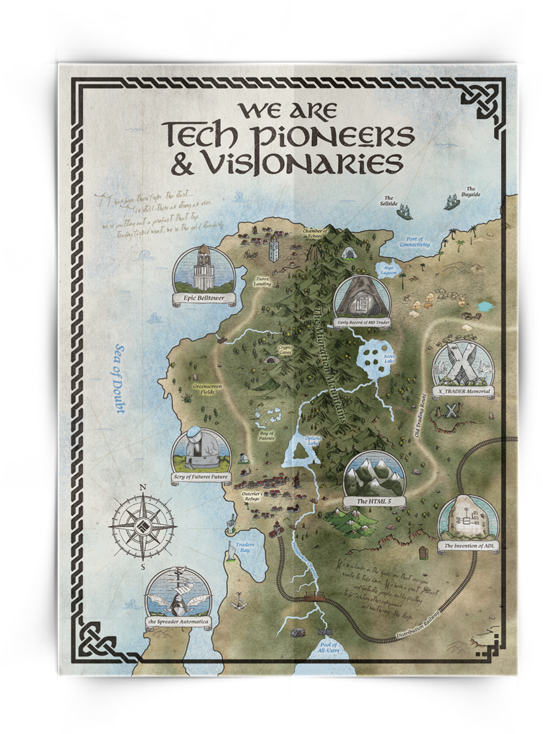
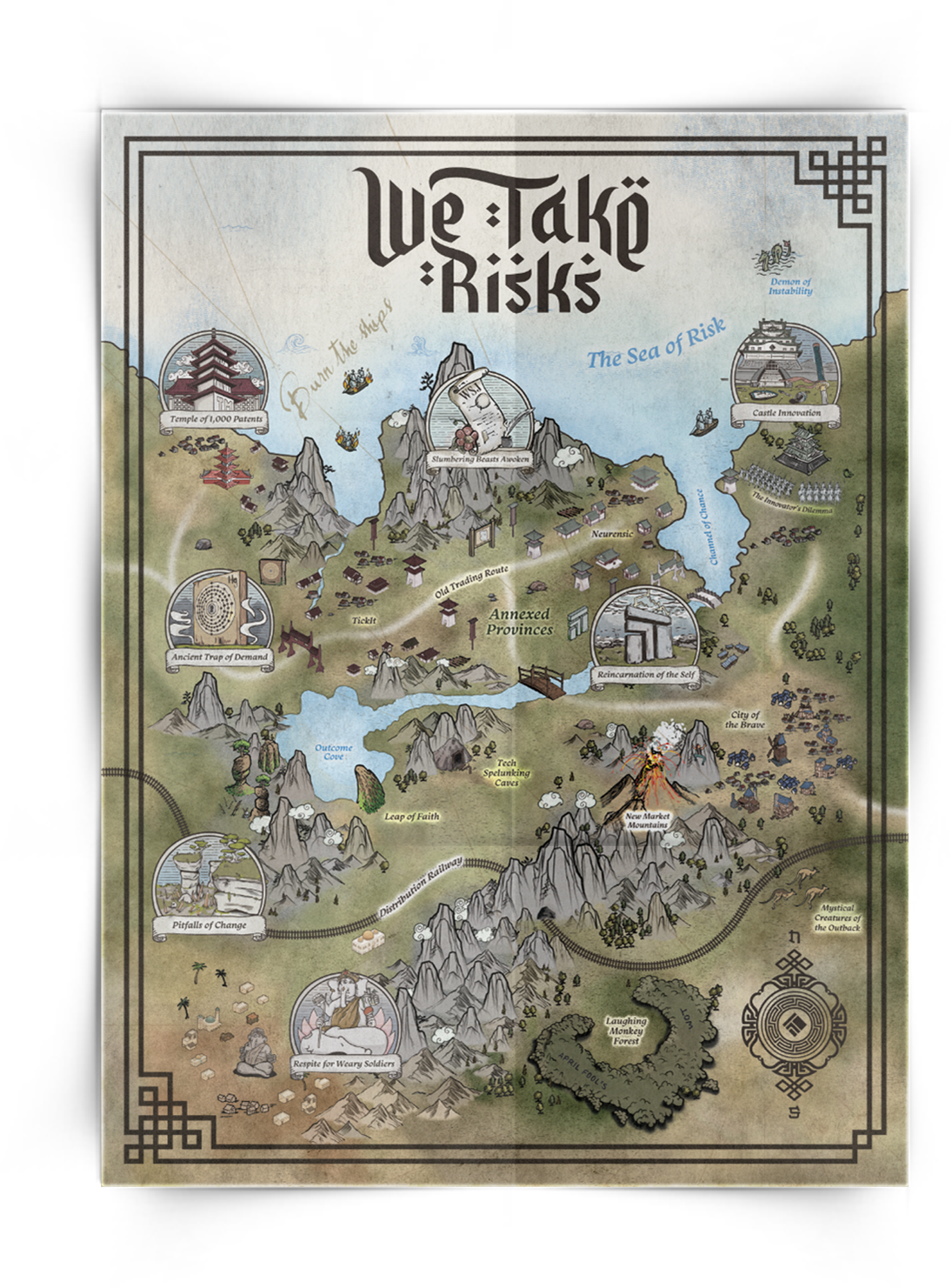
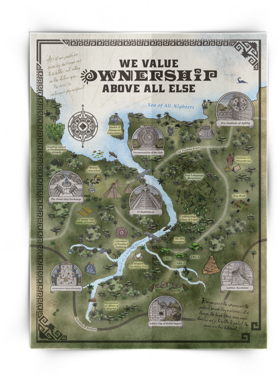

“Every year, BatesMeron exceeds our expectations and impresses with their creative work. It’s been a great relationship. The office is delighted with the environment we’re creating through their work.”


