Parkonect – Branding, Marketing & Website
The future of parking is in the cloud.
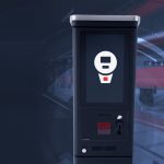
Lucky for the team at Parkonect, they’re already there. Founded in 2011 by an asset owner looking to solve challenges in his own garage, Parkonect was built by and for parking operators and managers to help maximize profit, fill spaces and create the most frictionless parking experience for customers. A decade later, Parkonect stands alone as a parking access and revenue control system (PARCS) truly built in the cloud, enabling third-party integrations, on-the-fly updates and a real-time dashboard of analytics to drive revenue. The brand’s highly advanced hardware and software deserved an identity and website representative of their unparalleled parking solutions.
SERVICES: brand messaging / visual identity / brand collateral / website / ongoing marketing

When we dived into our discovery session, it wasn’t tough to pinpoint Parkonect’s major differentiators. A fully cloud-based parking platform enabling instant over-the-air updates. The most third-party app integrations in the industry. Sleek hardware equipped with frictionless technology for ease of entry, exit and payment. And a suite of add-on solutions to customize the platform for every garage’s unique needs. Parkonect’s plethora of selling points gave us a wealth of information to build the brand’s messaging and identity as a nationwide parking industry-leader.

The tagline “Driving PARCS Forward” says it all: Parkonect is changing the future of parking technology.
The tagline “Driving PARCS Forward” says it all: Parkonect is changing the future of parking technology.
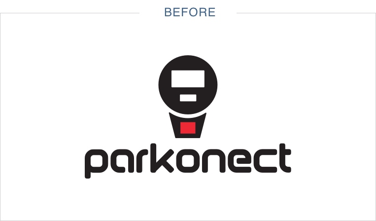
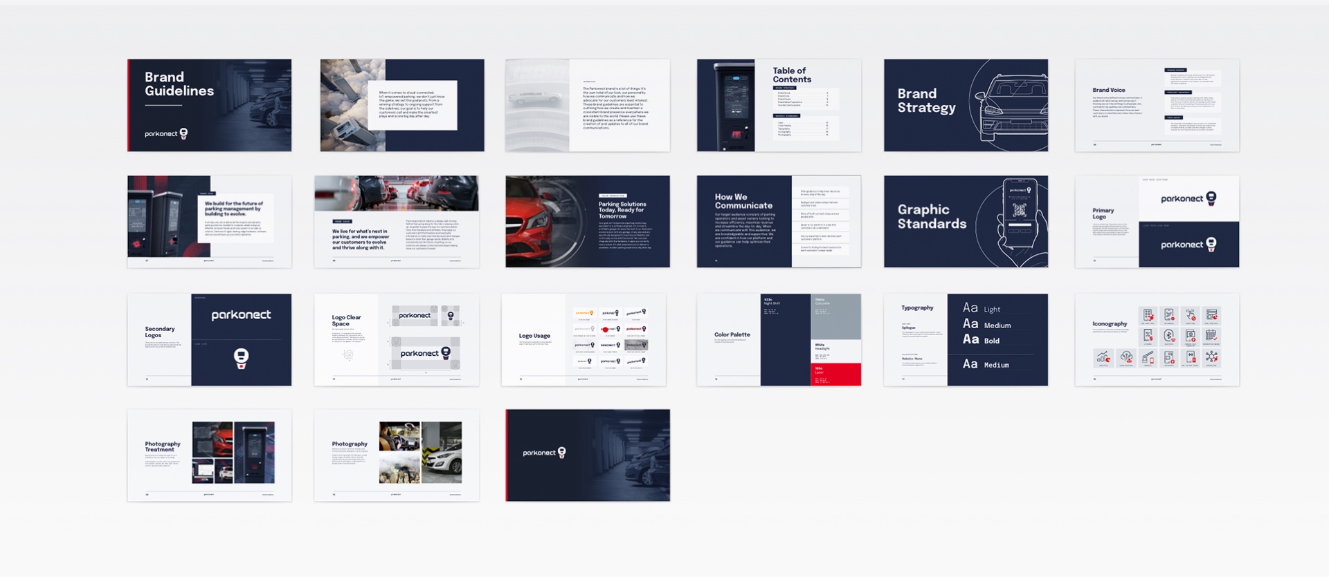
The new brand voice embodies the tech-savvy, change-making straight shooters that make up the Parkonect team, and calls for a bold, modern visual identity to tie it all together. After polishing the existing logo for better legibility and scalability, we got to work building a visual direction around Parkonect’s existing assets.


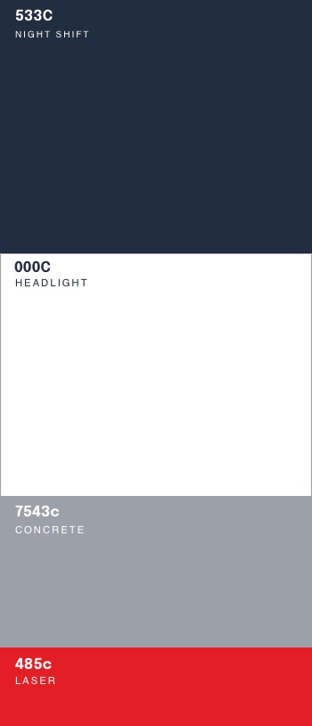
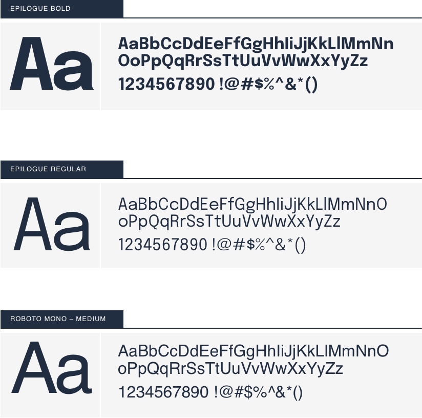
A palette anchored in deep navy blue and stark white provides plenty of opportunity for dark and light executions, while the laser red accent color is a nod to the actual laser lights built into Parkonect’s hardware. Contemporary sans serif typography hints at the brand’s heavily digital nature, along with an icon system that adds context to Parkonect’s wide breadth of features and add-ons. Altogether, the new look speaks to Parkonect’s trailblazing sophistication, edgy personality and nationwide industry standing.

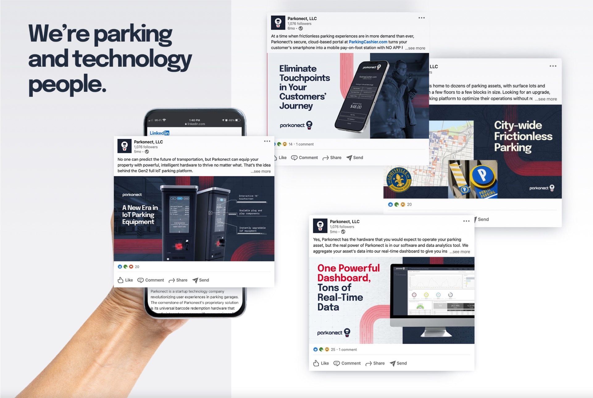
LinkedIn saw the new branding first, as we built Parkonect’s brand perception and drew in more of the target audience with case study examples and top-of-mind video content.
LinkedIn saw the new branding first, as we built Parkonect’s brand perception and drew in more of the target audience with case study examples and top-of-mind video content.
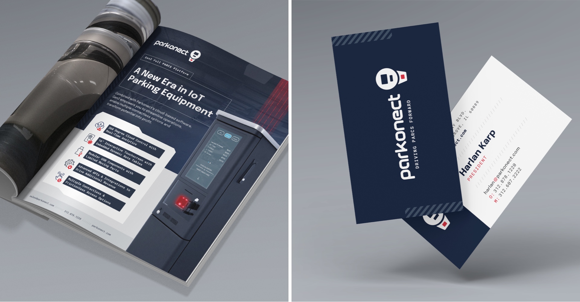
As we dove into building the brand’s digital presence, we simultaneously updated Parkonect’s brand, marketing and sales collateral. Business cards, letterhead, email signatures, sell sheets and even the sales team’s pitch battlecards each got the Parkonect brand treatment to round out phase one of our work together.
Then it was onto phase two, website development, and we leveraged all our web bells and whistles to bring the new digital home base to life. The updated home page welcomes visitors with smooth parallaxing imagery of Parkonect’s platform offerings, clear calls to action to book a demonstration or request a quote and prime real estate for Parkonect’s coverage map and multiple contactless parking solutions. Ending on testimonials from real Parkonect clients, it perfectly captures the impressive difference a Parkonect partnership can make for one’s garage.
Hardware, software, data and integration offerings are given their own dedicated pages to fully communicate the scope of Parkonect’s platform.
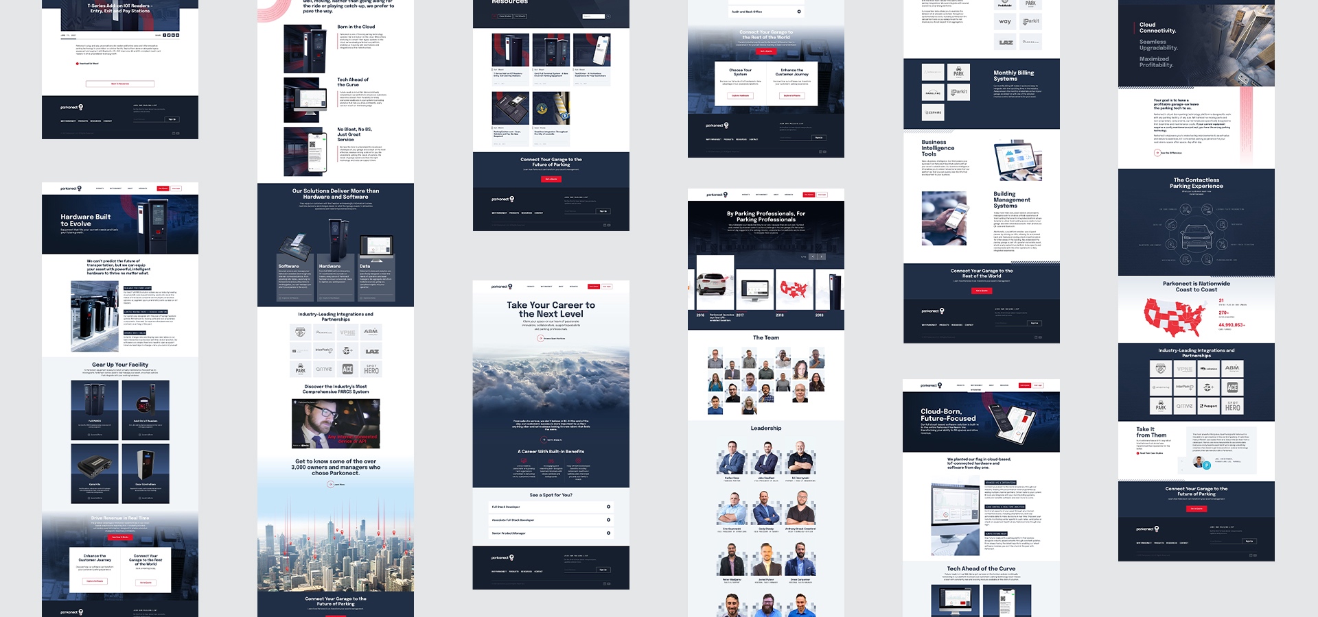
To top off the website, news, events and resources like case studies and sell sheet downloads are housed under the Resources tab, making the information users most often seek intuitive and easy to find.
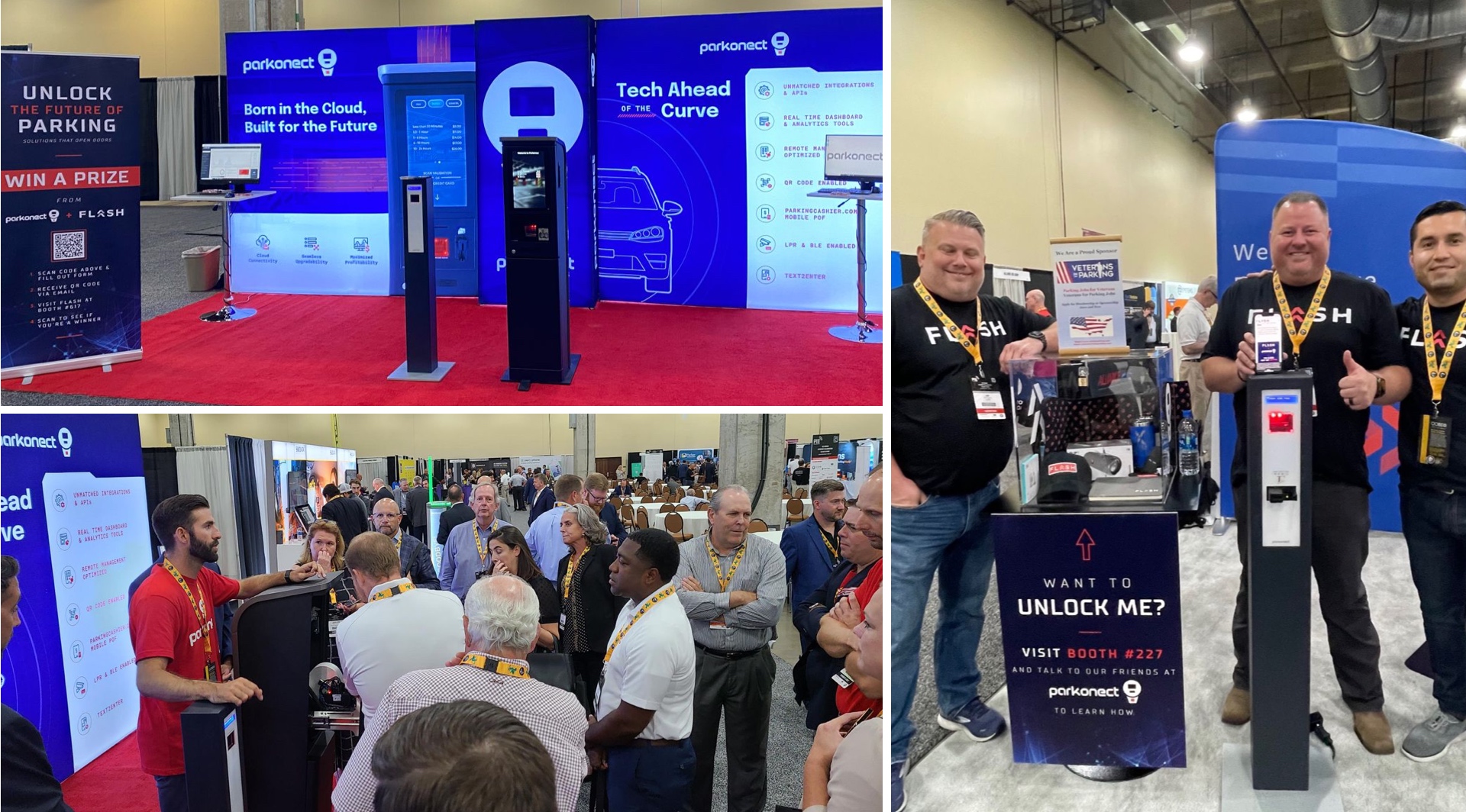
The website launched just in time for us to finish our latest project for the brand: Tradeshow materials and signage for one of the most popular events in parking, the Parking Industry Exhibition (PIE). To celebrate Parkonect’s recent acquisition by Flash Parking, we strategized a contest to draw traffic to both booths at PIE—and keep them there with booth graphics that reel in interest and set Parkonect apart as the future of parking.

“BatesMeron Sweet Design would spend time to get to know our company in terms of how we approach insurance. They were spot on in interpreting our ideas. With team members of varying ages, we can’t seem to agree on anything, but when it comes to the design that they sent us, everybody liked what we got back. One of the best things is they’ve been great communicators.”


