Onassis – Logo design
Onassis is a creator management agency built for a world where influence is both personal and powerful. As the agency prepared to make its own mark, it needed a visual identity that could capture the energy of the creators it represents while establishing a distinctive presence of its own.
Onassis is a creator management agency built for a world where influence is both personal and powerful. As the agency prepared to make its own mark, it needed a visual identity that could capture the energy of the creators it represents while establishing a distinctive presence of its own.
Sophisticated. Tropical. Never cliché.
Onassis came to us with a clear vision: a strong, simple identity with the polish of a luxury brand. They wanted refined typography, restrained details and a timeless quality that would feel just as relevant ten years from now.
But there was another side to the brief. The brand needed to appeal to both men and women while capturing the energy of its tropical roots. The challenge was finding a way to bring those influences together without sacrificing sophistication or slipping into the expected. We needed to find the space between elevated and expressive.
SERVICES: branding / logo / swag



Tropical, with a
tailored edge.
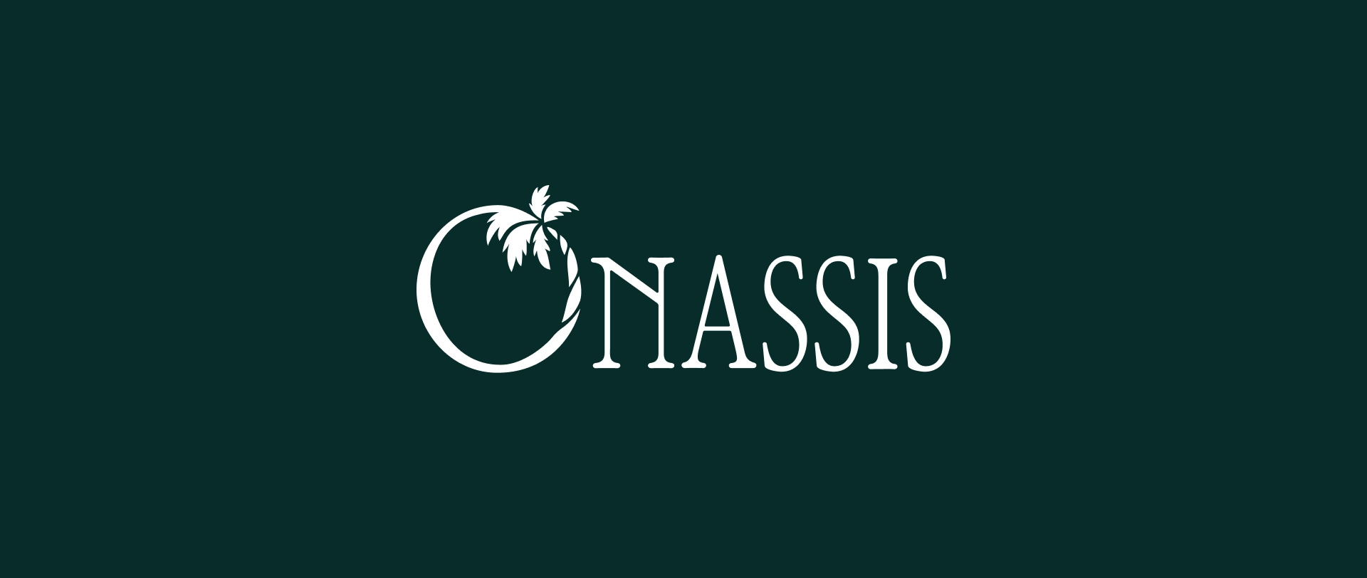
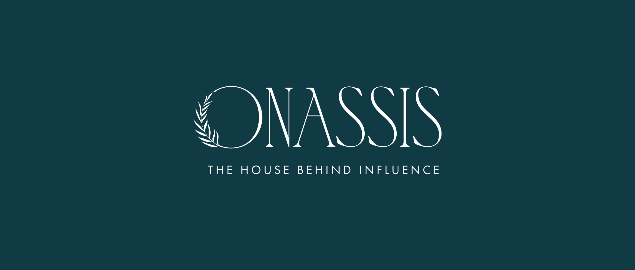
Inspired by the relaxed character of the tropics, this direction balances warmth with classic sophistication. A curved palm trunk transforms the “O” into a distinctive logo mark, while tall serif letterforms give the identity an elegant, timeless presence.
Giving structure to the strategy
With the sitemap in place, we moved into wireframing to determine how content, messaging and calls to action would work together on each page. Before adding color, imagery or polish, we made sure the experience made sense.

A nod to an iconic era.
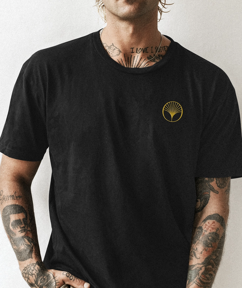
Inspired by the elegance of Art Deco, this direction integrates a stylized palm leaf into the “O,” creating a distinctive geometric mark. Clean lines bring structure and sophistication, while high-contrast serif typography gives the identity a sense of timeless, understated luxury.

Naturally refined.
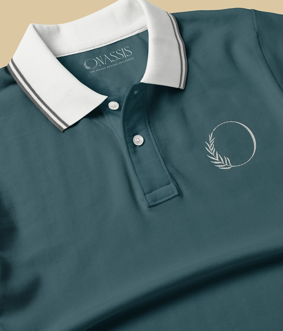
This direction takes a softer approach to the tropical brief, using a delicate palm frond to complete the “O” and give the mark an organic sense of movement. Paired with slender, high-contrast typography and a serene coastal palette, the identity feels effortless, understated and distinctly at home by the water.

Tropical, through an artful lens.
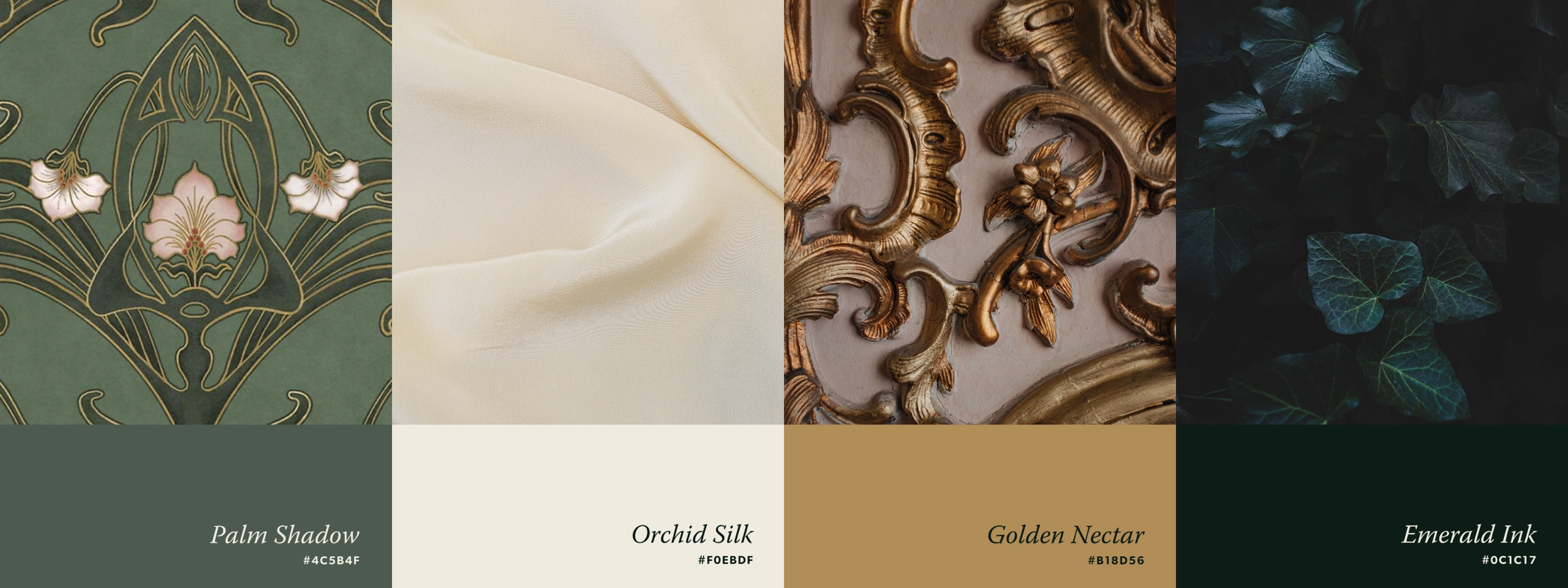
Inspired by Art Nouveau, this logo uses a stylized orchid as the main symbol. The flower is placed inside the “O” to create a memorable and unique identity. Orchids represent elegance, beauty and tropical nature in a subtle way. The custom ligature adds a handcrafted detail that reflects refinement and timeless design.


The unexpected direction.
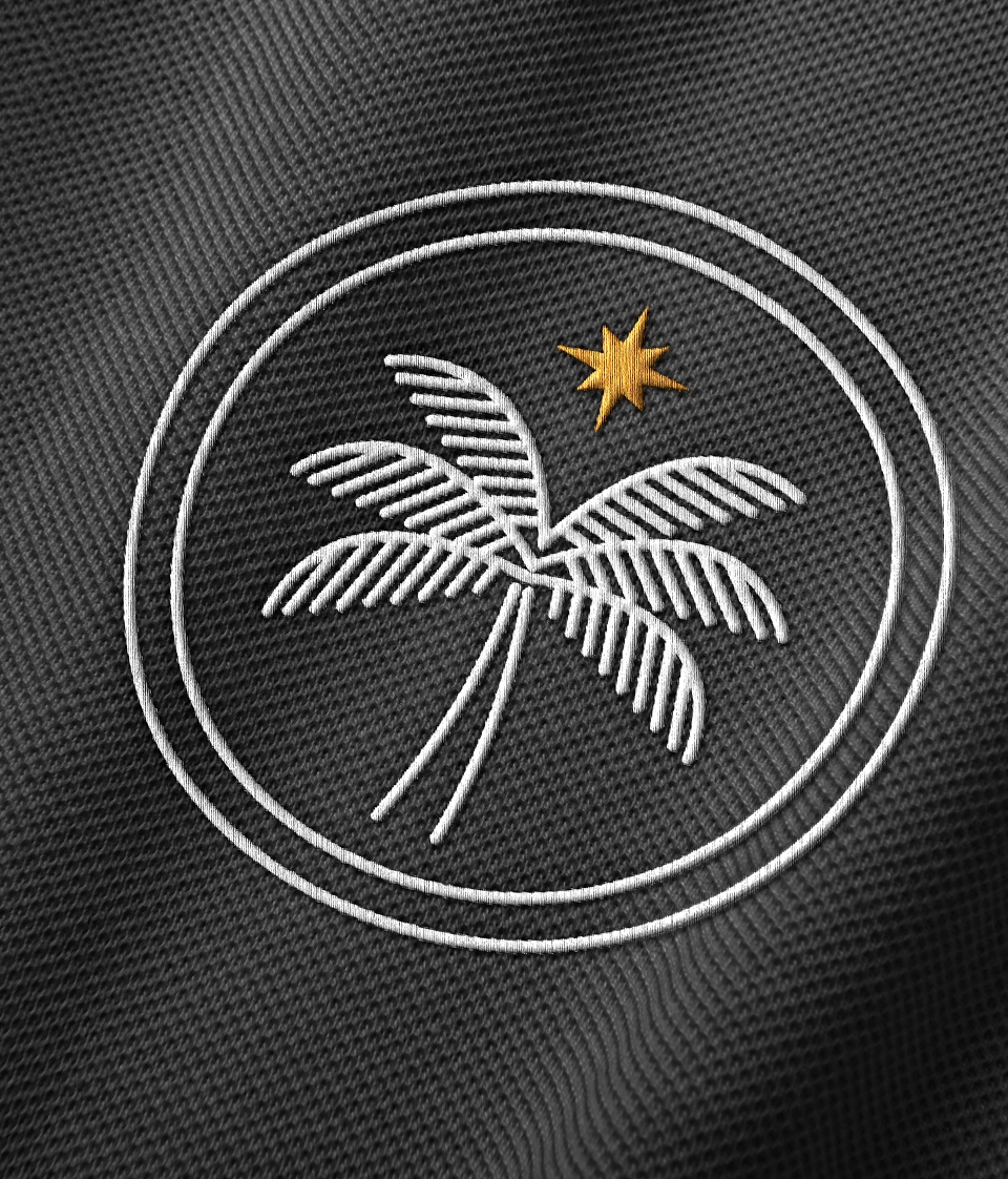
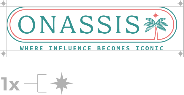
Breaking from the more restrained concepts, this direction embraces the spirit of vintage beach culture with an illustrated, emblem-style identity. Palm, water and star motifs create a visual world around the Onassis name, while the flexible structure gives the mark room to adapt across everything from apparel to social.
A little wild.
Very well composed.
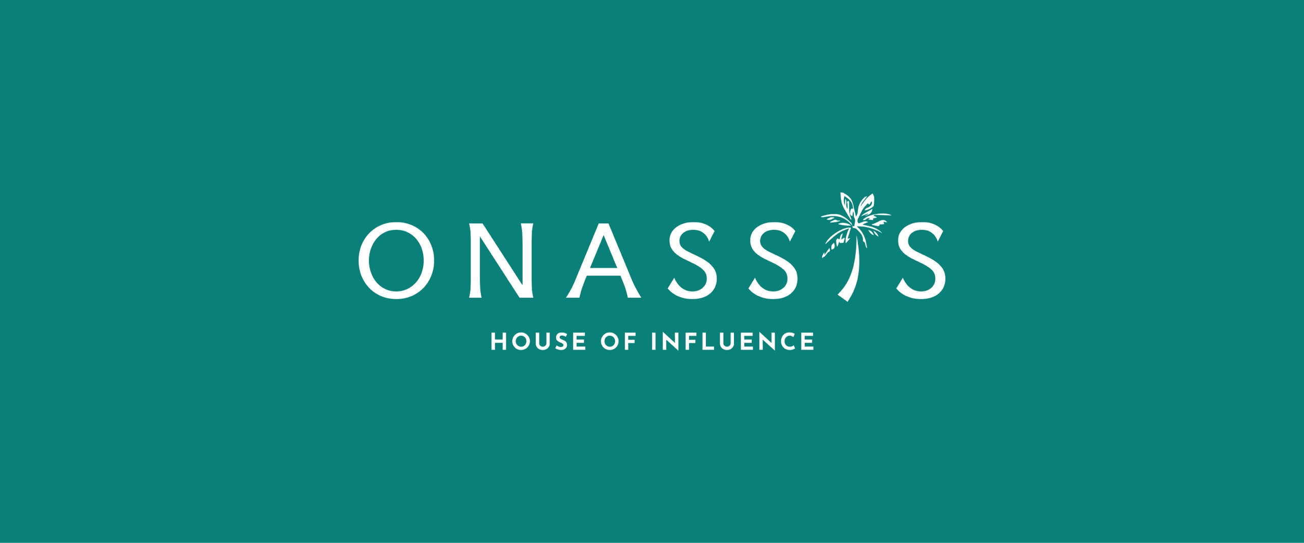
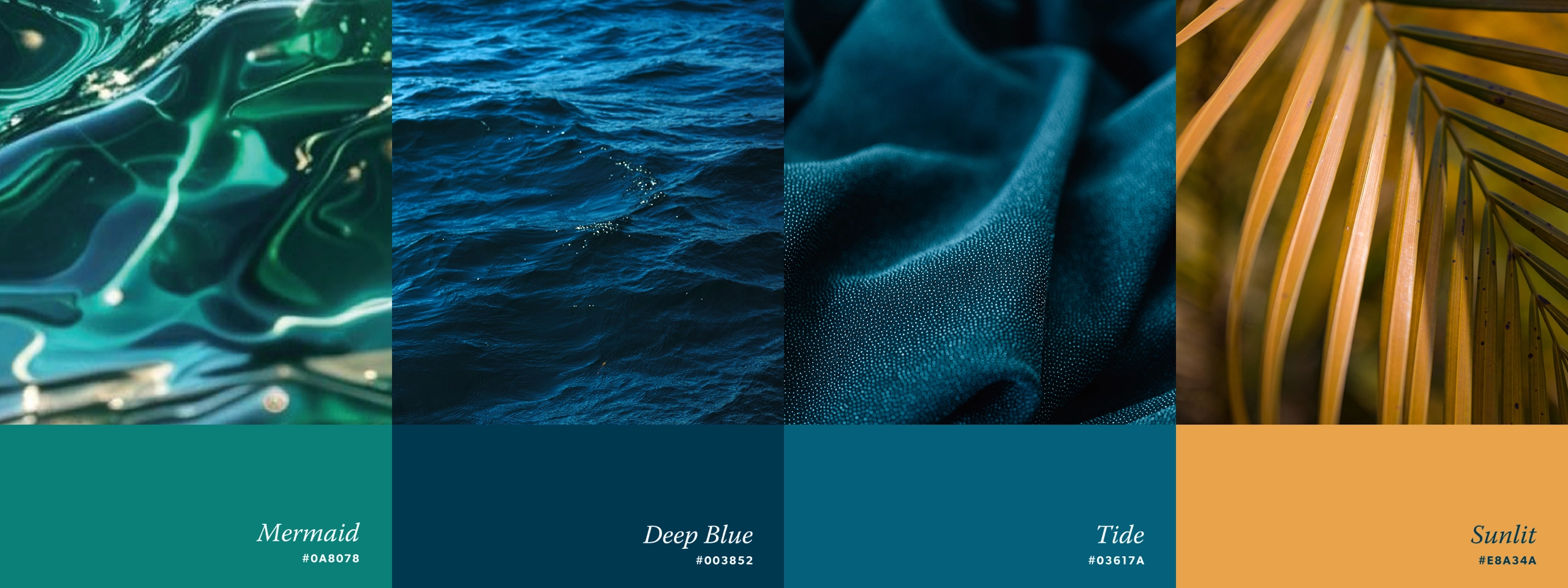
This direction plays with contrast, replacing the “I” in Onassis with a loosely illustrated palm against a crisp, generously spaced wordmark. The organic linework brings personality and movement, while cool jewel tones and streamlined typography keep the overall identity composed and polished.

one that felt unmistakably Onassis.


Miami turned all the way up.
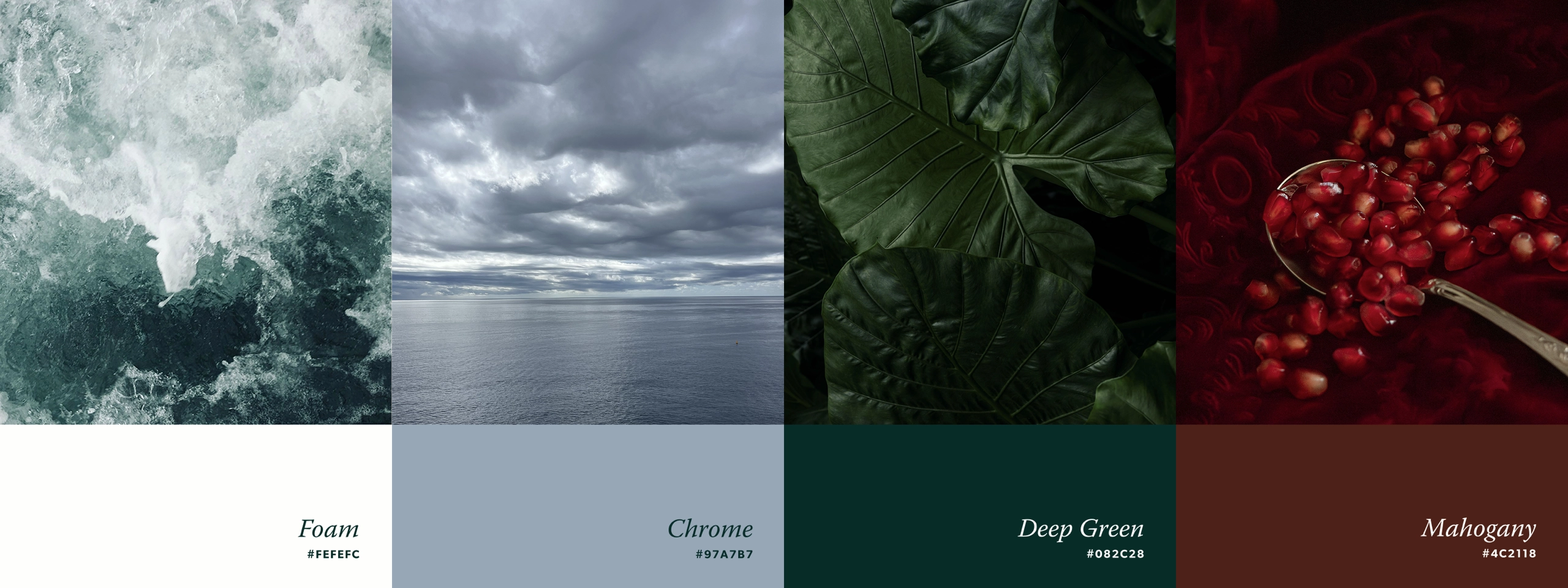
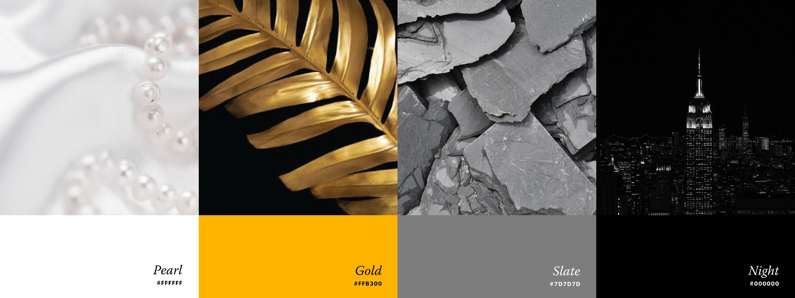
Once the direction was chosen, the color story brought it fully to life. Sea Foam and Lipstick capture the unmistakable energy of Miami, while Pearl keeps things crisp and Night Life adds the depth and sophistication needed to balance the brighter hues.


“BatesMeron produced high-quality work, communicated clearly and was extremely responsive. The process was seamless. Our team explained what we wanted, and they brought it to life.”
“BatesMeron produced high-quality work, communicated clearly and was extremely responsive. The process was seamless. Our team explained what we wanted, and they brought it to life.”