Midwest Construction Identity
In an industry saturated with tough and gritty brands, Midwest Construction Project Management (MCPM) dares to be different. Through its striking identity and proven work ethic, MCPM achieves the perfect balance between strong and sophisticated, offering clients superior service with an unconventional elegance.
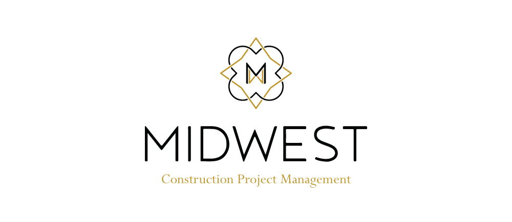 To enhance the MCPM brand, we created a logo that speaks to confidence and balance. The use of interweaving quatrefoil and diamond shapes in the icon creates a modern take on traditional architectural embellishments. The sharp angles represent the tough aspects of construction while the softer arcs allude to the nuance of MCPM’s design elements. Refined and strong, the icon itself is memorable enough to stand on its own and looks just as elegant with the the company’s typographic mark.
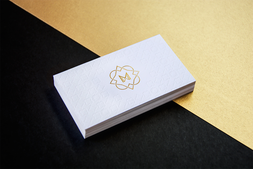
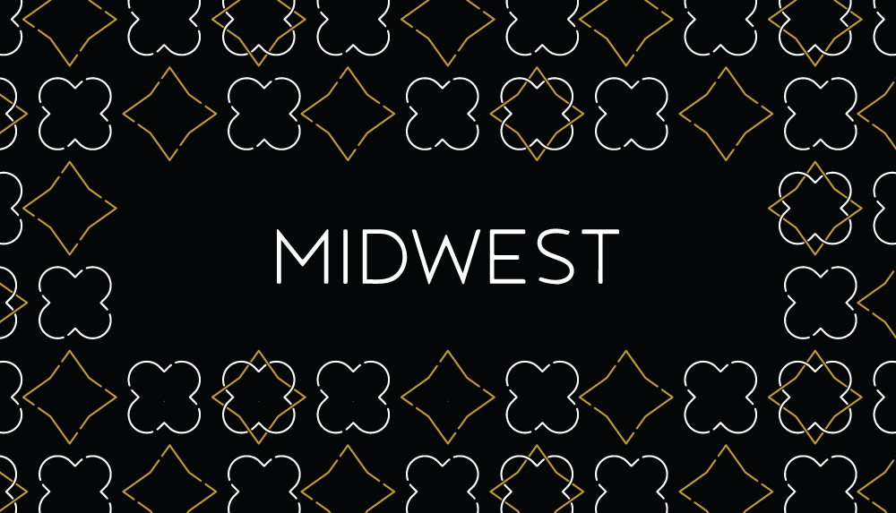
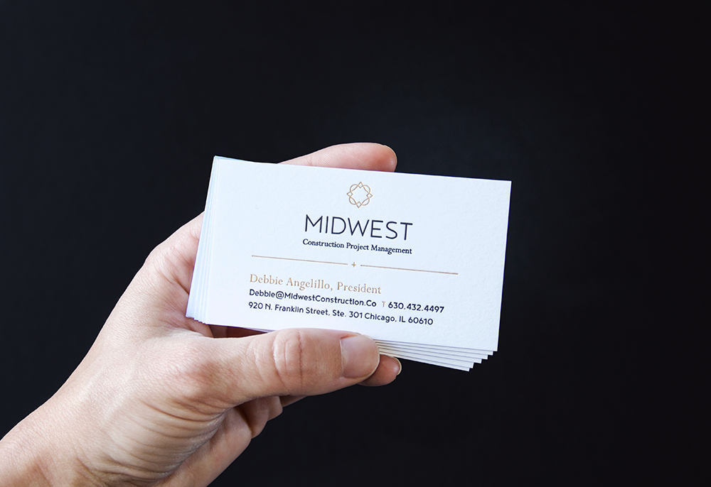
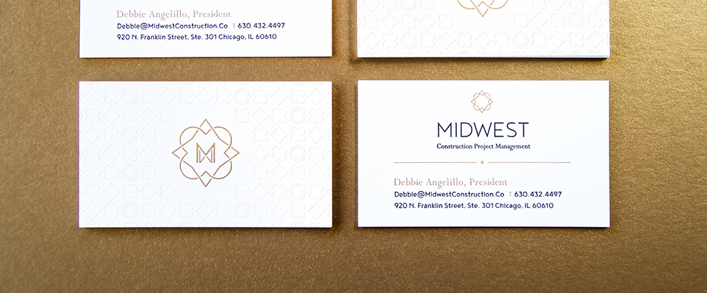
The logo comes to life on a business card that is captures a professional minimalist design while still managing to shine with scintillating detail. The intricate framework from the logo creates a sharp repeating pattern blind embossed on the back of the card. A few tantalizing glints of gold foil set the groundwork for an identity system that is subtle and sexy, while a neutral color palette of white, black and gold on soft cotton paper help accentuate the finer details.
With a logo that commands respect and attention, classy and tactile business cards and a whole new way to represent their brand, Midwest Construction Project Management is ready to take the construction management industry by storm—and look damn good doing it.


