Kitchfix – Branding, Marketing & Website
This ain’t your grandma’s granola.
Unless your grandma swears by locally sourced, organic and paleo ingredients. Founded by Chef Josh Katt in 2012, Kitchfix is a super-convenient solution for people who want craveable dishes free of artificial, processed or refined ingredients. It’s proven to be a hit—so much so that Kitchfix expanded with a line of grain-free grocery staples like granola and waffles. With Kitchfix on the rise, it was time to bring new energy to their brand identity.
SERVICES: BRAND MESSAGING / VISUAL IDENTITY / BRAND COLLATERAL / packaging / WEBSITE
When we came to the table, Chef Josh gave us an inside look at his creative culinary process. It starts with something that isn’t necessarily healthy, but he’s craving it…and bad. The next step is to deconstruct and re-create that dish with clean, nutritious and meaningful ingredients. We locked onto this idea of “craveability,” and launched their new messaging around that very concept.
We developed messaging and positioning that emphasized key product benefits with a language that’s all Kitchfix’s own. It began with the tagline “Full of Flavor, Not Filler.” and extended to other phrases that add endless color across packaging, marketing and their website.


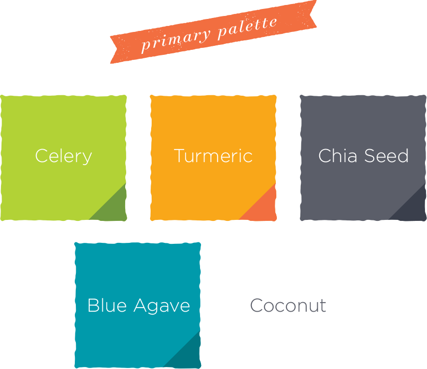
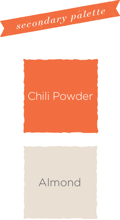
Kitchfix loved the idea of an earthy, yet vibrant tone for their visual standards, so we built out a complete color palette with an array of primary and secondary colors, like Celery, Turmeric, Almond and Chili Powder, that give the brand maximum flexibility to have a visual personality as enticing as the new brand voice.
Knowing Kitchfix is poised for nationwide expansion, it was important that their granola, granola bars and waffles make an impact from the grocery store shelf. Our CPG designs take full advantage of their voice and color palette to draw the consumer’s eye with pops of color and a personality that’s hard to ignore.


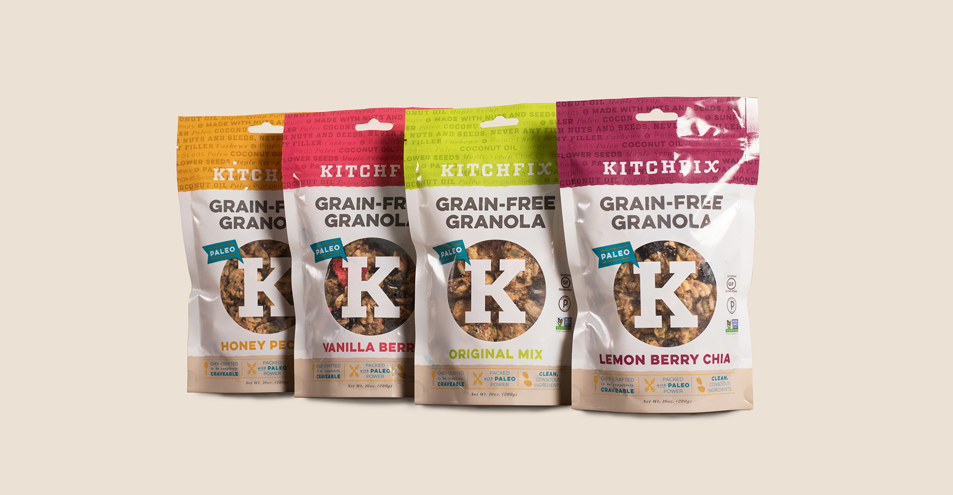

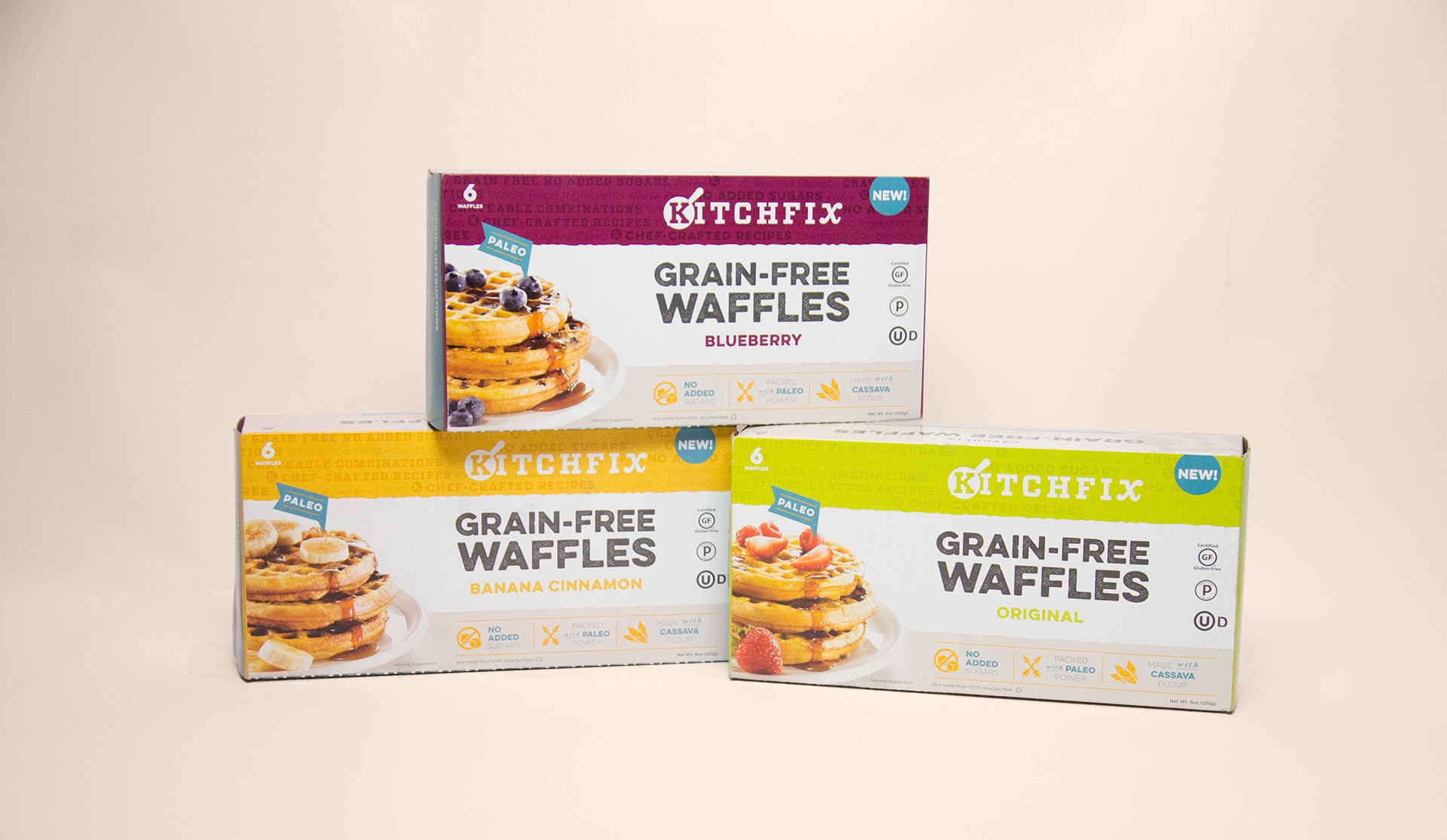

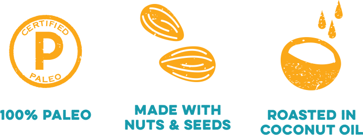
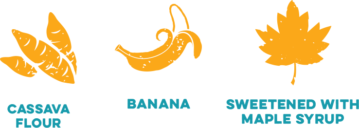
These designs perform double-duty, being both appealing and informative. And Kitchfix loves going against the grain—pun intended—to show that healthy can be colorful, fun and craveable.

Designing the updated overlay for the new Kitchfix microsite gave us a great opportunity to take their new messaging one step further. We developed a series of web sliders featuring call-outs from our language library. Elsewhere in the site design, we pulled in elements from their packaging, like our patterns and icons that call attention to key benefits of their products.


“Our brand was already seeing a great deal of success—but we were ready to take it to the next level. They’ve developed thoughtful and strategic messaging that has helped us articulate the unique characteristics of our brand. They’ve stepped up our design game as well, providing packaging that announces our brand to the national community in a truly memorable way.”


