Hobson Institute Identity
As one of the foremost physical therapists in Chicago, Dr. Jennifer Hobson constantly strives to find new ways to help her patients. For many years, Dr. Hobson had been treating patients with innovative physical therapy techniques. And after years of studying cutting-edge methods to help treat breathing problems, she was eager to bring these solutions to the people who needed it most. After all, there’s a huge market for helping people with asthma, sleep apnea and anxiety.
To effectively bring this revolutionary therapy to Chicago, Dr. Hobson knew that she would need to create a completely new practice separate from her more traditional center, Physical Therapy Renaissance. Dr. Hobson came to BatesMeron to bring her brand and company’s vision to life.
Our team interviewed Dr. Hobson to better understand her goals. It quickly became clear that she wanted her new brand to reflect the cutting-edge nature of her treatments as well as her own sense of reliability, professionalism and intellect. BatesMeron combined these elements into the elegant new face of physical therapy, the Hobson Institute.
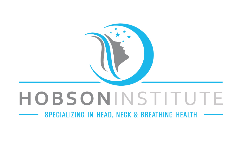
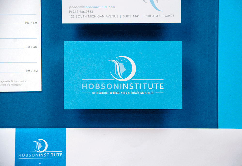
From the name and logo to all the supporting collateral, we wanted to create a consistent brand that was both clean and professional, but stopped short of a sterile, hospital-like feel. Our team created the name Hobson Institute to infuse Dr. Hobson’s impressive reputation and credibility directly into the brand along with the progressive nature of an institute. Similarly, the logo we created combined the concepts of trust and innovation with elements of breathing and health. It was crucial that the logo mark symbolized what the Hobson Institute focused on—without being overly illustrative. So the symbol has subtle nods toward sleep, breathing and wellness, while remaining stylized. To keep the logo grounded, a strong typographic treatment brings all the pieces together.
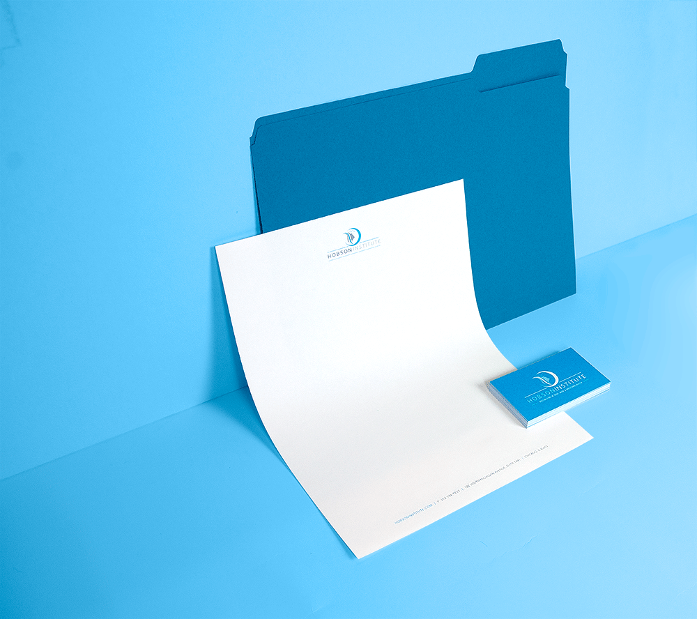
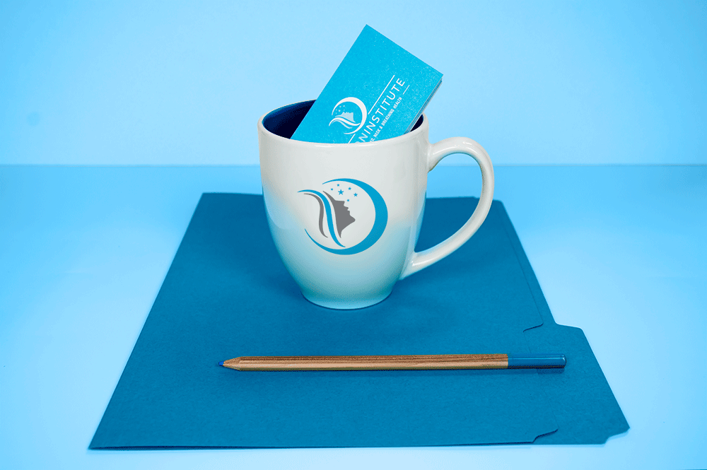
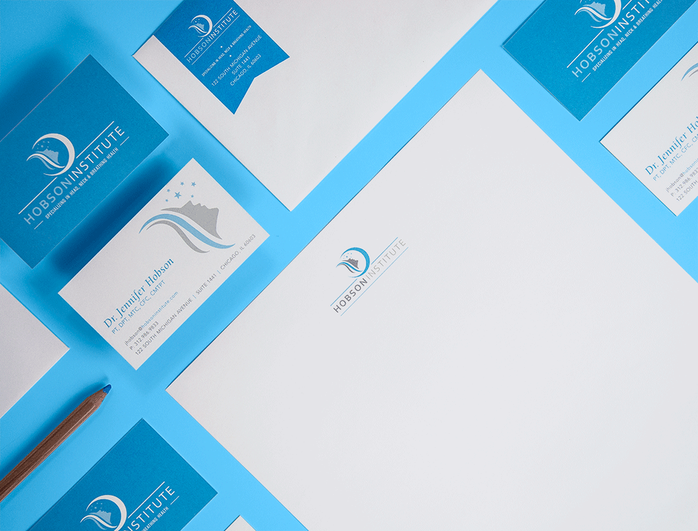
BatesMeron brought this brand identity to life through numerous deliverables as well, including business cards, coffee mugs, personalized envelopes and the Hobson Institute’s mobile-friendly website. Wanting to keep the idea of deep, healthy breathing as an integral part of the brand, we used bright, airy blues, greys and white in all of our designs. On the website, we included a combination of stylized images that conveyed a sense of breathing and wellness with real, patient-focused photos taken at the practice. All these elements worked together to create a design that was both comforting and compelling.
The launch of the Hobson Institute brand coincided with Dr. Hobson’s move into her new office space, and the results of the new identity were quickly revealed. The establishment of the Hobson Institute created a clear differentiation from the Physical Therapy Renaissance brand, allowing each practice to have its own marketing goals, messaging and structure. In no time at all, there were waiting lists full of patients young and old eager to participate in her breathing classes.
