The Fear of Color
For years humans have been chasing (and even inventing) color—expanding what’s available for creative expression. The first synthetic blue, known as Egyptian Blue, came into use around 3000BC, ripening imagination and changing artistry forever. And that was just the beginning! So why does it seem like people and brands are becoming increasingly fearful of color?

A Drive Through the Past
Think of a classic American car. Personally, a turquoise Chevy Bel-Air is the first thing that always comes to mind for me. Or maybe a red or yellow Mustang. Growing up, we had a purple sedan—I can’t even remember the last time I saw a purple car on the road!
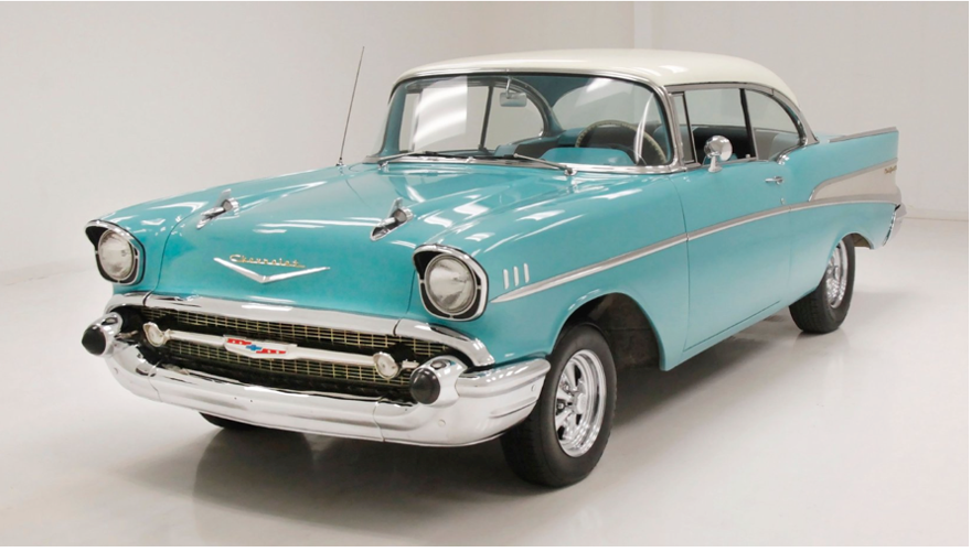
These colorful models are a surprise delight nowadays in a sea of white, gray and black.
Take a look at this chart that illustrates the change in car colors sold over the past 30 years (in Poland, but I think you’d find similar trends in the US).
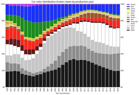
So, why the collective move to neutrals?
There are certainly many different factors at play—but unsurprisingly a large motivator is money. On the manufacturing side, producing cars, or even iPod minis, in many different color options is costly. What if we make too many red and not enough purple, what if the seller is stuck with 10 green cars and every buyer comes asking for blue?
In addition to manufacturers cutting back costs, consumers—facing multiple recessions over the past 30 years—look to the future when making these expensive purchases, considering their resale value. Cautious consumers consider neutral colors to have higher resale value for their mass appeal.

Mass Appeal and “Millennial Gray”
Look, look, before you get mad at me, I am a Millennial and a love a gray wall, but the rise of “millennial gray” is an interesting one. Partially a rejection of the “Tuscan” trend and yellow oak of the 80s and 90s we grew up with; it’s no surprise many of us wanted to pivot (PIVOT) from the beige that ruled our childhood. The trend towards gray also seems to be fueled by the Great Recession and house flipping during that time. Houses were often painted with a light, inoffensive grey for mass appeal when going back on the market.
Branding Gone Boring?
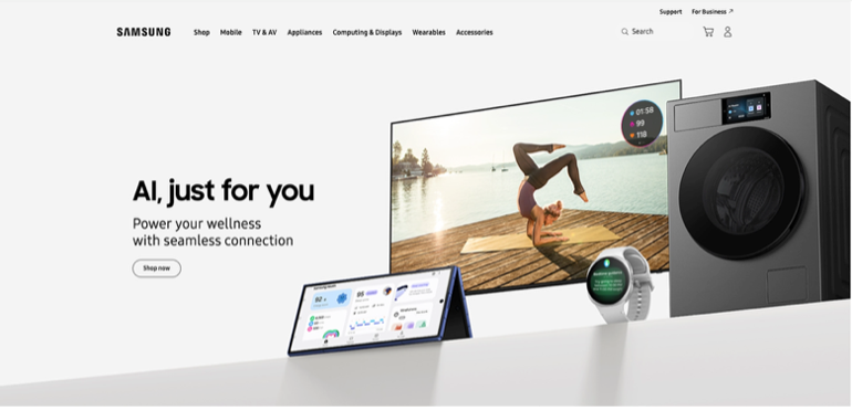
Much like cars, phones and gadgets, some brands have also moved to strip away their iconic brand colors over time. When you think of Samsung, you may think of their iconic blue.
But in recent years, they’ve stripped their brand color from their website for a more streamlined look.
Another extreme example is Apple. Below shows their colorful 80s-90s Apple logo, and how we see it used today.
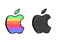
Brands are simplifying and streamlining their logos to be more easily scaled and replicated in all sorts of materials and spaces, often for web use and small placement.
Not to Fear!
With all this simplification of color, it might seem like bold colors no longer have a place in your branding—the truth is, it’s more important than ever! The refined and limited use of color leaves space for brands to take advantage of standing out on the shelf with a bright and colorful look.
Color can be complicated, but it doesn’t have to be! Come consult a color enthusiast at BatesMeron Sweet Design to bring your brand identity back to life.
The Atlanta Municipal Signs Redesign
6 Questions for: Artisan Bags' Cindy De Pecol
Shedding the Weight

