Logo Lawsuit No Nos
When you think of a brand, you usually think of its logo first. The logo is a visual representation of a brand’s identity; it’s typically the most memorable element of a brand. You want people to remember your logo: to know it, love it, slap a sticker of it on their laptop or walk around proudly with the logo visible, broadcasting to the world their support of your company.
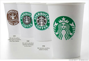
Here are some examples of timeless logos our designer, Todd, has written about in the past:

With thousands of logos presented to us on a daily basis, how easy is it to remember–or forget–which brands have which logos? What happens if there’s another logo out there that’s too similar to yours? That’s where logo trademarks come in.
Trademark lawsuits are often active in court as a result of similar logo designs. The standard for trademark infringement is based on the likelihood that consumers would confuse the logos and brands because there is not enough to sufficiently differentiate the two. The court system takes into consideration the reputations of the logos, the similarity in products and services between the brands in question, the targeted consumers and other factors that are more legal than we need to get into here.
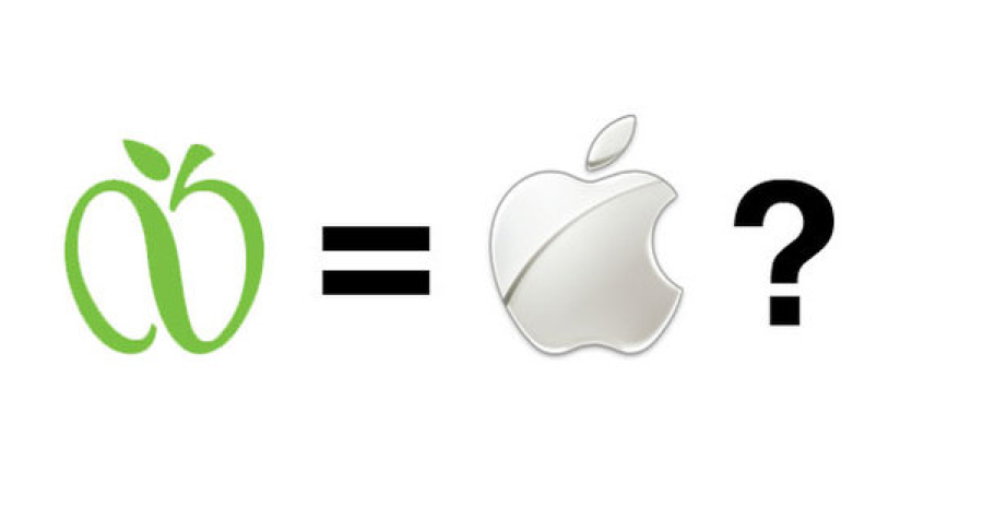
In 2007, Apple Inc. filed a trademark lawsuit against GreeNYC, a New York City initiative focusing on reducing global warming emissions to promote a more sustainable future. Below you can see the GreeNYC logo on the left. Apple’s main argument was that the logos were too similar and would confuse Apple users. Taking into consideration what these two companies offer customers, do you find these confusingly similar?

Outcome: Apple Inc. dropped lawsuit because of bad press even after GreeNYC offered to remove stem from logo.
Another trademark infringement complaint was placed by PayPal against Pandora in 2017 as result of Pandora’s rebranded “P” (PayPal on the left, Pandora on the right):

Last month Pandora rolled out an updated logo as result of the settlement:

In relation to the Apple Inc. example, how important does color play in logo identification? The PayPal and Pandora blues can cause some trouble, sure, but the green infinity design and the white/silver apple? Pandora’s wavy, new rainbow logo is definitely distinct enough now, don’t you think?
As a creative agency that specializes in branding, our team puts hours into the branding process. There is time dedicated to understanding the client’s values and goals, researching inspiration, sketching options and taking feedback and direction from clients. We want each client to know that their logo is as special to us when designing as it is to their brand and its identity. As our creative director Melissa said in her post about our team’s favorite logo designs:
“It’s not an understatement to say that the pressure is on when it comes to designing an identity. No matter how visionary a creative you are, a logo carries a whole lot of weight and requires an acute attention to detail and a ton of care in its crafting.”
We also want to help prevent any trademark infringements in the future because it is easy to have similar logos. Here are a few of the many examples:


With millions of logos in existence, it’s becoming more and more challenging to create logos that say everything you want while looking distinct from the pack. But because logos are the cornerstones of a brand and such a creative design challenge, we make sure our clients love their logos as much as we love designing them with work that is confusion- and trademark-lawsuit-free.
Need a new logo? You know how to reach us!
WTF Vintage Valentines
Conquering the Hurdles of Collaborating in Quarantine
Six Questions for Vivienne Apsey


