The Bone-Chilling Beauty of Halloween Horror Movie Poster Design
I wanted to celebrate the height of spook season by taking a look at some of the most bone-chilling horror movie posters of all time. One of the things I have always loved about being a designer is knowing that graphic design has the power to illicit emotional responses like joy, laughter, nostalgia and, in the case horror movie poster design, pants-wetting FEAR.
There are thousands of horror movie posters that have come and gone over the years. Typically, they’re either scary or a specimen of beautiful design. The majority fail to be both. But, there are a select group, the scream of the crop—the scrèam de la scrèam, if you will—that qualify as masterpieces that send a little chill up your spine. These designs stick in your brain and manifest into nightmarish scenes that keep you up at night.
So with out further a-BOO, here is my list of the top 13 creepiest examples of frighteningly well designed horror movie posters.
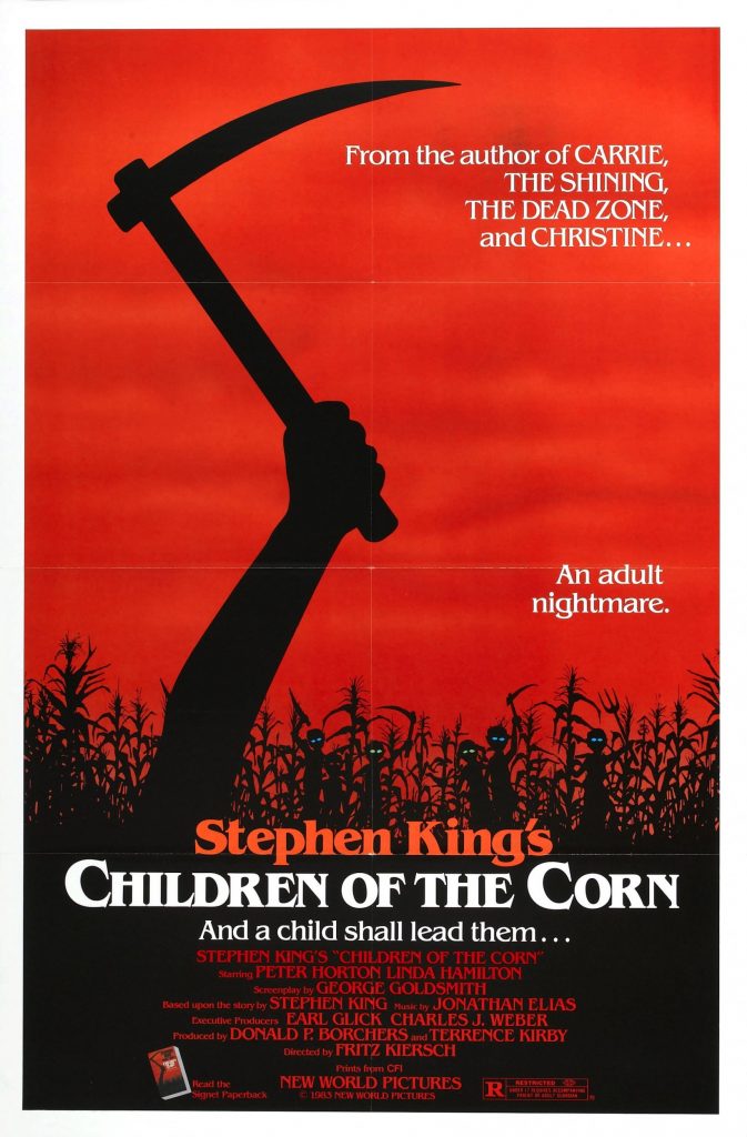
13. Children of the Corn
This one is a-maize-ingly creepy. The striking layout and those tiny little glowing eyes are sow unnerving. It almost makes me a little sickle.
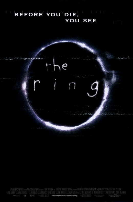
12. The Ring
This movie is dripping with unsettling imagery and the poster circles around what’s to come, build intrigue without revealing the frights that are in store.
11. The Last Exorcism Part II
The body contorting into the number two is a nimble device for representing this sequel. The back-breaking typography is achingly beautiful and leaves me feeling a little spineless.

10. Blair Witch
This Blair Witch remake makes good use of the creepy stick figure image established in the original. It’s simple symmetrical execution is striking and memorable, and has a looming feeling of ominousness. Cue the heavy breathing!

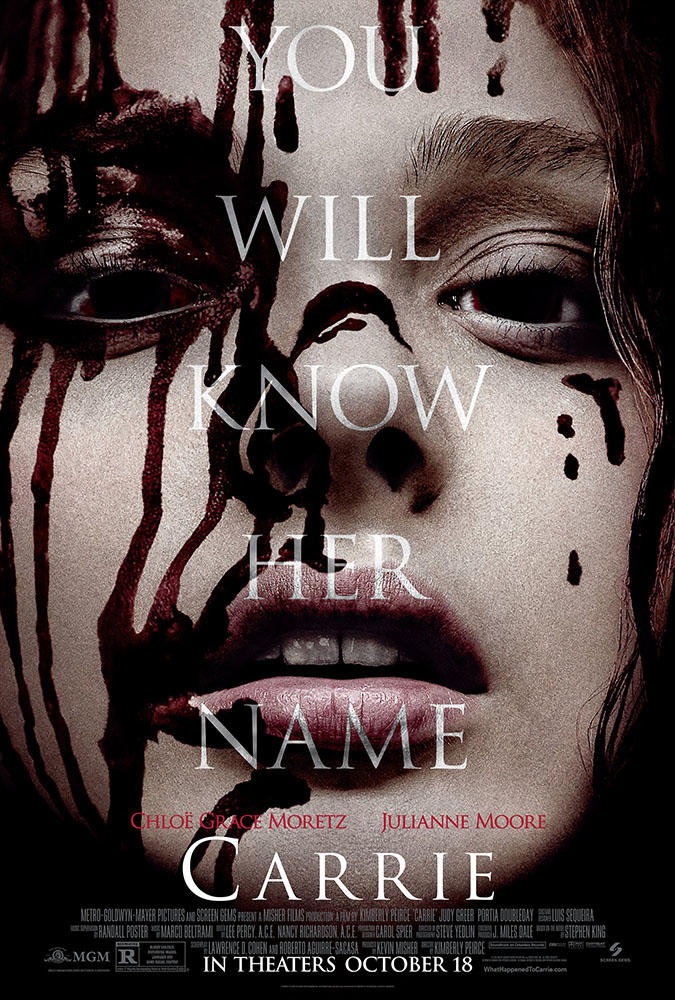
9. Carrie
This poster features a chilling portrait of the movie’s title character. Her hollow, listless expression spattered with near-black blood is beautiful and terrifying.
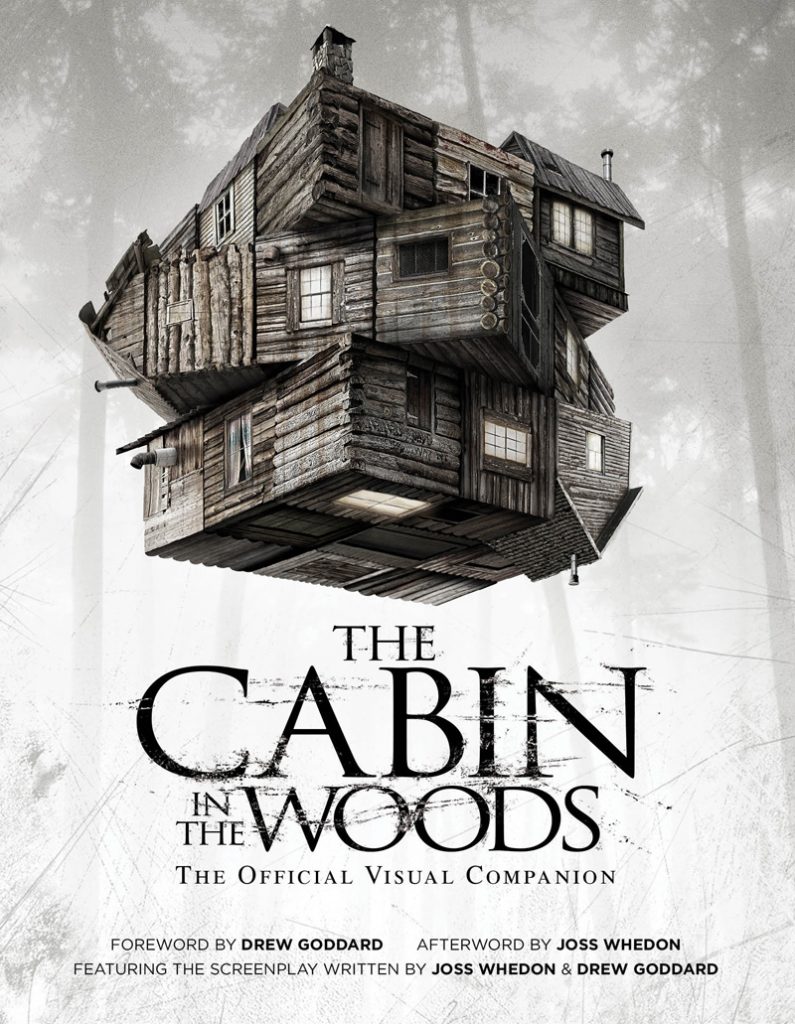
8. Cabin in the Woods
This twisting Rubik’s Cube of cabins is perfectly twisted and nightmarish. It reminds me of the infamously spooky Winchester Mansion, and definitely conveys the feeling of being trapped.
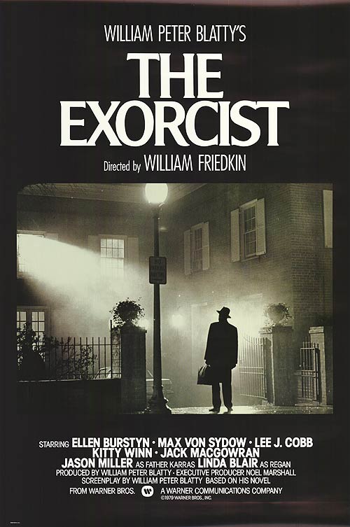
7. The Exorcist
This poster captures a beautiful and mysterious moment. The unearthly light source streaming from a window is really the only indicator that evil (and pea soup) are afoot.
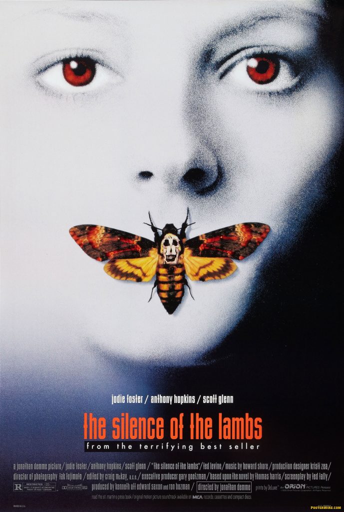
6. Silence of the Lambs
This is the scary movie art that has stuck with me the longest. I’ll never forget these red eyes starring at me from the isles of Blockbuster video as small child. I love the easter egg hidden in this poster, Salvador Dali’s In Voluptas Mors placed to create a Death’s Head Moth.

5. Saw II (Banned Poster)
Another clever sequel design. This one was actually so gnarly it got banned. At first you don’t even notice the fingers are severed. They appear almost to be sticking up out of something, but once you see it… you can’t unsee it. The mangled nails make my skin crawl.
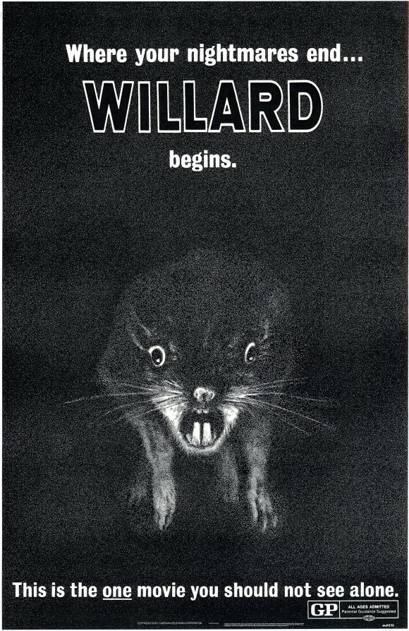
4. Willard
I had to include this one because I find it equal parts hilarious and frightening. The rat is illustrated like horrible, horrific taxidermy. This is one definitely qualifies as so bad it’s good.
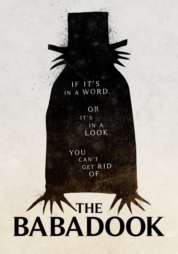
3. Babadook
Babadook ranks highly because the illustrations featured in this movie are so great. I love this minimal silhouette version that is featured on the poster. The typography is wonderful too.
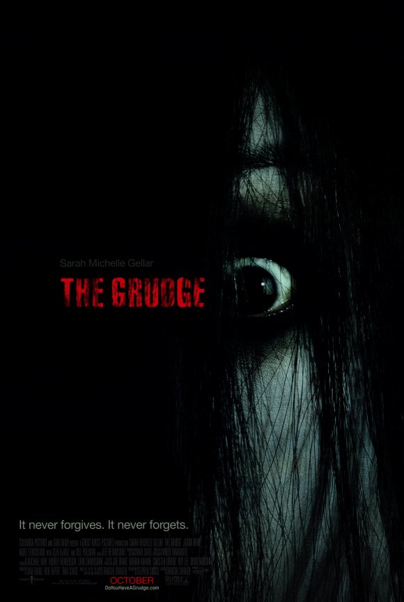
2. The Grudge
This bulging and shrouded eyeball is beyond nightmare inducing. It’s amazing how this tiny peek is super effective at getting the blood pumping and the imagination brewing.
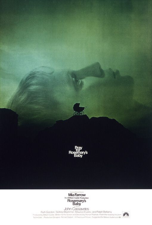
1. Rosemary’s Baby
This one is fantastically creepy. The scale of the elements and the minimalism of what they chose to include is brilliant. I love how much mystery this builds around the film. You might not know what’s wrong with Rosemary’s baby, but you know it’s NOT going to be good.
I think the success of the majority of these posters can be attributed not to gratuitously gory imagery, but to beautiful and poignant restraint. Monsters are always scarier before they are fully revealed, when the imagination can run wild into the night and conjure visions of the thing that is scariest to you. All 13 posters here nail this in their own special way.
I came across so many good design options while researching this post. I couldn’t include them all and there are some favorites I had to leave out. Do you have a favorite? What are the scariest horror movie posters you’ve ever seen?
What’s In It for Me? The Importance of Asking Questions on the Job
Observations on AI
BatesMeron was just named THE TOP Branding Agency in Chicago by Clutch.co and we're swooning. Here's...


