Food Packaging: Mouthwatering Design
I freaking love going to the grocery store. Maybe it’s that I’m really getting into the swing of this 30-something thing, but for me, a Saturday morning spent browsing the supermarket shelves is thoroughly delightful. Although… delightful for reasons you might not expect. Sure, the food is great and all, but the food packaging is where it’s really at.
Let’s take a look at some CPG samples and see what works and why.
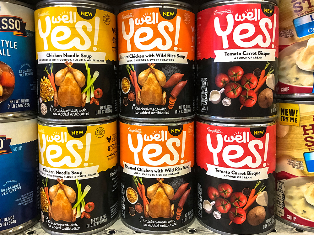
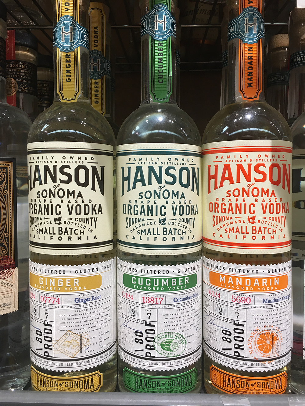 Pro tip: if you’re looking to spot mouthwatering designs while checking off your grocery list, spend some time on the following aisles: 1. The spirits/wine aisle (duh.) 2. Ethnic food aisle and 3. The organic foods section.
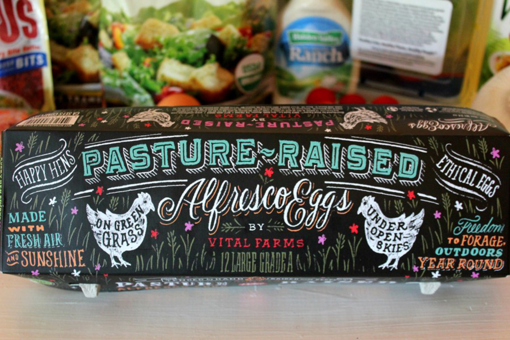
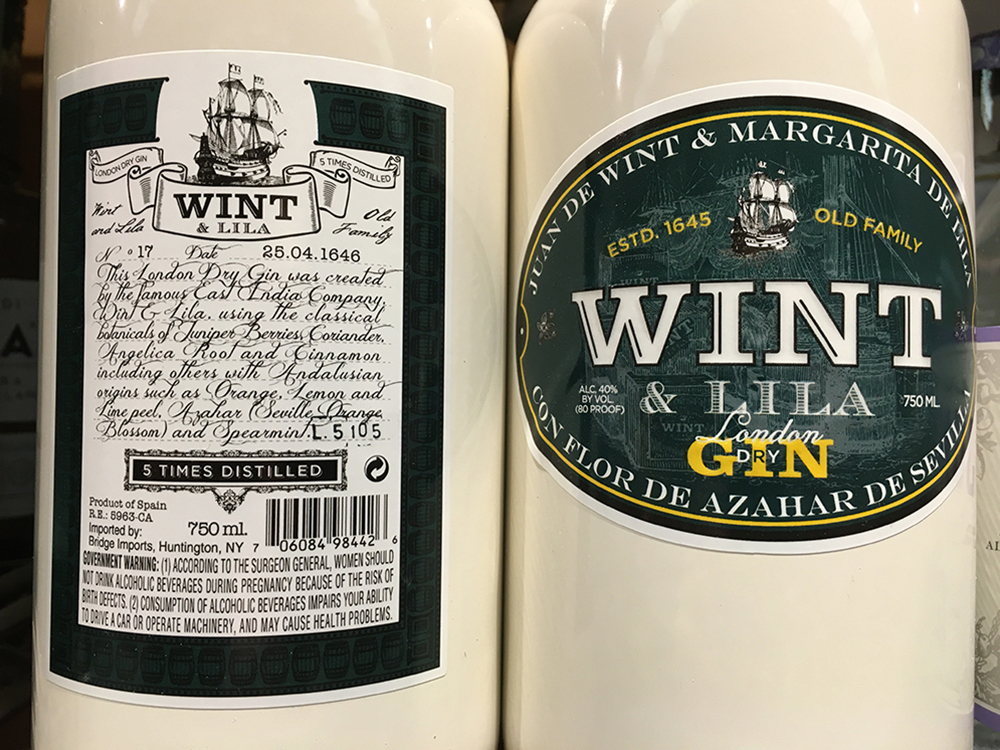
 If we ever run into each other at the local grocery, there’s a chance I’ll be conducting a photoshoot with a cute little can of sardines. This is how I spend my time. Feel free to pretend you don’t know me.
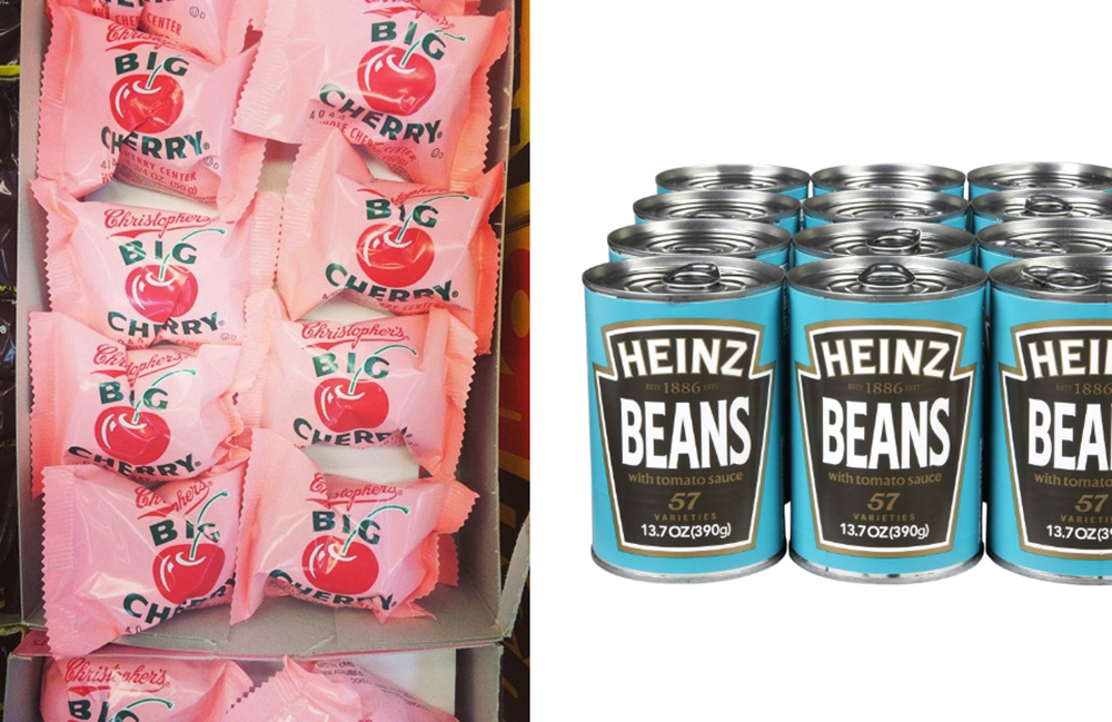
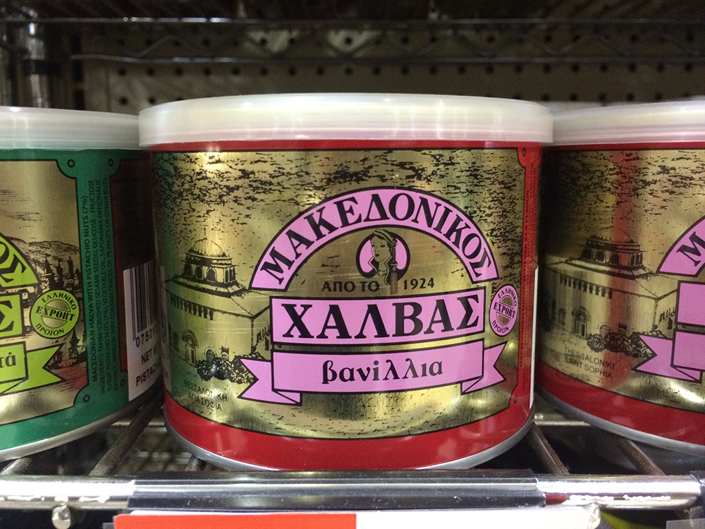
Regardless of how simple or complex a food packaging concept may be, there are countless hours of strategy, planning, prep and design that go into getting a product ready to vie for attention on the shelf. With an endless amount of “other options” and competition in the market, there are a couple key points to keep in mind when creating product packaging that sells as great as it tastes.
Clarity
Packaging should reflect the brand’s personality and tone, with each detail—from the colors and textures to the photography and language—working directly to reinforce the brand name, its promises and voice.
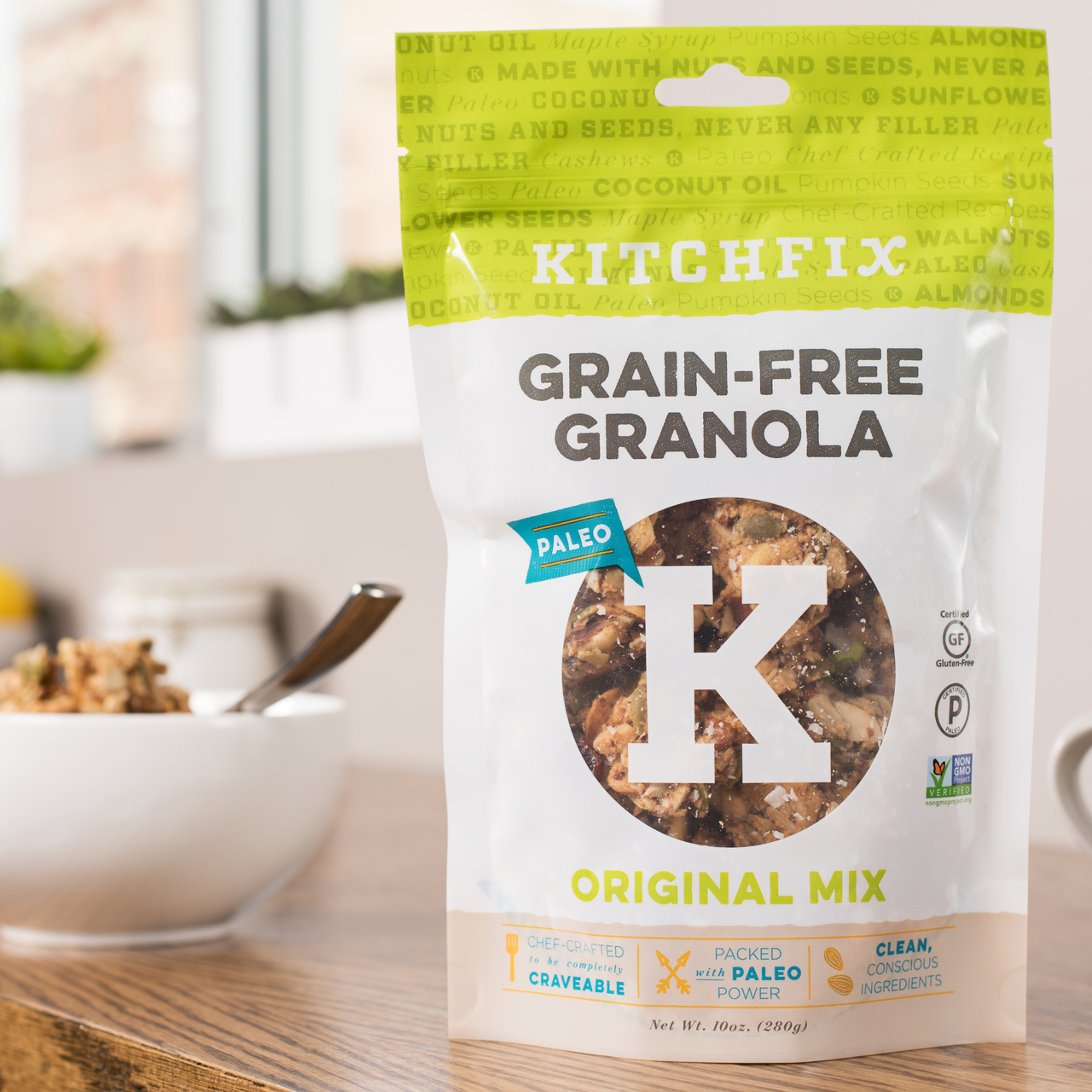 Package design by BatesMeron
Transparency
Clearly presenting the product—what’s actually in the box, bag or carton—may seem like a given, but if you take your time looking, you’re sure to find examples where the product isn’t accurately presented, leading to confusion and distrust.
Target Audience
Having a firm grasp on the primary target audience helps guide key phrasing and messaging to connect a particular product with the right consumer. Appealing to their sense of individuality creates a positive rapport. Do they strive to eat healthy? Are they environmentally conscious? Always on the hunt for something new? Finding out what’s important to the audience and putting it front and center is a driving force behind the success of any packaged good.
Originality
As mentioned before, there is a lot of variety out there. To stand out, brands have to be authentic and original. A great way to do this is to zig where others zag. If I’m looking at a shelf full of olive oil (I always get stuck when it’s time to replenish—why does every store carry a paralyzingly enormous inventory of olive oil?) I digress. If all the labels have a rustic aesthetic, the bottle that’s bright and modern is going to catch my eye. Likewise, if most of the food packaging is showing photography of olives, the illustrated olive is going to break through.

Innovation
A pretty package for a tasty treat is great. A pretty package for a tasty treat that’s also functionally designed is irresistible. People like smart package design because it solves problems and makes life a tiny bit simpler. When packaging is crafted to be easier to grab, stack, tote, scoop, store, pour or schlep, consumers take note.
Form + function = shelf appeal.
Take, for example, the more convenient experience of flooding your fries with Heinz’ Easy Squeeze! ketchup versus spending half your life tapping the “57” on the old glass bottle.

Also, let’s talk Coke’s genius 2002 Fridge Pack revolution. The structure of the box barely changed, but with a little perforation, a clunky container became a personal vending vessel, making each refreshing can of caramel coloring and carbonation an effortless grab away.

Don’t even get me started on stacked wine.

There you have it, your weekend is planned. Get thee to the nearest grocery store to feast your eyes on some sweet package design—restock the Easy Squeeze!, ogle the oils (and don’t forget to hit up that sample counter). Enjoy!
What’s your favorite food packaging? Why? Let us know in the comments or on our Facebook page. We can geek out together!
What Goes into Making a Tagline That Really Sings?
Constructing A Brand
BatesMeron is Turning 20!Six Things That Have Powered Us Through Two Decades


