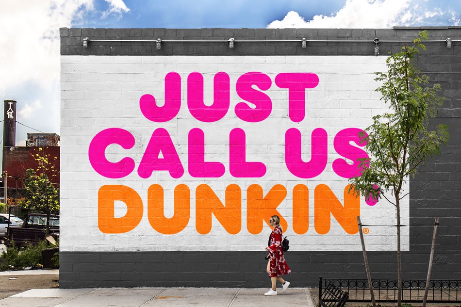
Dunkin’: A Rebrand Done Right

As a designer, I like to follow many design blogs and feeds. I love reading about new trends and concepts, but one thing that never fails to get my attention is when major companies undergo rebrands. This is because they are usually followed by a flurry of articles on why the new rebrand fails and why it was a step in the wrong direction. As designers, we tend to look at designs and instantly try to find a new approach to change them into what we think makes them “better”, but in doing this, we fail to see what the brand truly meant to achieve and who it is that they are targeting.
A few months back, Dunkin’ Donuts announced its new rebrand which will be implemented this month. This caught my attention, not because of the change itself or the fact that I’m a coffee addict, but because unlike other rebrands, the design community was fairly quiet about this one. In fact, I saw several posts actually supporting the change. The biggest element of the brand update was the name change: dropping the word “Donuts” and simply going by “Dunkin’”. To me, Dunkin’ has always been a go-to spot for coffee and rarely would I find myself actually buying any donuts from there, so dropping the “Donuts” from the name seemed, well, perfect.
A name change is usually as big as you can go in a rebrand, but again Dunkin’ is a case study on how to do a rebrand right. Starting with its slogan, “America Runs on Dunkin’”, which they launched in 2006, allowed the name change to become a natural transition in its update. Even prior to the announcement of the name change, I would constantly hear reference to the shortened moniker. In fact, it has reached the point where people seem to have completely forgotten that Dunkin’ was meant to be a verb in the name. It was only natural for the brand itself to follow suit.
Now, Dunkin’ is hoping the rebrand will shed more light on their popular beverage products. Dunkin’ claims that beverages, especially coffee, make up 60% of the company’s US sales, and this name update gives the chain a chance to increase the brand’s flexibility. We’re already seeing this flexibility with Dunkin’s new espresso-based drinks, and in the past, Dunkin’ has made other changes to its brand to showcase its beverages. In 2002, Dunkin tried to highlight its coffee offering by adding a coffee cup to its wordmark. While this helped, it still seemed like a bandage job, with a pictorial mark that just didn’t work well next to the name. This latest rebrand has really done the trick.

What I personally like best about the brand is that throughout years of change, Dunkin’ has managed to embrace its heritage by retaining its familiar pink and orange colors and iconic font, initially introduced in 1973, and rebrand to something totally new yet iconic and familiar. What do you think of Dunkin’s rebrand strategy? Let us know in the comments!
The Fake It Till You Make It Fallacy
The Left-Brain-Right-Brain Battle
All Hail the Creative Brief


