Graphic Design 101: 5 Design Tips You’ll Use Daily
As a graphic designer, I’m constantly looking for design tips and tricks that will improve my process, better my designs and help me make the best use of my time. In all honesty, some of the most useful tips aren’t anything super complex, they just help you improve the essential elements of your designs.
Whether you’re creating graphics for social media or designing a theme for an upcoming campaign, the applications of graphic design are vast. From picking a font to perfecting proportions to allotting white space, the combinations, choices and possibilities can seem endless.
To help you along your own design path, I’ve narrowed down the list of advice to my top five design tips. These basic design tips will help you save time and build work you’re proud of.
1. Start with a Great Color Palette
Using color beautifully takes a trained eye and that can take time. But once you’ve built your palette, you can check one huge task off your designing checklist. Taking time to create the perfect palette is one of your most crucial steps to ensuring a successful design.

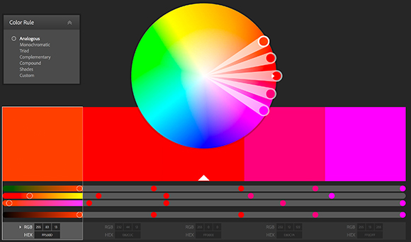
We get color inspiration from all over the place—magazines, random websites, architecture and nature all offer a library of ideas. We particularly love Adobe Kuler because it provides a handy-dandy color wheel for quickly creating your own palette. You can even upload your own images and directly pull colors to build new configurations. Once you’ve got your palette, it can then be imported right into any Adobe program and saved for convenient use.
Another great tool is the PANTONE Studio app, where you can capture your world in PANTONE colors, build and create palettes from images that you already have on your smartphone and then share the colors with your Creative Cloud account, clients and social networks. We love this app so much here our senior designer, Katie Baird, wrote a completely separate blog about it.
2. White Space is Your Friend
Don’t be afraid to leave white space in your design. As they say, less really is more. It’s all about achieving the right balance of interesting visuals—then stepping back and giving your work room to breathe.

Apple is one of the most influential companies of all time, and not just in the realm of technology. The brand’s design, especially the use of white space, is iconic. People and brands are always striving to emulate Apple’s crisp, sophisticated vision because it’s so simple and memorable. Who would have thought a tech company would change the way people perceive minimalist graphic design.
3. Consistency Throughout the Brand
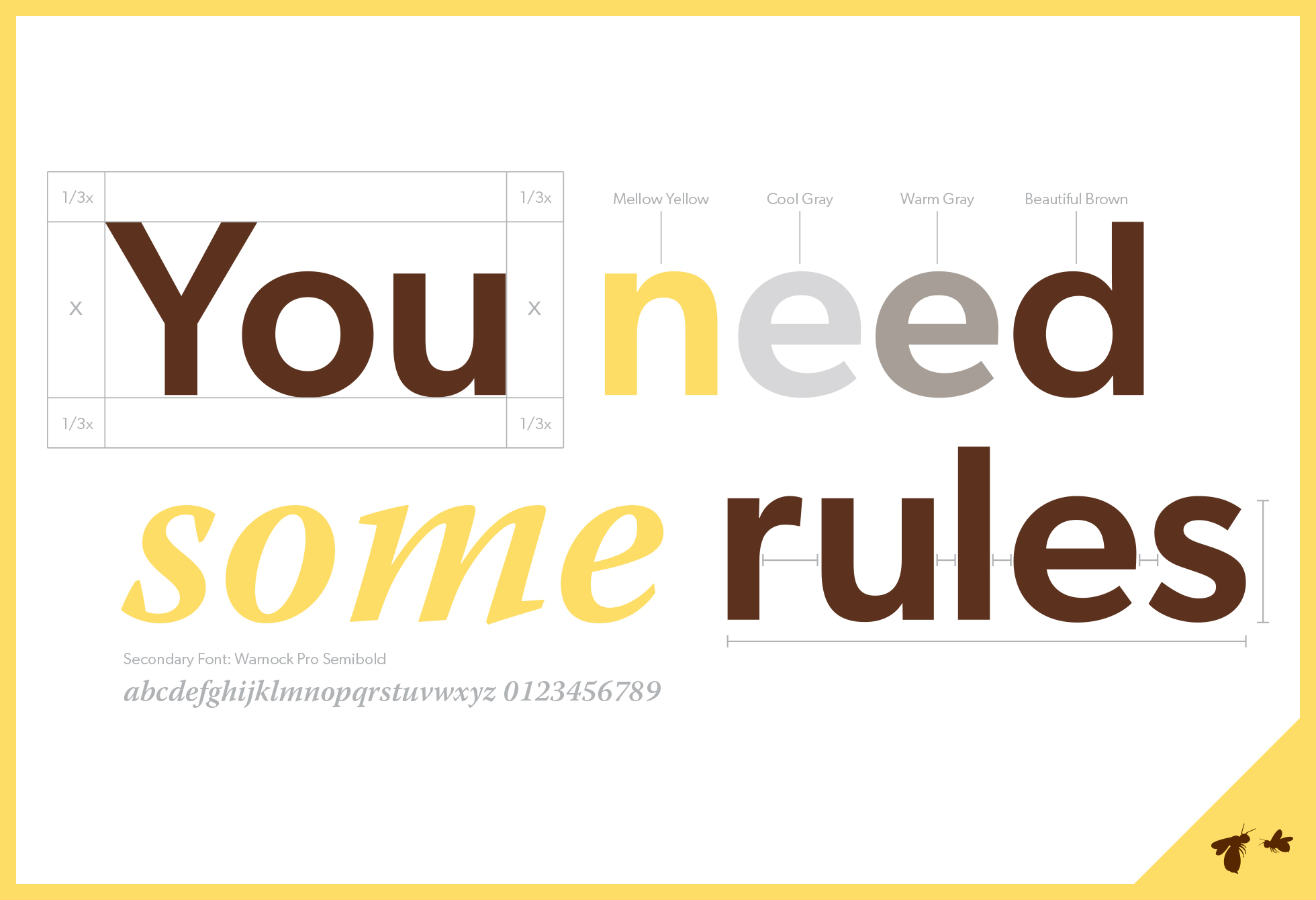
Consistency is an important element if you are designing for an established brand. If you’re working with multiple designs across an ad campaign, website or other project, it becomes even more crucial to pay attention to the look and feel of what’s already out there.
Consistency ensures the tone is the same, even as you change the content or medium. It can even solve some of your design challenges for you by providing you a toolbox of assets to work with.

This important design tip can be seen in action on the layouts above. The uniform placement of text, use of typefaces and color palette achieve visual recognition, which every brand strives for.
4. Keep it Simple
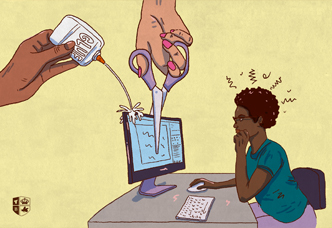
Have you ever seen a design where you weren’t sure what was going on—where it looked like someone may have thrown up on the page? When a design feels cluttered, removing elements rather than tinkering with too much will help enhance the design and allow the featured item to pop.
If you overdo it with too many special effects like shadows, gradients and 3D elements, you’ll quickly over-complicate a design. That’s not to say you can’t use any special effects, just sprinkle them into your design—kind of like you would when seasoning your food, too much can ruin it all.
 (sorry I couldn’t resist)
5. Remember Your Intended Audience
Lastly, make sure you never forget who you are designing for. Unless your project is purely for your own personal enjoyment, you are probably designing for a specific audience. Keeping that audience at the top of your mind will ensure that you are creating something they will react to.
Are you feeling inspired now? Are you ready to take on the world with design? As creatives we are always looking for ways to build our craft so don’t be shy to share design tips you have or common roadblocks you’ve encountered and how you’ve gotten past them.
Conquering the Hurdles of Collaborating in Quarantine
Here’s Why You Need to Be Investing in Your Brand Now
Uber's Constant Rebranding Won't Fix Neglected Company Culture


