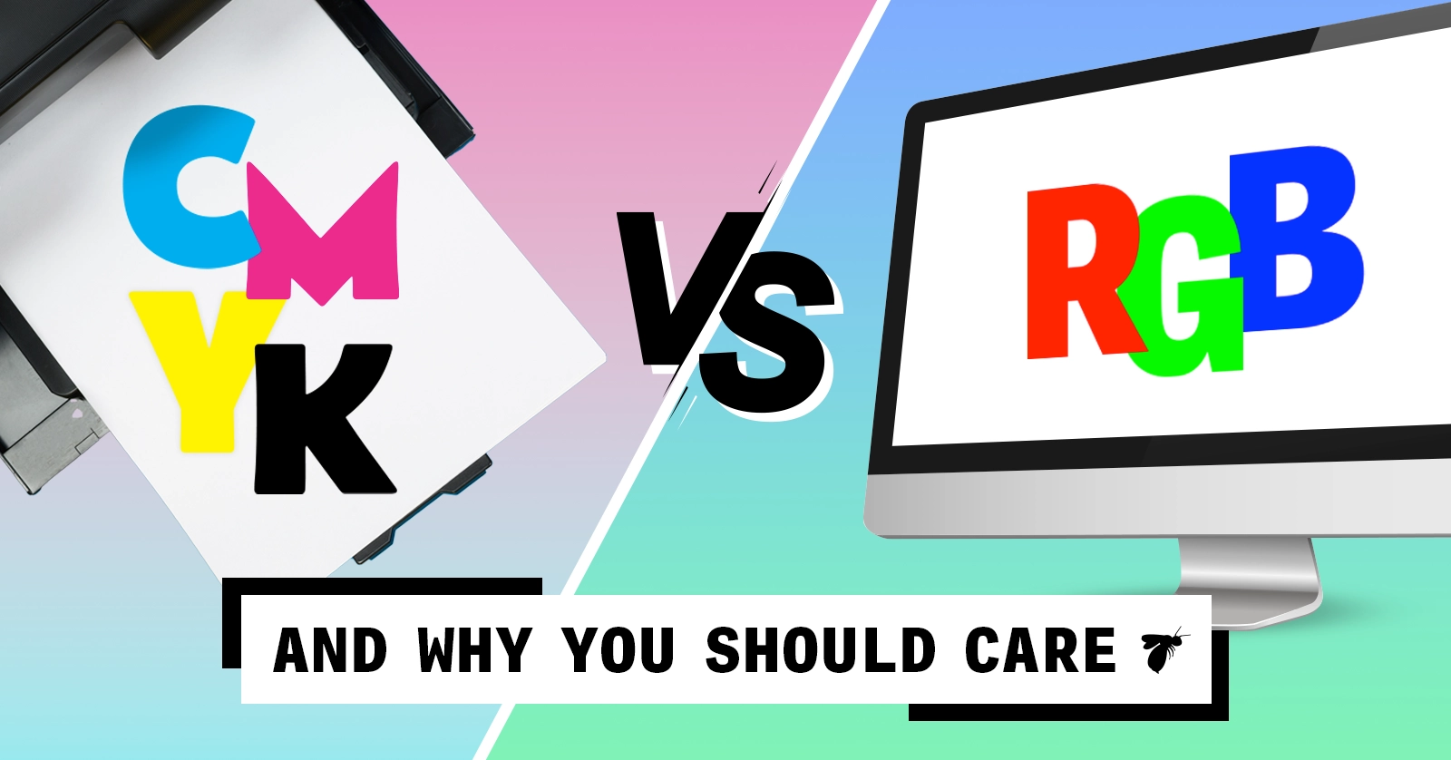
CMYK VS RGB
And why you should care!

Primary Colors Were A LIE!
In school, we learn red, blue, and yellow are the primary colors. Mix red and yellow, you get orange. Kid stuff. But what if I told you this is an outdated way of viewing the color spectrum?

CMYK the Real Primary Colors
Cyan, magenta, yellow, and black (CMYK) were first introduced to printing over 100 years ago by the Eagle Printing Company. They found they could produce what felt like an unlimited number of tones with just four colors.
There’s an argument to be made that red, blue, and yellow are not in fact the primary colors and that cyan and magenta (paired with yellow) are better representative of true primary colors. In color, the word “primary” means that there’s no way to mix two colors to get that color.
One way to see the argument for CMYK as primary colors is to see the results of mixing paint or ink together. Mixing cyan and magenta will create a beautiful, bright blue.

Mixing magenta and yellow comes to a nice, rich red.

This dethrones the notion that royal blue and red are true primary colors.
Primary Colors of Light
Color is tricky though! Not only does color act differently when comparing colored light vs. colored inks and pigment, the primary colors are different as well. The primary colors of light are red, green, and blue. Shortened to RGB, this is the color structure that supplies most digital screens’ ability to show color.
One way to look at how colored light mixes to create such a full spectrum of color is to break them out and combine two at a time. Mixing blue light and red light results in magenta, green and red results in yellow, and green and blue make cyan. Sound familiar? Mixing all 3 will result in White. Here’s a link where you can play with the colors combining RGB on your own.
But Why Does It Matter??
A modern brand exists in both the digital space and the real world, and it’s important to know what sort of challenges that may pose. RGB has 16.7 million colors it’s able to represent, while CMYK has a much narrower spectrum of 16 thousand. So, while most designers these days start designing on a screen, it’s important to know how the end product is going to be produced and used. Many colors you see on screen can’t be replicated exactly in print.
A Comprehensive Plan
Don’t fret! Your brand can look seamless from screen to page with the help of a little planning.
From the designer’s end, it can be as simple as starting the project in the correct color space when setting up a project file. Or when creating a brand identity, plan ahead with a brand guide that bridges the gap between digital and print to keep your brand looking top notch, no matter who picks up the look and feel down the road. Here you can break down your brand colors by CMYK and RGB, so everyone knows the right hues to use, and when.
Uncomfortable with color?
Call us at BatesMeron! We’d be happy to talk color and the best ways to make it work for you.
The Trials and Tribulations of a Young Designer: How Prototyping Saved Me
Observations on AI
Six Questions for Cameryn Berridge


