The Atlanta Municipal Signs Redesign
My hometown, Atlanta, Georgia—jewel of the South—is well known for scads of great things. It’s a city overflowing with music, warmth, art, history, old trees with branches you can climb like ladders, biscuits and fried chicken. And this summer, we can finally round out that list with the addition of fantastically designed municipal signs.
Municipal signs got you down?
The Department of Planning (DOP) uses municipal signage to communicate with the public about everything from tree removal to zoning hearings and proposals. Historically, these signs appear to have been put together with very little attention to design. Yes, they were downright ugly.
Enter one of my biggest agency crushes, Atlanta-based Matchstic. They worked with the DOP to makeover the look of the Atlanta municipal signs—and in doing so, empowered and engaged citizens with a better understanding of their surroundings.
“To me, when you saw the signs that we had before, what they said to you as residents was, ‘we don’t care a lot about this.’ They’re hard to read, they kind of screamed, ‘this is a bureaucracy, good luck!’”
—Tim Keane, Commissioner of Atlanta’s Department of Planning
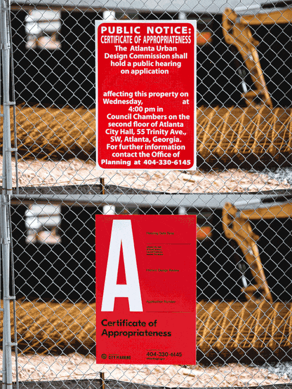 Old vs. new. Image courtesy of Matchstic
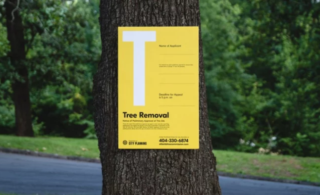 Image courtesy of Matchstic
Heed Hierarchy
The original signs were cryptic and cluttered. The new Atlanta municipal signs are clean, bright, colorful and smart, boasting a modern, flexible layout that will adapt to any situation that could arise at the City Planning office. Each notice is classified by one HUGE letter—which is fun, yes, but more than that, it serves a purpose, acting as a marker that can inform in a split second.
Additional details and print is organized in a way that naturally allows your eye to flow around the notice. This consistent, easy-to-read design shows off the place where aesthetic and functional design meet. And it’s a very lovely place to be.
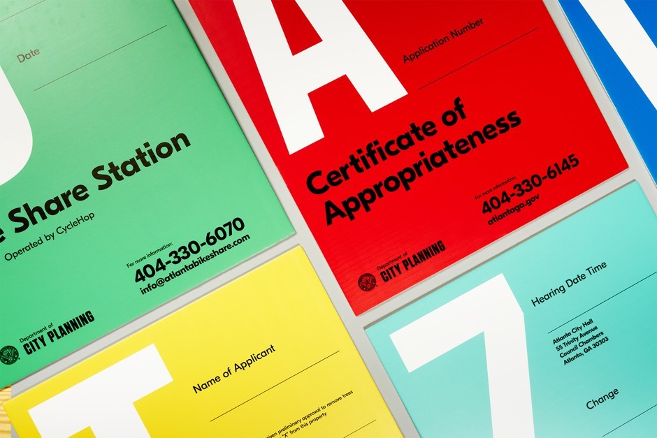 Image courtesy of Matchstic
Design That Solves Problems
These signs are a great study for what design is at its core: a tool for solving problems. The clear and concise design uses typography, color and a strong composition to slice through bureaucratic jargon, making life a little easier and less complicated for those who interact with the notices.
Atlanta isn’t the only city out there that’s using great design to engage audiences. Got examples of how your city is using design to make life better? Email us. We’d love to discover more examples of city’s getting smart with design.
A Trip Inside the World of 3D Printing
6 Questions for: Jean O'Brien
Timeless Logos: If it Aint Broke... Don't Fix It


