Shedding the Weight
I’m sure everyone has heard of the weight loss plan, Weight Watchers. But after 55 years, this diet membership brand has decided to shed their values to better align with today’s standards of health. In an attempt to rebrand itself away from your mother’s diet program, Weight Watchers has shifted towards branding themselves as a health and wellness organization that goes beyond just weight loss and focuses heavily on wellness and healthy living. The new direction included an overhaul of its prehistoric logo, a rename to just “WW” and a revamp of their entire product line. Have I peaked your interest? Well even more interesting is this marketing video to promote the brand.

So why the change? With today’s increasing acceptance of one’s body image, Weight Watchers felt that the term “diet” had negative connotations associated with it. President & CEO of WW International, Mindy Grossman said in an interview that “It’s not just about weight anymore. Today’s generation is more preventative, they want to live healthily. They want to educate themselves.”
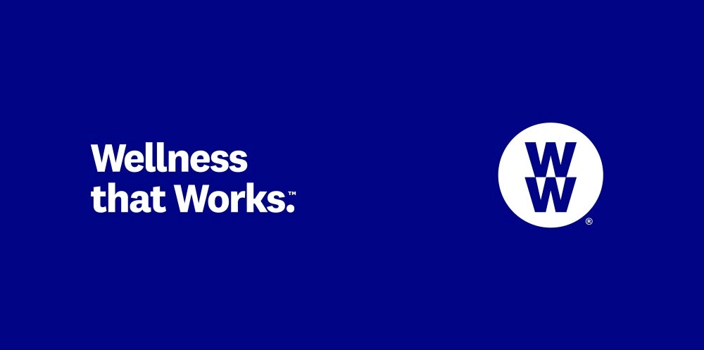
Along with a new logo mark, Weight Watchers updated their tagline as well, “Wellness that Works.” The new slogan is intended to appeal to people who want to build healthy habits without necessarily focusing on weight loss.
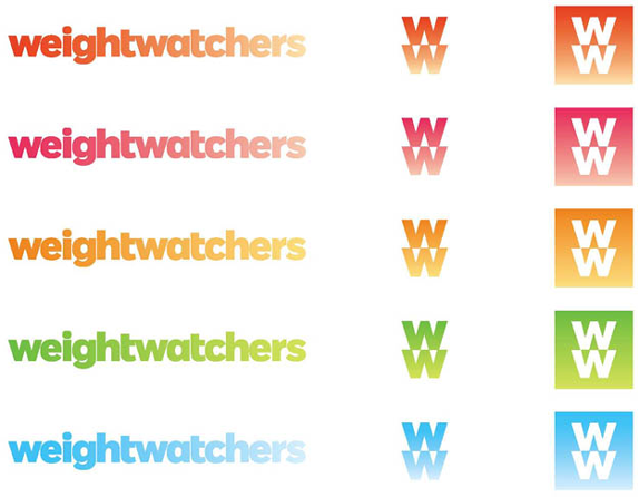
In order to make sure that the new logo and tagline would resignate with the intended audience, Weight Watchers reached out to one of the world’s largest design studios, Pentagram. The designer, Paula Scher, explains that she chose a version of the font Fort with a little customization. The use of all lowercase letters were intentional, along with the gradientations as well. The idea behind it was that it would presumably represent the shedding of weight, which is what the company is famous for. Although the logo is grayscale, they needed to add color versions to the branding standards as well.
However, as with all new things, not everyone is sold on it. As expected, this new rebrand was introduced with some critisism. Some people are saying that the letters look like Microsoft Word Art. And not to mention the irony of the pronunciation. Say it out loud, “double U double U.” It sounds like you are saying “double you double you.” With the new direction focused on health and wellness, maybe this isn’t a big deal, but something to think about when you are planning your next rebrand. Speaking of rebrands, are you looking to update your look? Let’s sit down and discuss to see if we can help.
Rainbow Capitalism
Our 2018 WeeTreat Workshop
This Girl Can Sell: What a Female-focused Campaign Looks Like in 2015


