Timeless Logos: If it Aint Broke… Don’t Fix It
When you think of the something that has “stood the test of time” what comes to mind? Is it a building, a clothing trend, your favorite restaurant or maybe a relationship? Well something that may not necessarily come to mind, but certainly should, is a logo.
A great logo means a brand is recognizable at just a glance, but some of the world’s top brands find it hard to resist making a complete overhaul of their logo during their lifetime. This often is a force of habit, a marketing tactic or the company fighting to stay relevant. However, timeless logos command such authority that it would take someone who is very brave (or very foolish) to attempt to redesign them.
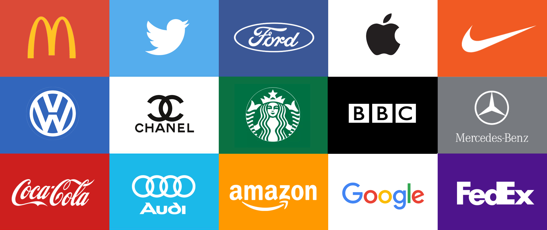
I’m not saying that you shouldn’t make alterations to your logo if need be—an evolution helps your brand stay fresh and relevant, without compromising its integrity. In this ever-changing world, there is just something wonderful about a brand whose mark has stood the test of time. It shows that the design team that worked on it kept key elements like simplicity and uniqueness in mind.
The more complex the logo the harder it is for the brain to recall, therefore I wanted to show you a couple brands that I like that have stayed relatively consistent through the years and a couple who have felt the need to undergo a major overhaul.
If you know me (or have read other posts from me on the BMSD blog) it will come as no surprise what my first timeless logo is.
NIKE
Yep that’s right, Nike. Since its original creation in 1971, this iconic logo has only needed to evolve ever so slightly. The root of the mark is the swoosh, which has remained firmly in place through the years. This mark has become so well recognized that it no longer needs to be accompanied by the brand name for us to know it’s Nike.
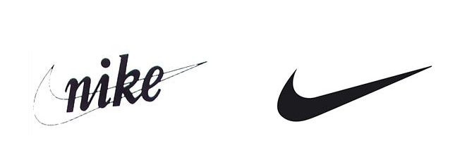
Nike is immortal and has surpassed time, it has not conformed to any fads or fashion. Its simplicity is unmatched and has become one of the most trusted brands amongst athletes.
TARGET

Without sounding too corny the Target logo, since it was first revealed in 1962, has been on target. The logo was streamlined in 1968 and has since evolved into one of the most recognized symbols in the US. Like Nike, the bullseye has remained the main focus allowing people to recognize the brand at a moment’s glance.
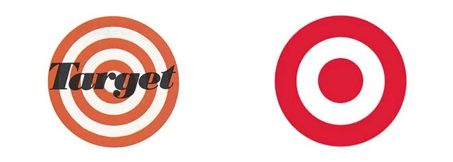
Because most people were familiar with the iconic bullseye it was able to stand on its own. So in 2006, Target decided to drop their name in much of their marketing. This is because Target has been so successful with brand recognition that the symbol itself has become memorable.
Now as promised, not all brands are so immune to change. Some brands feel so much pressure to please customers and keep up with the times they inevitable end up modifying their logo.
NBC

The National Broadcasting Company’s (NBC) logo has gone through many iterations over its long history. To be exact NBC has undergone nine different variations during its lifetime. Today’s recognizable peacock logo has been linked with NBC since 1956, falling in and out of use over the decades. It was originally created for the network’s color broadcasts and served as inspiration for many of its variations.
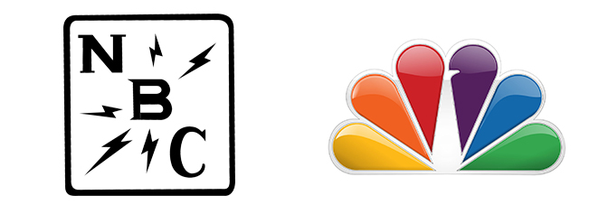
By 1986 color broadcasts were no longer a selling point, but the peacock had strong brand recognition, so much that NBC sometimes was referred to as the “Peacock Network.” As mentioned earlier as a key element when creating a logo or brand mark, the simpler rainbow bird with bold lettered typeface was in use until 2011, when a slightly stylized version of the peacock evolved. Now as recognizable as the peacock is today, their branding strategy could have used a little more work in the initial stages.
ADIDAS

While many of the world’s top brands stem from a thoughtful and often thought-provoking approach to their logo designs, Adidas was quite different. The brand was created by Adolf Dassler in 1949 when he was producing shoes for the military. Dassler wasn’t focused on longevity when the logo was created, it just needed to be something noticeable on the battlefield. Seemingly, the only well-thought aspect was the word mark, which comes from a combination of Adolf’s nickname, Adi, and the first letters of his last name, Das (bet you didn’t know that).

Once Adidas had established itself as a household name, the company sought out a new look in 1997 to emphasize its high-performance line of products. However, the updated logo only lasted until 2005 when it would undergo its last iteration and settle on a minimal mixture of the wordmark and the iconic three bars.
Although all these are all timeless logos in their own right, lessons can be learned by comparing companies who got it right the first time. If you’re on to a good thing, don’t mess with it because your brand will increase value that can prove to be priceless down the road.
Campaign Crush: Save the Food
Why You Should Pick a Small Agency for Your Project
The Power of Project Management


