Netflix’s Abstract: Lessons from Paula Scher

It’s been 10 years since Gary Hustwit released the Helvetica documentary that sent designers and type-nerds around the world into a tizzy, so a fresh look into the world of design and creativity was long overdue. Netflix, the streaming service we all love so dear, filled the void with its newest eight-episode docu-series, Abstract: The Art of Design.

Abstract dedicates each episode to a different type of creator—from Nike shoe designer Tinker Hatfield to Es Devlin, the stage designer behind Beyoncé’s Formation tour. We lucky viewers get a peek into how these design powerhouses do what they do best. Across the internet, and in the BMSD office, creative ears perked up at the opportunity to hear some of the most creative minds working today share their lives and work.
As a creative person, I knew Abstract would be interesting, but as a writer I wondered if any of it would be directly applicable to my work. BMSD designer Katie and I sat down and dissected our favorite episode, an in-depth look at famed graphic designer Paula Scher, finding the nuggets of wisdom from her that spoke to us most.
Initial Thoughts:
Katie: I definitely loved the Paula Scher episode the most—she has always been an idol of mine. I love the way she thinks about design and she left me with so many great takeaways from the episode.
Anna: That episode resonated a lot with me too. Maybe because it’s the most applicable to what we do every day. Also, before I went into writing, I started as a graphic design student in college and I remember learning about her. She seemed really aggressive at the time, but in Abstract I got a better sense of her. She’s not scary, just really intensely interested in what she does.
 Illustrated Quote Designed by Chris Piascik
“You have to be in a state of play to design. If you’re not in a state of play, you can’t make anything.”
Katie: I love this and I think it resonates with all creative people. It brings to mind another one of my favorite design-related quotes from Saul Bass “Work? It’s just serious play.” I definitely agree with Paula and Saul. The best creating seems to happen when your mind is malleable; when you have room to explore and try and fail and try again. You need to give yourself the freedom to try things just because it makes you laugh or you are curious what will happen and what it will look like.
Anna: That is definitely true of writing too. It’s hard because it’s not visual the same way. We don’t have color or shapes or textures to play with. All writers have is words on the page and you can only deviate so far before you lose meaning. I think the idea of being a little bit playful or toning down the seriousness is really important to not get frustrated and just stare at your screen hoping the perfect thing comes from the heavens.
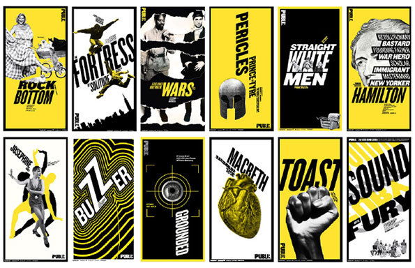
 The Public Theater Posters
“Type has spirit. Type doesn’t have to be this clean mechanical thing that is simply doing its job. It can be this marvelous thing to engage with.”
Katie: This is something I need to keep in mind with my own work. It can be easy to fall into an uninspired solution when you look at type as just this required element that is going to take up space on your design. Type can be used to draw people in, communicate a message and make them care. Type can be the heart and soul of the piece.
Anna: This hit on an impression I have at times that writing takes a backseat to design. In most scenarios the words have to be there, so it’s nice to hear a perspective where it’s embraced as an element of the overall design. It’s also fun to see words take a shape. Paula’s work is exciting to me because it uses words—my favorite thing—and makes them visually meaningful in their own way.
 Logos Designed by Paula Scher
“You’re not changing somebody, you’re making them a more perfect vision than when you started.”
Katie: This is very relevant to the branding work we do at BatesMeron. When clients come to us, we never try to come up with a new version of what they could or should be. We are distilling all that makes them who they are into this very clear tidy package that says it all. It’s more focused and better communicated, but it’s still totally them.
Anna: Definitely. It speaks to our BMSD philosophy of only doing work that serves the client. We start with the unique challenge of each client and work from there, rather than trying to fit clients into a mold. It reminds me of Tinker Hatfield’s work with Nike. Mark Parker, Nike CEO, begins that episode saying,“Tinker Hatfield started to define what working with an athlete was all about. It was a relationship, really digging in and getting to know them.” We build a relationship with our clients to deliver work they love. I don’t think any designer or creative professional could do their job without understanding who and what they’re working for.
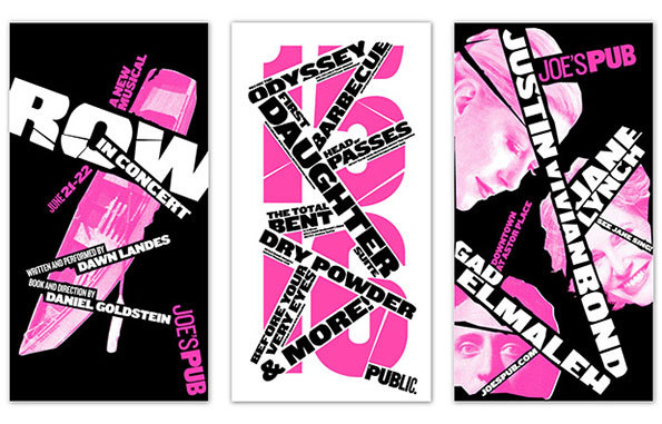
 The Public Theater Posters
“Making stuff is the heart of everything. That drive never goes away. What can I make next?”
Katie: For designers, artists and creatives of all stripes, this sentiment rings true. There is something in our blood that fuels this need to make things. Taking the thoughts and ideas that tumble around in our heads, making them exist in the physical world and seeing how people react with them—that’s magic to us.
Anna: For me it’s more of a compulsion to find the perfect word or a new way of saying things. It’s tough sometimes, but the satisfaction of coming up with good work that the client loves is really enjoyable and it makes me want to keep doing it.
 The Public Theater Posters
Final Thoughts:
Katie: Abstract as a whole is such a great concept. I love that it’s bringing exposure to concepts that aren’t at the forefront of the public mindset. It’s cool to show people how much goes into the spaces, art and products they interact with every day. For me, I love seeing creatives in other fields than my own and how they work, and how I can apply their advice or processes to my work.
Anna: We only discussed one episode here, but the whole series has such great insight into the creative process. The most inspiring (and comforting) thing I felt after watching the series was the human struggle each of the designers face. It can feel like brilliant people are always brilliant and their work comes easily, like they’ve mastered their craft. Abstract really dispels that notion—even those brilliant people, the designers and artists we all admire, start with the same thing we all do: a challenge and a blank page.
Have you started watching Netflix’s Abstract yet? If so, drop us a note in the comments to let us know what you thought.
Art on Wheels
5 Tricks to Get Your Creative Juices Flowing
6 Questions for: Melissa Leonard


